I've used PGFplots to generate some maps of a local area in the past, doing watershed calculations in GRASS and exporting the vectors as ASCII files, which can be plotted by PGFplots relatively easily. That only required an xy coordinate system (spatial extent of about 100 km by 100 km), and distortions were negligible.
As you noted, on a (near) global scale, things become more complicated, and plate caree is by far the easiest thing to start with.
Here's a very basic attempt to get started (I've been meaning to look into this for a while):
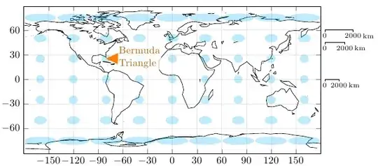
World map in equidistant rectangular (Plate Caree) projection, with Tissot's Indicatrix in blue, and the Bermuda Triangle shown in orange
The world map is part of the Gnuplot data: world.dat
By setting disabledatascaling in PGFplots, you can use normal coordinates instead of axis cs coordinates, and the scaling factors to convert between canvas coordinates and data coordinates will be available in \pgfplotunitxlength and \pgfplotsunitylength.
axis equal makes sure that the x and y unit lengths are the same.
I've written a key called scale circle, which you can add to the options of a \draw circle. The key will scale the x radius according to the latitude.
What this approach doesn't do is curve lines that don't follow longitudes or latitudes. I'm not sure what the best approach for this is, I'm guessing some to path magic (Andrew Stacey?), or an \addplot expression. I'll have a think about this.
\documentclass{article}

\usepackage{pgfplots}

\begin{document}

\makeatletter
\pgfmathsetmacro\kmAtEquator{36/4200} % Degree/km at equator
\tikzset{
    scale circle/.code={
        \pgfgetlastxy{\x@coord}{\y@coord}
        \pgfmathsetmacro\xscale{\pgfkeysvalueof{/tikz/x radius}*1/cos(\y@coord/\pgfplotsunitylength)}
        \tikzset{/tikz/x radius=\xscale}
    },
    scale bar/.code={
        \pgfgetlastxy{\x@coord}{\y@coord}
        \pgfmathsetmacro\xscale{1/cos(\y@coord/\pgfplotsunitylength)}
        \tikzset{
            insert path={
                node [
                    below,
                    font=\scriptsize
                ] {0}
                +(0,-2pt) -- +(0,0) -- ++(#1*\xscale*\kmAtEquator,0)
                node [
                    below,
                    font=\scriptsize,
                    inner xsep=1pt,
                    label={[inner sep=0pt,font=\scriptsize]right:km}] {#1}
                -- +(0,-2pt)
            }
        }
    },
    scale bar/.default=2000
}
\makeatother


\begin{tikzpicture}
\begin{axis}[
    grid=both, ytick={-60,-30,...,90}, xtick={-180,-150,...,180},
    grid style=black!10,
    enlargelimits=false,
    axis equal,
    scale only axis,
    width=10cm,
    height=5cm,
    disabledatascaling, clip=false
]

\addplot [] table {world.dat};


\pgfplotsextra{
    \foreach \x in {-160,-120,...,160}{
        \foreach \y in {-75,-50,...,75}{
            \fill [cyan, opacity=0.25] (\x,\y) circle [radius=5, scale circle];
        }
    }
    \fill [orange] (-64.9,32.3)   -- (-66.1,18.5) node [anchor=mid west, inner sep=1pt, orange!75!black, fill=white, text opacity=1,fill opacity=0.75, align=left] {Bermuda\\Triangle} -- (-80.4,25.2)   -- cycle;
    \draw (185,0) [scale bar];
    \draw (185,45) [scale bar];
    \draw (185,60) [scale bar];
}
\end{axis}
\end{tikzpicture}

\end{document}

pgfplotsread off your data from an external file. Are you going to use an external image for the background ? – percusse Nov 24 '11 at 15:17To do this in pgfplots, I would need to generate several hundred datafiles with coordinates for polygons and lines, read those, I'm not sure pgfplots is up to that. Or I could create a PDF without any text and write on top of that, so that at least the fonts would match the surrounding document. But for the scale-ruler that would be difficult.
I'm often plotting maps in my field; usually (near)-global, starting with coastlines, then contours on top of that, etc...
– gerrit Nov 24 '11 at 15:28Tikzanyway. So that would reduce the problem dramatically. For example see this question and its wonderful answers. Is this relevant for you to draw only the ellipsoids and everything else is flattened to the background? There are some options for the scaling also. You can obtain the exact size an draw on it with a relative length such that the scale gets scaled too. – percusse Nov 24 '11 at 15:35pgfmathematical engine is not bad at all with precision etc. and the problem is often the long LaTeX compilation times ( i even use it to draw bode plots with 900-1000 sample points). But if your problem requires large chunks data to be handled simultaneously, it might just let you down. – percusse Nov 24 '11 at 15:52