2

I'm trying to type up notes on a lecture I attended in which three capital letters (F, M, V) were clearly some very specific implementation in which none of them contain curved edges. I can't find any of them in LaTeX symbol lists or with DeTeXify, but I know I've seen at least some of them before (the V is sometimes used with vector spaces, and each of the letter's usual upper vertices has a horizontal line widening the top), and suspect they're all from the same family. They're not mathbb, mathbf, mathcal, mathfrak, mathit, mathrm, mathscr, mathsf or mathtt characters. The F is similar to a digamma, but with a short line located on and perpendicular to the lower of the horizontal lines; and the M, were it inverted to resemble a W, would have widening lines similar to those of the V.

Edit: picture added, per a suggestion.

J.G.
  • 237
  • If no one jumps to an answer, could you draw by hand, scan and post the image? – Steven B. Segletes Jun 06 '17 at 10:13
  • 1
    @StevenB.Segletes Hopefully the attached image will help. – J.G. Jun 06 '17 at 10:18
  • Most serif letter forms obey this style, even LaTeX's default Computer Modern font. I presume you need an exaggerated form of those, perhaps? Oh, and are they italic shape or not? \documentclass{article} \begin{document} $FMV$ FMV \end{document} – Steven B. Segletes Jun 06 '17 at 10:25
  • Maybe you are looking for so-called "Egyptian" fonts (also "slab serif"), something like http://www.fontscape.com/pictures/shinntype/BodoniEgyptian.gif? Or this? https://www.fonts.com/font/archive-type/archive-antique – Steven B. Segletes Jun 06 '17 at 10:30
  • Also http://designwoop.com/uploads/2011/12/03_slab_serif_fonts_Tertre.jpg, http://premiumcoding.com/wp-content/uploads/2014/04/slab-serif-fonts2.png, http://www.fontriver.com/i/fonts/typo_slab_serif/typoslabserif_light_specimen.jpg. It seems "slab serif" is definitely the search term that you are looking for. – Steven B. Segletes Jun 06 '17 at 10:38
  • @StevenB.Segletes Slab serif looks encouraging; but how would I use it in a math environment? – J.G. Jun 06 '17 at 10:42
  • The commercially available CH Math font seems to offer LaTeX Math support, for example, http://www.micropress-inc.com/fonts/chmath/chmain.htm. Otherwise, you need to declare font families and import glyphs, in a way similar to this answer: https://tex.stackexchange.com/questions/315102/different-sum-signs/315109#315109. – Steven B. Segletes Jun 06 '17 at 10:46
  • My above comment applies if the font is available to LaTeX. If not, your other option is to use Xelatex or Lualatex to import the font. How about Charter BT: \documentclass{article} \usepackage[bitstream-charter]{mathdesign} \usepackage[T1]{fontenc} \begin{document} $FMV$ FMV \end{document} – Steven B. Segletes Jun 06 '17 at 10:55

1 Answers1

1

From the comment discussion, we decided a slab font was the appropriate class. The question arose how to import such glyphs into LaTeX math, if no prior support was available by way of package.

Fortunately, LaTeX supports several slab-serif fonts for text, which means that glyphs from those font families can be imported into math mode.

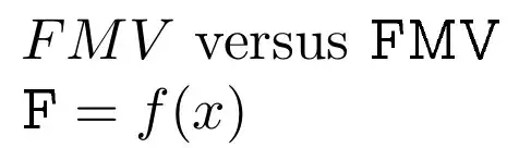
Here I use the Computer Concrete font (beton package, ccr font family), see http://www.tug.dk/FontCatalogue/computerconcreteeuler/, and import the F, M, and V into math mode as \slabF, \slabM, and \slabV.

\documentclass{article}
\usepackage{mathtools}
\DeclareFontFamily{T1}{ccr}{}

\DeclareFontShape{T1}{ccr}{m}{n}{
  <-8> ccr5
  <8-> ccr10}{}

\DeclareSymbolFont{Xccr}{T1}{ccr}{m}{n}

\DeclareMathSymbol{\slabF}{\mathalpha}{Xccr}{70}
\DeclareMathSymbol{\slabM}{\mathalpha}{Xccr}{77}
\DeclareMathSymbol{\slabV}{\mathalpha}{Xccr}{86}
% =============================================
\begin{document}
$FMV$ versus $\slabF\slabM\slabV$

$\slabF = f(x)$
\end{document}

enter image description here

If no suitable font can be found, and in light of the OP's comment below, there is always the approach of taking a sans font and modifying it. Here, I choose Alegreya, because of its capital M shape. I have also implemented things to satisfy the smaller math styles

\documentclass[12pt]{article}
%\usepackage[T1]{fontenc}
\usepackage{AlegreyaSans}
\usepackage{stackengine,scalerel}

\newcommand\slabF{\mathord{\scalerel*{\stackinset{r}{.2pt}{c}{}{%
  \rule{0.8pt}{2.1pt}}{%
  \fontfamily{\AlegreyaSansfamily}\selectfont F}}{F}}}
\newcommand\slabM{\mathord{\scalerel*{\kern1.5pt\stackinset{c}{}{b}{}{%
  \rule{2.1pt}{0.8pt}\kern6.5pt\rule{2.1pt}{0.8pt}}{%
  \fontfamily{\AlegreyaSansfamily}\selectfont M}\kern1.5pt}{M}}}
\newcommand\slabV{\mathord{\scalerel*{\kern1.5pt\stackinset{c}{}{t}{-.15pt}{%
  \rule{2.1pt}{0.8pt}\kern5.5pt\rule{2.1pt}{0.8pt}}{%
  \fontfamily{\AlegreyaSansfamily}\selectfont V}\kern1.5pt}{V}}}
  \begin{document}
FVM and $FMV$ versus $\slabF\slabM\slabV$

$\slabF = f(x)\cdot \slabM + a\slabV$

$\slabF\slabM\slabV\scriptstyle\slabF\slabM\slabV\scriptscriptstyle\slabF\slabM\slabV$
\end{document}

enter image description here

  • Unfortunately this isn't quite what I had in mind. My drawing, which I can't update for several hours, didn't make this clear, but the top/bottom-extending lines on V/M don't extend into the width the letter would otherwise occupy. The outermost long lines in the M should also lean quite far from the vertical, but not due to italics (there is still left-right symmetry). – J.G. Jun 06 '17 at 12:28
  • @J.G. I understand that this font may not be the proper solution for your need, but the answer accomplished several points: 1) it alerted you what to look for in the form of "slab serif" fonts, and 2) it shows how, once you have found the proper font, how to import the result into the math mode of LaTeX. So, once you have a more appropriate font, the transition should hopefully be easier. – Steven B. Segletes Jun 06 '17 at 12:32
  • @J.G. Please see my edit. – Steven B. Segletes Jun 06 '17 at 13:04