My current plotting tool for my papers is pgfplots for nice consistent plots. Now I would like to add a boxplot. Is this possible with help of pgfplots, or any helper package?
Asked
Active
Viewed 2.7k times
5 Answers
29
PGFPlots supports boxplots natively as of version 1.8 See Boxplot in LaTeX for an example.
The remainder of this answer should be considered obsolete.
There is a much improved version of this code at Simpler boxplots in pgfplots - is this possible?. It allows creating box plots with a single command, and adds much more flexibility to the data format and the plot styles:

Original answer:
Not out of the box, and you'd have to do the quantile calculations outside of PGFplots, but then you can draw box plots with a bit of style trickery.
This code
\begin{axis} [enlarge x limits=0.5,xtick=data]
    \addplot [box plot median] table {testdata.dat};
    \addplot [box plot box] table {testdata.dat};
    \addplot [box plot top whisker] table {testdata.dat};
    \addplot [box plot bottom whisker] table {testdata.dat};
\end{axis}
can generate this plot

if testdata.dat is of the form
index median box_top box_bottom whisker_top whisker_bottom
Here's a full compilable example:
\documentclass{article}
\usepackage{pgfplots}
\usepackage{filecontents}

\begin{filecontents}{testdata.dat}
0 1 1.2 0.4 1.5 0.2
1 2 2.3 1.5 2.7 1
2 0.7 1.4 0.5 1.9 0.1
\end{filecontents}

\pgfplotsset{
    box plot/.style={
        /pgfplots/.cd,
        black,
        only marks,
        mark=-,
        mark size=1em,
        /pgfplots/error bars/.cd,
        y dir=plus,
        y explicit,
    },
    box plot box/.style={
        /pgfplots/error bars/draw error bar/.code 2 args={%
            \draw  ##1 -- ++(1em,0pt) |- ##2 -- ++(-1em,0pt) |- ##1 -- cycle;
        },
        /pgfplots/table/.cd,
        y index=2,
        y error expr={\thisrowno{3}-\thisrowno{2}},
        /pgfplots/box plot
    },
    box plot top whisker/.style={
        /pgfplots/error bars/draw error bar/.code 2 args={%
            \pgfkeysgetvalue{/pgfplots/error bars/error mark}%
            {\pgfplotserrorbarsmark}%
            \pgfkeysgetvalue{/pgfplots/error bars/error mark options}%
            {\pgfplotserrorbarsmarkopts}%
            \path ##1 -- ##2;
        },
        /pgfplots/table/.cd,
        y index=4,
        y error expr={\thisrowno{2}-\thisrowno{4}},
        /pgfplots/box plot
    },
    box plot bottom whisker/.style={
        /pgfplots/error bars/draw error bar/.code 2 args={%
            \pgfkeysgetvalue{/pgfplots/error bars/error mark}%
            {\pgfplotserrorbarsmark}%
            \pgfkeysgetvalue{/pgfplots/error bars/error mark options}%
            {\pgfplotserrorbarsmarkopts}%
            \path ##1 -- ##2;
        },
        /pgfplots/table/.cd,
        y index=5,
        y error expr={\thisrowno{3}-\thisrowno{5}},
        /pgfplots/box plot
    },
    box plot median/.style={
        /pgfplots/box plot
    }
}

\begin{document}
\begin{tikzpicture}
\begin{axis} [enlarge x limits=0.5,xtick=data]
    \addplot [box plot median] table {testdata.dat};
    \addplot [box plot box] table {testdata.dat};
    \addplot [box plot top whisker] table {testdata.dat};
    \addplot [box plot bottom whisker] table {testdata.dat};
\end{axis}
\end{tikzpicture}
\end{document}
10
If you use R, you can output the boxplot using tikzDevice.
Here's an example:
library(tikzDevice)
tikz('normal.tex', standAlone = TRUE, width=5, height=5)
boxplot(mpg~cyl,data=mtcars, main="Car Milage Data",
+    xlab="Number of Cylinders", ylab="Miles Per Gallon")
dev.off()

Frank Zafka
- 1,189
8
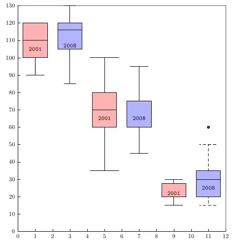
For every point more than 3/2 times the interquartile range from the end of a box, is a dot. The only special optional arguments, beside all other which are valid for drawing lines and filling areas, are IQLfactor, barwidth, and arrowlength, where the latter is a factor which is multiplied with the barwidth for the line ends. The IQLfactor, preset to 1.5, defines the area for the outliers.
Run it with xelatex
\documentclass{article}
\usepackage{pst-plot}
\begin{document}

\begin{pspicture}(-1,-1)(12,14)
\psset{yunit=0.1,fillstyle=solid}
\psaxes[dy=1cm,Dy=10,ticksize=4pt 0,axesstyle=frame](0,0)(12,130)
\rput(1,0){\psBoxplot[fillcolor=red!30]{
   100 90 120 115 120 110 100 110 100 90 100 100 120 120 120}}\rput(1,105){2001}
\rput(3,0){\psBoxplot[arrowlength=0.5,fillcolor=blue!30]{
  90 120 115 116 115 110 90 130 120 120 120 85 100 130 130}}\rput(3,107){2008}
\rput(5,0){\psBoxplot[barwidth=40pt,arrowlength=1.2,fillcolor=red!30]{
  35 70 90 60 100 60 60 80 80 60 50 55 90 70 70}}\rput(5,65){2001}
\rput(7,0){\psBoxplot[barwidth=40pt,fillcolor=blue!30]{
  60 65 60 75 75 60 50 90 95 60 65 45 45 60 90}}\rput(7,65){2008}
\rput(9,0){\psBoxplot[fillcolor=red!30]{
  20 20 25 20 15 20 20 25 30 20 20 20 30 30 30}}\rput(9,22){2001}
\rput(11,0){\psBoxplot[fillcolor=blue!30,linestyle=dashed]{
  20 30 20 35 35 20 20 60 50 20 35 15 30 20 40}}\rput(11,25){2008}
\end{pspicture}
\end{document}
-
This is so cool! I want to re-purpose this for generating a performance plot. How would I display dates instead of numbers along the x axis as well as add a description of what the x and y axis are? Sorry, I am rather new to LaTeX. – The Dude May 08 '12 at 22:55
-
@TheDude: can you give an example (maybe a graphic) of what you really whant to show – May 23 '12 at 12:19
-
-
@KBM: use
\uput[-90](6,0){y.axis}and\uput[180](0,65){y}or\rputor ... You can also rotate the names, if needed – Dec 04 '15 at 07:51 -
4
QtiPlot is a free program that can take your spreadsheet data and create a box plot with a consistent look. You can change the title, x-axis, etc., and then export the image into a .tex file thereby generating all the code from \begin{tikzpicture} to \end{tikzpicture}. Copy that code into your LaTeX document. Here is what I generated from some sample data. 
DJP
- 12,451
3
I am not aware of any easy-to-use packages for producing box plots in pgfplots but this TeXample example and this topic at LaTeX Community show that it's not too hard to produce one.
Pieter
- 5,411
symbolic x coords. Is there something special I have to set? – knittl Jun 27 '12 at 16:41on background layer(from backgrounds library) for the data points andfill=whitefor the boxes to no avail. Is there something about error bars, I'm missing (always drawn "in the back")? – knittl Jul 25 '12 at 17:44\addplotcommand for your data before thebox plotcommands, the lines should be plotted behind the boxplots. Markers will always be drawn on top, if you want to avoid that, you'll have to use a secondaxisenvironment that coincides with the first one. You might want to open a new question if this doesn't work. – Jake Jul 25 '12 at 18:28\addplot[only marks,mark=*]to draw the actual data points. Could I draw them without mark using marks? Otherwise I'll have to open a new question – knittl Jul 25 '12 at 18:41