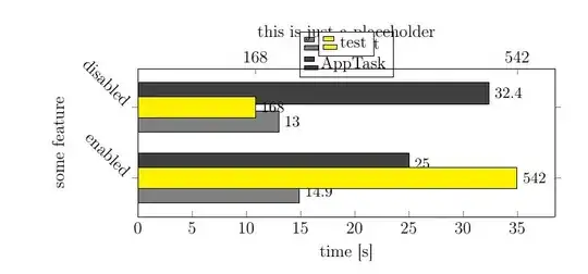
I am trying to visualize measurements in seconds on the lower x axis, while the upper x axis is supposed to display a different variable (message count). I read the similar questions, but they did not apply to the exact problem.
If I put all plots in the first axis, I cannot seem to get the x ticks on the upper axis right. They are very hard to control. If I put the 'different' plot in the second axis, it looks as the example below. Can it be done for the bars to look like they belong to either of the categories and have different axis? Any help is appreciated!
The MWE I have is as follows:
\documentclass{article}
\usepackage{tikz}
\usepackage{pgfplots}
\pgfplotsset{width=7cm,compat=1.3}

\begin{document}
\begin{figure}
\centering
\begin{tikzpicture}%[scale=1.08]
\begin{axis}[
x tick label style={
    /pgf/number format/1000 sep=},
ylabel={some feature},
y label style={at={(axis description cs:-0.1,0.5)},anchor=north},
xlabel={time [s]},
enlargelimits=0.3,
enlarge y limits=0.55,
enlarge x limits={upper,value=0.1},
y=50pt,
axis x line*=bottom,
legend style={at={(0.5,1.25)},
    anchor=north},
symbolic y coords={enabled,disabled},
ytick=data,
xbar=5pt, xmin=0,xmax=35,
width=340pt,
y tick label style={rotate=315,anchor=east},
nodes near coords,
every node near coord/.append style={anchor=west, font=\small},
bar width=15pt,
]
\addplot [fill=gray]
coordinates {(13.0,disabled) (14.9,enabled)};
\addplot [fill=darkgray]
coordinates {(32.4,disabled) (25.0,enabled)};
\legend{ Tasklet,  AppTask}
\end{axis}
\begin{axis}[
xbar,
axis x line*=top,
xlabel={this is just a placeholder},
xlabel near ticks,
enlargelimits=0.3,
enlarge x limits={upper,value=0.1},
enlarge y limits=0.55,
axis y line=none,
xtick=data,xmin=0,
width=340pt,
y=50pt,
symbolic y coords={enabled,disabled},
nodes near coords,
every node near coord/.append style={anchor=west, font=\small},
bar width=15pt,
legend style={at={(0.5,1.25)},
anchor=north},
legend columns=3,
]
\addplot [fill=yellow]
coordinates {(168,disabled) (542,enabled)};%168 and 542
\addlegendentry{test}
\end{axis}
\end{tikzpicture}
\caption{Execution times for AppTasks and Tasklets. Parameters: 5 simulation runs, 1 broker, 100 providers, 50 consumers, forwarding enabled versus disabled, dynamic cache list sizing, filtered cache list composition mode, dynamic [$6s,3s,1s$] dissemination interval}
\label{fig:MeasurementForwarding100}
\end{figure}
\end{document}

