1

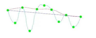
I am trying to create a diagram which looks like this:

enter image description here

I have tried fitting a function with increasingly many nodes, but it does not look right (showing all 3 curves on the diagram to better illustrate):

\documentclass[10pt,landscape,a4paper]{article}
\usepackage[utf8]{inputenc}
\usepackage[UKenglish]{babel}
\usepackage{tikz}

\begin{document}

\begin{tikzpicture} [scale = 0.5]

\foreach \p in {-5,...,5} \node[circle,fill=green] at (\p,2*rand)  (\p) {};
\draw [cyan, xshift=4cm] plot [smooth, tension=1] coordinates { (-5) (-4) (-3) (-2) (-1) (0) (1) (2) (3) (4) (5) };
\draw [red, xshift=4cm] plot [smooth, tension=1] coordinates { (-5)  (-3)  (-1)  (1)  (3)  (5) };
\draw [blue, xshift=4cm] plot [smooth, tension=1] coordinates { (-5)  (5)  };
\end{tikzpicture}

\end{document}

enter image description here

I have also tried creating nodes like this (ie with a defined function x^2+x+1 + "noise" instead:

\foreach \p in {-5,...,5} \node[circle,fill=green] at (\p, \p * \p + \p + 1 + rand) (\p) {};

but that does not work at all.

In any case my code forces me to list nodes manually, which is not great.

I guess I need a way of interpolating with increasingly higher degree polynomials ? But I am not sure how to do this.

  • 4
    LaTeX-free advice: I would generate the data outside of LaTeX (Matlab, MS Excel, Python, etc.) and then plot the result (e. g. csv file for the xy points and the polynoms in equation form) using pgfplots. These are the tools you would use in a real life scenario anyway and not LaTeX for mathematical problem solving. – Dr. Manuel Kuehner Feb 27 '19 at 13:41
  • For an example of using external data with pgfplots, see https://tex.stackexchange.com/questions/475602/drawing-a-function-without-knowing-its-definition/475883#475883 – John Kormylo Feb 27 '19 at 15:09

1 Answers1

2

You could defined "interpolating" coordinates and connect those with a smooth plot.

\documentclass[10pt,landscape,a4paper]{article}
\usepackage{tikz}
\begin{document}

\begin{tikzpicture} [scale = 0.5]
\pgfmathtruncatemacro{\imin}{-5}
\pgfmathtruncatemacro{\imax}{5}
\foreach \p in {\imin,...,\imax} \node[circle,fill=green] at (\p,2*rand)  (p\p) {};
\foreach \X [evaluate=\X as \Xm using {int(\X-1)},evaluate=\X as \Xp using
{int(\X+1)}] in {\imin,...,\imax}
{\ifnum\X=\imin
  \path (p\X) coordinate (i\X);
 \else
  \ifnum\X=\imax
   \path (p\X) coordinate (i\X);
  \else
   \path (barycentric cs:p\X=0.6,p\Xm=0.2,p\Xp=0.2) coordinate (i\X);
  \fi 
 \fi
}
\draw [blue] plot [smooth, tension=1,variable=\X,samples at={\imin,...,\imax}] 
(i\X);
\end{tikzpicture}
\end{document}

enter image description here

Of course, you could change the weighting in addition to the tension.

\documentclass[tikz,border=3.14mm]{standalone}
\begin{document}
\foreach \X in {1,1.5,...,10,9.5,9,...,1.5}
{\begin{tikzpicture}
\pgfmathtruncatemacro{\imin}{-5}
\pgfmathtruncatemacro{\imax}{5}
\pgfmathsetmacro{\mainweight}{\X}
\pgfmathsetseed{27}
\node[anchor=north west,font=\sffamily] at (\imin,-2)
{weight is \pgfmathprintnumber{\mainweight}};
\foreach \p in {\imin,...,\imax} \node[circle,fill=green] at (\p,2*rand)  (p\p) {};
\foreach \X [evaluate=\X as \Xm using {int(\X-1)},evaluate=\X as \Xp using
{int(\X+1)}] in {\imin,...,\imax}
{\ifnum\X=\imin
  \path (p\X) coordinate (i\X);
 \else
  \ifnum\X=\imax
   \path (p\X) coordinate (i\X);
  \else
   \path (barycentric cs:p\X=\mainweight,p\Xm=1,p\Xp=1) coordinate (i\X);
  \fi 
 \fi
}
\draw [blue] plot [smooth, tension=0.5,variable=\X,samples at={\imin,...,\imax}] 
(i\X);
\end{tikzpicture}}
\end{document}

enter image description here

  • +1 Very cool animation :). The OP is offline apparently. I would assume that this is not what is broadly considered as "curve fitting". But maybe it's precise enough for the OP to show the idea behind it. – Dr. Manuel Kuehner Feb 27 '19 at 19:12
  • 1
    @Dr.ManuelKuehner I agree that this is not a real fitting algorithm, and that LaTeX is not really made for such things. –  Feb 27 '19 at 19:15