This is the Adobe Garamond Pro small caps as appeared on the official Adobe spec sheet:
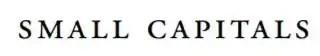
This is what I got from XeLaTeX with
\setmainfontand\textsc{}:


\documentclass{article}

\usepackage{fontspec}
\setmainfont[ItalicFont=AGaramondPro-Italic.otf,
BoldFont=AGaramondPro-Bold.otf,
BoldItalicFont=AGaramondPro-BoldItalic.otf,
Numbers=OldStyle]
{AGaramondPro-Regular.otf}

\begin{document}

\textsc{small capital} is not the same as SMALL CAPITALS scaled down,
 but either kerning or letter spacing is off.

\end{document}
The shapes of the glyphs are correct, i.e. XeLaTeX knows where and how to find true small caps instead of just making up fake ones by scaling down regular caps, but just why are the kernings SO OFF???
.otffile? – Meatball Princess May 04 '19 at 20:30fontspec, though (see the approach forxelatex+tufteclasses here, for instance). – May 06 '19 at 18:28