In order to automatically choose the left or right side for the “caption”, it is best to convert the plot to a 2D plot, otherwise finding where to draw the line is made artificially difficult. Here is code that automatically chooses the “correct” side (based on the position relatively to a vertical line splitting both ellipses in halves):
\documentclass[border=5pt, tikz]{standalone}
\usepackage{pgfplots}
\pgfplotsset{compat=1.16}
\usetikzlibrary{calc}

% Input
\pgfmathsetmacro\rA{5.0}
\pgfmathsetmacro\RA{7.0}
\pgfmathsetmacro\rB{1.5*\rA}
\pgfmathsetmacro\RB{1.5*\RA}
\pgfmathsetmacro\h{2}
\pgfmathsetmacro\Start{0}
\pgfmathsetmacro\End{0}
%
\pgfplotstableread{
Percent   Color           Text
21        red             1
27        cyan            2
6         green!80!black  3
46        brown           3
}\tabledata

\pgfplotstablegetrowsof{\tabledata}
\pgfmathsetmacro\RowNoMax{\pgfplotsretval-1}

\newif\ifcapleft

\begin{document}

\begin{tikzpicture}[every path/.style={thick}]
\begin{axis}[
  clip=false,
  axis lines=middle, axis equal, hide axis,
  y dir=reverse,
  samples y=0,
  ]
\pgfplotsinvokeforeach{0,...,\RowNoMax}{
  \pgfplotstablegetelem{#1}{Percent}\of{\tabledata}
  \pgfmathsetmacro\Percent{\pgfplotsretval}
  \pgfplotstablegetelem{#1}{Color}\of{\tabledata}
  \pgfmathsetmacro\Color{"\pgfplotsretval"}
  \pgfplotstablegetelem{#1}{Text}\of{\tabledata}
  \pgfmathsetmacro\Text{"\pgfplotsretval"}

  \pgfmathsetmacro\Start{\End}
  \pgfmathsetmacro\End{\Start+\Percent*3.6}
  \pgfmathtruncatemacro\tmpLeft{
    ifthenelse(Mod(0.5*(\Start+\End), 360) < 180, 0, 1)}

  \ifnum\tmpLeft=1 \caplefttrue \else \capleftfalse \fi
  \edef\Nanchor{\ifcapleft north west\else north east\fi}
  \edef\Sanchor{\ifcapleft south west\else south east\fi}

  \edef\temp{
   % Draw
   \noexpand\addplot[domain=\Start:\End, smooth]
     ({\RA*sin(x)}, {\rA*cos(x)}) coordinate[pos=0](uiStart)
     coordinate[](uiEnd) coordinate[pos=0.5](uiMid);
   \noexpand\addplot[domain=\Start:\End, smooth]
     ({\RB*sin(x)}, {\rB*cos(x)}) coordinate[pos=0](uoStart)
     coordinate[](uoEnd) coordinate[pos=0.5](uoMid);
   % Text
   \noexpand\coordinate (Mid) at ($(uiMid)!0.5!(uoMid)$);
   \noexpand\coordinate (X) at (Mid -| \ifcapleft-\fi 4cm,0);
   %
   \unexpanded{\begin{scope}[nodes={inner xsep=0pt, font=\footnotesize}]}
     \noexpand\draw[fill] (Mid) circle[radius=2pt] -- (X)
       node[anchor=\Sanchor] {\Text} node[anchor=\Nanchor] {$\Percent\,\%$};
   \noexpand\end{scope}
  }
  \temp
}
\end{axis}
\end{tikzpicture}

\end{document}
Notes:
The circle(2pt) syntax is obsolete and causes problems. Use circle[radius=2pt].
\pgfplotsset{compat=newest} does not yield reproducible results. Better use \pgfplotsset{compat=1.16} in a place like here, where people may retry the code years later.
I added smooth to the ellipses plots, otherwise one could see the segments joining the sample points.
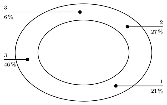
What follows is my first answer that reused the 3D plot (!) for the ellipses from the original code. Here, we add a new column to the table that says whether the “caption” should be printed on the left or on the right. Thus, the side must be manually chosen for each data point (row of the table).
\documentclass[border=5pt, tikz]{standalone}
\usepackage{pgfplots}
\pgfplotsset{compat=1.16}
\usetikzlibrary{calc}

% Input
\pgfmathsetmacro\r{5}
\pgfmathsetmacro\R{\r+3}
\pgfmathsetmacro\h{2}
\pgfmathsetmacro\Start{0}
\pgfmathsetmacro\End{0}
%
\pgfplotstableread{
Percent   Color                      Text   LabelPos
21        red                        1      r
27        cyan                       2      r
6         green!80!black             3      r
46        brown                      3      l
}\tabledata

\pgfplotstablegetrowsof{\tabledata}
\pgfmathsetmacro\RowNoMax{\pgfplotsretval-1}

\newif\ifcapleft

\begin{document}

\begin{tikzpicture}[every path/.style={thick}]
\begin{axis}[
  clip=false,
  axis lines=middle, axis equal, hide axis,
  y dir=reverse,
  samples y=0,
  ]
\pgfplotsinvokeforeach{0,...,\RowNoMax}{
  \pgfplotstablegetelem{#1}{Percent}\of{\tabledata}
  \pgfmathsetmacro\Percent{\pgfplotsretval}
  \pgfplotstablegetelem{#1}{Color}\of{\tabledata}
  \pgfmathsetmacro\Color{"\pgfplotsretval"}
  \pgfplotstablegetelem{#1}{Text}\of{\tabledata}
  \pgfmathsetmacro\Text{"\pgfplotsretval"}
  \pgfplotstablegetelem{#1}{LabelPos}\of{\tabledata}
  \pgfmathsetmacro\LabelPos{"\pgfplotsretval"}

  \pgfmathsetmacro\Start{\End}
  \pgfmathsetmacro\End{\Start+\Percent*3.6}

  \if\LabelPos l\caplefttrue\else\capleftfalse\fi
  \edef\Nanchor{\ifcapleft north west\else north east\fi}
  \edef\Sanchor{\ifcapleft south west\else south east\fi}
  \edef\temp{
   % Draw
   \noexpand\addplot3[domain=\Start:\End, smooth]
     ({\r*sin(x)}, {\r*cos(x)}, {\h}) coordinate[pos=0](uiStart)
     coordinate[](uiEnd) coordinate[pos=0.5](uiMid);
   \noexpand\addplot3[domain=\Start:\End, smooth]
     ({\R*sin(x)}, {\R*cos(x)}, {\h}) coordinate[pos=0](uoStart)
     coordinate[](uoEnd) coordinate[pos=0.5](uoMid);
   % Text
   \noexpand\coordinate (Mid) at ($(uiMid)!0.5!(uoMid)$);
   \noexpand\coordinate (X) at (Mid -| \ifcapleft-\fi 4cm,0);
   %
   \unexpanded{\begin{scope}[nodes={inner xsep=0pt, font=\footnotesize}]}
     \noexpand\draw[fill] (Mid) circle[radius=2pt] -- (X)
       node[anchor=\Sanchor] {\Text} node[anchor=\Nanchor] {$\Percent\,\%$};
   \noexpand\end{scope}
  }
  \temp
}
\end{axis}
\end{tikzpicture}

\end{document}

If you want to stay with the 3D plot but still have automatic placement of the “captions”, you can use the following code. Be aware that due to the projection, the chosen side is not obvious at first glance:
\documentclass[border=5pt, tikz]{standalone}
\usepackage{pgfplots}
\pgfplotsset{compat=1.16}
\usetikzlibrary{calc}

% Input
\pgfmathsetmacro\r{5}
\pgfmathsetmacro\R{\r+3}
\pgfmathsetmacro\h{2}
\pgfmathsetmacro\Start{0}
\pgfmathsetmacro\End{0}
%
\pgfplotstableread{
Percent   Color           Text
21        red             1
27        cyan            2
6         green!80!black  3
46        brown           3
}\tabledata

\pgfplotstablegetrowsof{\tabledata}
\pgfmathsetmacro\RowNoMax{\pgfplotsretval-1}

\newif\ifcapleft

\begin{document}

\begin{tikzpicture}[every path/.style={thick}]
\begin{axis}[
  clip=false,
  axis lines=middle, axis equal, hide axis,
  y dir=reverse,
  samples y=0,
  ]
\pgfplotsinvokeforeach{0,...,\RowNoMax}{
  \pgfplotstablegetelem{#1}{Percent}\of{\tabledata}
  \pgfmathsetmacro\Percent{\pgfplotsretval}
  \pgfplotstablegetelem{#1}{Color}\of{\tabledata}
  \pgfmathsetmacro\Color{"\pgfplotsretval"}
  \pgfplotstablegetelem{#1}{Text}\of{\tabledata}
  \pgfmathsetmacro\Text{"\pgfplotsretval"}

  \pgfmathsetmacro\Start{\End}
  \pgfmathsetmacro\End{\Start+\Percent*3.6}
  \pgfmathtruncatemacro\tmpLeft{
    ifthenelse(Mod(0.5*(\Start+\End), 360) < 180, 0, 1)}

  \ifnum\tmpLeft=1 \caplefttrue \else \capleftfalse \fi
  \edef\Nanchor{\ifcapleft north west\else north east\fi}
  \edef\Sanchor{\ifcapleft south west\else south east\fi}
  \edef\temp{
   % Draw
   \noexpand\addplot3[domain=\Start:\End, smooth]
     ({\r*sin(x)}, {\r*cos(x)}, {\h}) coordinate[pos=0](uiStart)
     coordinate[](uiEnd) coordinate[pos=0.5](uiMid);
   \noexpand\addplot3[domain=\Start:\End, smooth]
     ({\R*sin(x)}, {\R*cos(x)}, {\h}) coordinate[pos=0](uoStart)
     coordinate[](uoEnd) coordinate[pos=0.5](uoMid);
   % Text
   \noexpand\coordinate (Mid) at ($(uiMid)!0.5!(uoMid)$);
   \noexpand\coordinate (X) at (Mid -| \ifcapleft-\fi 4cm,0);
   %
   \unexpanded{\begin{scope}[nodes={inner xsep=0pt, inner ysep=2pt, font=\tiny}]}
     \noexpand\draw[fill] (Mid) circle[radius=2pt] -- (X)
       node[anchor=\Sanchor] {\Text} node[anchor=\Nanchor] {$\Percent\,\%$};
   \noexpand\end{scope}
  }
  \temp
}
\end{axis}
\end{tikzpicture}

\end{document}


\Startat an angle greater than 180°. I have now only marginally addressed the problem; I was now concerned with the uniform label lines. – cis Jan 31 '20 at 10:05\pgfplotsset{compat=newest}is valuable. – Dr. Manuel Kuehner Jan 31 '20 at 10:13\addplot3 [only marks, mark=*, red] coordinates { ({\r*sin(0)}, {\r*cos(0)}, {\h}) }; \addplot3 [only marks, mark=*, blue] coordinates { ({\r*sin(180)}, {\r*cos(180)}, {\h}) };before\end{axis}. This has to do with the fact that the ellipses are drawn in the original code with\addplot3(otherwise these particular equations would give circles). – frougon Jan 31 '20 at 10:16\Startangle. – frougon Jan 31 '20 at 10:53