3

Does anyone know how to do a scatterplot inside a square pie chart? I know I'm supposed to provide a MWE but but I'm very clueless of where to begin. What I'd need is 2 square pie charts within the same figure, and each pie filled with different scatter symbols. Basically I want to show how the distributions of 2 categories line up in one group - hence the combination of pie charts and scatter plots in one. I haven't been able to locate any example, but I'm hoping some masters here would know how to do it! Thank you in advance for any help you can give.

Here's a picture of what I want: enter image description here

Stefan Pinnow
  • 29,535
  • 1
    If you know Python, you can try sane_tikz out and do it explicitly. https://github.com/negrinho/sane_tikz . Happy to help. – rnegrinho Feb 18 '20 at 12:29
  • Sadly I don't. LaTeX is the first coding language that I learn. It's great in many ways but also super fiddly, especially when you are trying to write a thesis! – Lilly Nguyen Feb 18 '20 at 12:33
  • 1
    @LillyNguyen Your question may have better success if you provide a possibly hand-drawn sketch of what you would like. In its current state, it's difficult for me to understand. – frougon Feb 18 '20 at 13:07
  • @frougon I've added a picture. Thank you for your help! – Lilly Nguyen Feb 18 '20 at 13:17
  • 1
    @LillyNguyen You have such a nice handwriting, it would have been a pity to hide it. :) About the question, I'm afraid I don't know how to make square pie charts, but I hope someone will. – frougon Feb 18 '20 at 13:39
  • 1
    Something like that is possible in tikz,you would basically draw the areas manually behind your scatter plot. What are the x- and y-axis, and is the data so nicely distributed that not a single yellow person data point belongs in the top left corner? – Alexander Feb 18 '20 at 13:43
  • @Alexander thank you for your suggestion. Are you saying that it should be a scatter plot to begin with, and then manual drawing of the square pie? That sounds more complex that I woulda imagined. I was thinking it's a normal pie chart, and then the scatter symbols get filled in somehow. The symbols doesn't need to be in a particular position in relation to the axis. All that matters is that the right number of each symbol is filled into each part of the pie. I basically want to show how the distribution of 2 categories line up for each group. I'd be grateful if anyone could help me with this! – Lilly Nguyen Feb 18 '20 at 13:48
  • 1
    Ok, then it is not a scatter plot but a square pie chart which is filled with additional markers. I don't think there is a automatic solution for this, for example you don't really want your markers be placed randomly because then they might end up on top of each other. In tikz or other software you can manually draw this of course. – Alexander Feb 18 '20 at 14:09
  • 2
    @frougon This is how you may get a square pie chart: \documentclass[tikz,border=3mm]{standalone} \usepackage{pgf-pie} \begin{document} \begin{tikzpicture}[xscale = 1.75, font=\sffamily] \pie[square, color={red,blue,yellow}, text=inside, text=legend, ]{50/A,30/B,20/C} \end{tikzpicture} \end{document}. I am unfortunately a bit lost with regards to how the markers are to be placed. –  Feb 18 '20 at 14:17
  • @Schrödinger'scat Alexander is right that it's just a pie chart with additional markers. The only requirement is that the right number is in each part, and they don't stay on top of each other. I only have 13 data points for 1 square and 19 for the other. – Lilly Nguyen Feb 18 '20 at 14:34
  • 1
    Is the size of each region independent of the points scattered within or is it determined by it? What you're asking for seems to imply the latter but your picture suggests the former, – Karl Hagen Feb 18 '20 at 15:13
  • @KarlHagen It is indeed independent of the points scattered in it. They are two independent categories, and the point of the chart is to show how their distribution overlaps. – Lilly Nguyen Feb 18 '20 at 15:23

1 Answers1

2

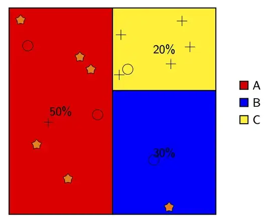
This does something of that sort. It uses this answer to fill in symbols at random positions such they do not overlap. For instance, with

\path (-3,-3) pic{random symbols={xmax=3,ymax=6,symbols={{5*s},{2*o},{1*+}}}};

you instruct TikZ to put these symbols in a rectangle with lower left coordinate (-3,-3), width 3cm and height 6cm. The symbols are 5 stars (5*s), 2 circles (2*o) and one cross (1*+). These symbols are defined in separate pics. The underlying chart is done with pgf-pie.

\documentclass[tikz,border=3mm]{standalone}
\usetikzlibrary{shapes.geometric}
\usepackage{pgf-pie}
\newcounter{nsymbols}
\tikzset{pics/random symbols/.style={code={\setcounter{nsymbols}{1}
\tikzset{random symbols/.cd,#1}
\def\pv##1{\pgfkeysvalueof{/tikz/random symbols/##1}}%
\def\mysplit##1*##2;{\edef\myn{##1}\edef\myitem{##2}}
\edef\temp{\pv{symbols}}
\edef\tmplist{"x"}
\foreach \X in \temp
{\expandafter\mysplit\X;
\foreach \Y in {1,...,\myn}
{\stepcounter{nsymbols}
\xdef\tmplist{\tmplist,"\myitem"}}}
\edef\nmax{\number\value{nsymbols}}
\setcounter{nsymbols}{1}
\pgfmathsetmacro\xlist{\pv{r}+rnd*(\pv{xmax}-2*\pv{r})}
\pgfmathsetmacro\ylist{\pv{r}+rnd*(\pv{ymax}-2*\pv{r})}
\pgfmathsetmacro{\myitem}{{\tmplist}[1]}
\path (\xlist,\ylist)pic{\myitem}; 
\foreach \XX in {1,...,\pv{n}}
 {\pgfmathsetmacro\x{\pv{r}+rnd*(\pv{xmax}-2*\pv{r})}
  \pgfmathsetmacro\y{\pv{r}+rnd*(\pv{ymax}-2*\pv{r})}
  \xdef\collision{0}
  % check if the mark is too close to the percentage
  \pgfmathsetmacro\checkdistance{4*sqrt(pow(\x-\pv{xmax}/2,2)+pow(\y-\pv{ymax}/2,2))}
  \ifdim\checkdistance pt<\pv{R} pt
      \xdef\collision{1}
  \fi
  \foreach \element [count=\YY starting from 0] in \xlist{
      \pgfmathsetmacro\checkdistance{sqrt(({\xlist}[\YY]-(\x))^2+({\ylist}[\YY]-(\y))^2)}
      \ifdim\checkdistance pt<\pv{R} pt
          \xdef\collision{1}
          \breakforeach
      \fi
       } 
   \ifnum\collision=0
      \xdef\xlist{\xlist,\x}
      \xdef\ylist{\ylist,\y}
      \stepcounter{nsymbols}
      \ifnum\value{nsymbols}<\nmax
         \pgfmathsetmacro{\myitem}{{\tmplist}[\value{nsymbols}]}
         \path (\x,\y) pic{\myitem}; 
      \fi
   \fi  
   \unless\ifnum\value{nsymbols}<\nmax
     \breakforeach       
   \fi 
    }   
 }
},
random symbols/.cd,n/.initial=50,% tries
xmax/.initial=3,% width
ymax/.initial=3,% height
r/.initial=0.15,%radius
R/.initial=0.4,% grace distance, should be greater than 2*r
symbols/.initial={{2*s}},
/tikz/.cd,
pics/s/.style={code={\node[star,draw,fill=orange,minimum size=3mm,inner sep=0pt]{};}},
pics/+/.style={code={\draw (-1.5mm,0mm) -- (1.5mm,0mm) (0,-1.5mm) -- (0,1.5mm);}},
pics/o/.style={code={\draw (0,0) circle[radius=1.5mm];}},
}
\begin{document}
\begin{tikzpicture}[font=\sffamily]
\pie[square,
color={red,blue,yellow},  
text=inside,
text=legend, 
]{50/A,30/B,20/C}
\pgfmathsetseed{42}
 \path (-3,-3) pic{random symbols={xmax=3,ymax=6,symbols={{5*s},{2*o},{1*+}}}};
 \path (0,-3) pic{random symbols={xmax=3,ymax=3.6,symbols={{1*s},{1*o}}}};
 \path (0,0.6) pic{random symbols={xmax=3,ymax=2.4,symbols={{1*o},{5*+}}}};
\end{tikzpicture}
\end{document}

enter image description here