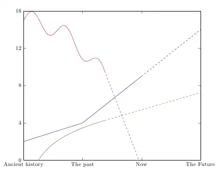
I'd like to add a dashed line to the end of a plot to indicate a future projection as opposed to real data. I can do this by adding a second plot, as in the example below. However this isn't really neat - its repeated code and doesn't lend itself to doing this with data pulled in using pgfplotstableread for example. Is there a way of changing linestyle for a selected section of a plot? ie saying that for the last segment of each plot should be in a different style?
\documentclass[english]{article}
\usepackage[T1]{fontenc}
\usepackage[latin9]{inputenc}

\usepackage {tikz}
\usepackage{pgfplots}

\begin{document}
\begin{tikzpicture}
\begin{axis}[width=\textwidth,
ymin=0,
ymax=16,
ytick={0,4,...,16},
xmin=0,
xmax=12,
no markers,
xtick={0,4,...,12},
xticklabels={Ancient history,The past,Now,The Future}
]
\addplot+ [color=blue] coordinates
{(0,2)
(4,4)
(8,9)
};
\addplot+ [color=blue,style=dashed] coordinates
{(8,9)
(12,16)};
\end{axis}
\end{tikzpicture}

\end{document}