1

See my MWE:

\documentclass{scrartcl}
\usepackage{tikz}
\usepackage[per-mode = fraction]{siunitx}
\usetikzlibrary{datavisualization.formats.functions}

\begin{document}

\begin{tikzpicture} \datavisualization[ scientific axes = clean, all axes = grid, x axis = { logarithmic, ticks = { step = 1, minor steps between steps = 9 }, label = $\omega,\si{\radian\per\s}$ }, y axis = { ticks = {step = 45}, label = $\frac{\varphi(\omega)}{\si{\degree}}$ }, visualize as line/.list = { P, PD 1, PD 2, I, PT_1 1, PT_1 2, phase }, style sheet = vary thickness and dashing, P = {label in legend = {text = P}}, PD 1 = {label in legend = {text = PD (1)}}, PD 2 = {label in legend = {text = PD (2)}}, I = {label in legend = {text = I}}, PT_1 1 = {label in legend = {text = PT${1,1}$}}, PT_1 2 = {label in legend = {text = PT${1,2}$}}, phase = {label in legend = {text = $\arg{G_S(j\omega)}$}} ] data[set = P] { x, y .0001, 0 10000, 0 } data[set = PD 1] { x, y .0001, 0 .001, 0 .1, 90 10000, 90 } data[set = PD 2] { x, y .0001, 0 10, 0 1000, 90 10000, 90 } data[set = I] { x, y .0001, -90 10000, -90 } data[set = PT_1 1] { x, y .0001, 0 .01, 0 1, -90 10000, -90 } data[set = PT_1 2] { x, y .0001, 0 1, 0 100, -90 10000, -90 } data[set = phase] { x, y .0001, -90 .001, -90 .01, -45 .1, -45 10, -135 100, -135 1000, -90 10000, -90 }; \end{tikzpicture}

\end{document}

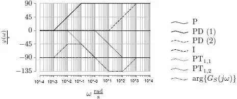
With the result

result

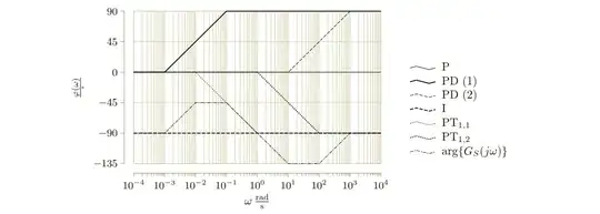
As you can see the ticks labels of the frequency axis are overlapping. How can one achieve following behavior?

wish

Thank you for your help and effort in advance!

Su-47
  • 2,508
  • This post might help: https://tex.stackexchange.com/questions/207212/how-do-i-change-the-font-size-of-the-axis-tick-labels-in-pgfplots – Arne Jan 29 '21 at 14:41
  • Thank you for your comment @Arne! Sorry for the long absence! In fact I don't want to change the font size (if even possible, if not, than the font size can be slightly decreased). I wish that the ticks are displayed uniform as the power of ten (without the leading 1\cdot). – Su-47 Jan 31 '21 at 23:36

1 Answers1

2

You can change the function that typesets the tick labels using the tick typesetter key and make them smaller using the node style key.

\documentclass{scrartcl}

\usepackage{tikz} \usepackage[per-mode = fraction]{siunitx} \usetikzlibrary{datavisualization.formats.functions}

\def\printonlypower#1{% \pgfmathparse{int(round(log10{#1}))}% (10^{\pgfmathresult})% } \def\printonlyexponent#1{% \pgfmathparse{int(round(log10{#1}))}% (\pgfmathresult)% }

\begin{document}

\begin{tikzpicture} \datavisualization [ scientific axes = clean, all axes = grid, x axis = { logarithmic, ticks = { step = 1, minor steps between steps = 9, node style={font=\tiny}, tick typesetter/.code={\printonlypower{##1}}, }, label = $\omega,\si{\radian\per\s}$, }, y axis = { ticks = {step = 45}, label = $\frac{\varphi(\omega)}{\si{\degree}}$ }, visualize as line/.list = { P, PD 1, PD 2, I, PT_1 1, PT_1 2, phase }, style sheet = vary thickness and dashing, P = {label in legend = {text = P}}, PD 1 = {label in legend = {text = PD (1)}}, PD 2 = {label in legend = {text = PD (2)}}, I = {label in legend = {text = I}}, PT_1 1 = {label in legend = {text = PT${1,1}$}}, PT_1 2 = {label in legend = {text = PT${1,2}$}}, phase = {label in legend = {text = $\arg{G_S(j\omega)}$}}, ] data[set = P] { x, y .0001, 0 10000, 0 } data[set = PD 1] { x, y .0001, 0 .001, 0 .1, 90 10000, 90 } data[set = PD 2] { x, y .0001, 0 10, 0 1000, 90 10000, 90 } data[set = I] { x, y .0001, -90 10000, -90 } data[set = PT_1 1] { x, y .0001, 0 .01, 0 1, -90 10000, -90 } data[set = PT_1 2] { x, y .0001, 0 1, 0 100, -90 10000, -90 } data[set = phase] { x, y .0001, -90 .001, -90 .01, -45 .1, -45 10, -135 100, -135 1000, -90 10000, -90 }; \end{tikzpicture}

\end{document}

Only printing the powers

However, I would strongly advise you against making the tick labels that small; it's just too hard to read. Instead, make the plot larger, so the tick labels fit. With scale=1.5 you get this: The same but larger

Much better. If you are really constrained and cannot make the plot larger for some insurmountable reason, the next best option is to only print the exponents and adjust the axis label accordingly. You can use \printonlyexponent as defined in the MWE above. Only printing the exponents


Some asides:

  • I would recommend not rotating the y axis label. It's much harder to read this way.
  • Your x axis label looks wrong. You probably mean \omega\,\si{\s\per\radian}.
schtandard
  • 14,892
  • Hello @schtandard! Thank you for your great answer! I don't understand why should the angular frequency measured in seconds per radian? A phase response shows typically the angle measured in degree over the angular frequency which is measured in radian per seconds, see for example the Bodeplot. – Su-47 Feb 06 '21 at 16:52
  • 1
    Yes, the unit of \omega is \radians\per\second. In order to get the unit-less numbers on the tick labels, you need to divide \omega by its unit (or multiply with the reciprocal unit). Just like you did for \varphi. – schtandard Feb 06 '21 at 19:19