2

In the following MCE, the characters don't start at the same (left) vertical line (look at the horizontal rule of "T").

\documentclass{article}
\usepackage[showframe]{geometry}
\ifpdftex
\usepackage{lmodern}
\else
\usepackage{fontspec}
\setmainfont{Latin Modern Roman}
\addfontfeature{Kerning=Off}
\fi
\usepackage{pagegrid}
\begin{document}
\parindent=0pt\sffamily\Huge%
L

E

I

T \end{document}

enter image description here

I wonder if it comes from some kerning of the font but, if so, the fontspec's Kerning=Off option doesn't have any effect.

  • Do you know why the characters don't start at the same (left) vertical line and how to force that?
  • Aside question: what is this tiny space between the left margin and the characters? In other words, why the text doesn't start at the very left of the text area?
Denis Bitouzé
  • 9,652
  • 4
  • 27
  • 85

1 Answers1

2

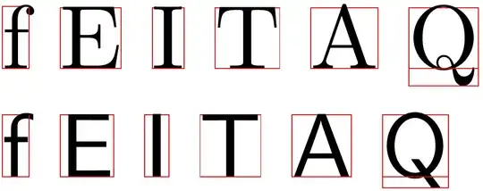
In TeX's eyes a letter is just a box with a width, height, and depth. The actual glyph is neither necessarily contained in the box, nor it fills it completely.

\documentclass{article}

\usepackage{color} \newcommand*{\foo}[1]{% \begingroup \sbox0{#1}% \fboxsep=-0.1pt \fboxrule=0.1pt \textcolor{red}{% \fbox{\copy0}% \llap{\vrule width\wd0 height.1pt}% }% \endgroup }

\begin{document} \foo{f} \foo{E} \foo{I} \foo{T} \foo{A} \foo{Q}

\sffamily \foo{f} \foo{E} \foo{I} \foo{T} \foo{A} \foo{Q} \end{document}

enter image description here

You see that the uppercase E and I in sans-serif simply have more room on their left than the uppercase T. I don't think that font files contain any information about such "padding", so I fear there is no automatic way to correct this.

campa
  • 31,130
  • 1
    The spaces at the sides of characters in their boxes are known as "side bearings". The principle is carried over from metal type and is based on the principle that for optimal readability, in a word the letters should be separated by optically "uniform" spacing. – barbara beeton May 07 '21 at 20:47