Here, I use a simple \colorbox to contain the versal and then scale it to the desired size. EDITED to handle descenders, such as capital Q.
\documentclass{book}
\usepackage{lettrine}
\usepackage{xcolor,scalerel,stackengine}
\setlength{\textwidth}{5.25in}
\fboxsep=1pt
\newcommand\my[1]{\scaleto{\colorbox{black}{%
\textcolor{white}{\abovebaseline[0pt]{#1}}}}{7ex}\,}
\begin{document}
\thispagestyle{empty}
\LARGE
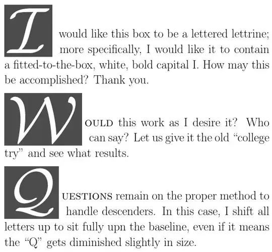
\lettrine[nindent = .4em]{\my I}{} would like this box to be a
lettered lettrine; more specifically, I would like it to contain
a fitted-to-the-box, white, bold capital I. How may this be
accomplished? Thank you.
\lettrine[nindent = .4em]{\my W}{ould} this work as I desire it? Who
can say? Let us give it the old ``college try'' and see what results.
\lettrine[nindent = .4em]{\my Q}{uestions} remain on the proper method
to handle descenders. In this case, I shift all letters up to sit
fully upn the baseline, even if it means the ``Q'' gets diminished
slightly in size.
\end{document}

This approach provides ample opportunity for customization. For example, colors and versal font can easily be adjusted (I also increased \fboxsep by .5 pt, to contain the protruding points on W):
\documentclass{book}
\usepackage{lettrine}
\usepackage{xcolor,scalerel,stackengine}
\setlength{\textwidth}{5.25in}
\fboxsep=1.5pt
\newcommand\my[1]{\scaleto{\colorbox{black!70}{%
  \textcolor{white}{\abovebaseline[0pt]{$\mathcal{#1}$}}}}{7ex}\,}
\begin{document}
\thispagestyle{empty}
\LARGE
\lettrine[nindent = .4em]{\my I}{} would like this box to be a
  lettered lettrine; more specifically, I would like it to contain
  a fitted-to-the-box, white, bold capital I. How may this be
  accomplished? Thank you.
\lettrine[nindent = .4em]{\my W}{ould} this work as I desire it?  Who
  can say?  Let us give it the old ``college try'' and see what results.
\lettrine[nindent = .4em]{\my Q}{uestions} remain on the proper method
  to handle descenders.  In this case, I shift all letters up to sit
  fully upn the baseline, even if it means the ``Q'' gets diminished
  slightly in size.
\end{document}
Alternately, with the mathrsfs package, defining the color as red!50!black and the versal as $\mathscr{#1}$. Further, I reduce the versal height from 7ex to 6ex:
\documentclass{book}
\usepackage{lettrine}
\usepackage{xcolor,scalerel,stackengine,mathrsfs}
\setlength{\textwidth}{5.25in}
\fboxsep=1.5pt
\newcommand\my[1]{\scaleto{\colorbox{red!50!black}{%
  \textcolor{white}{\abovebaseline[0pt]{$\mathscr{#1}$}}}}{6ex}\,}
\begin{document}
\thispagestyle{empty}
\LARGE
\lettrine[nindent = .4em]{\my I}{} would like this box to be a
  lettered lettrine; more specifically, I would like it to contain
  a fitted-to-the-box, white, bold capital I. How may this be
  accomplished? Thank you.
\lettrine[nindent = .4em]{\my W}{ould} this work as I desire it?  Who
  can say?  Let us give it the old ``college try'' and see what results.
\lettrine[nindent = .4em]{\my Q}{uestions} remain on the proper method
  to handle descenders.  In this case, I shift all letters up to sit
  fully upn the baseline, even if it means the ``Q'' gets diminished
  slightly in size.
\end{document}

SPECIAL SUPPLEMENT FOR BARBARA BEETON
To address the dismay brought on by my handling of descenders like Q in the above approach, I felt compelled to remedy the situation. It still requires a little manual intervention with the Q, both to extend the lettrine lines from 2 to 3, as well as to grow the vertical extent of the Q from the default 7ex height to something larger (here 9ex).
\documentclass{book}
\usepackage{lettrine}
\usepackage{xcolor,scalerel,stackengine}
\setlength{\textwidth}{5.25in}
\fboxsep=1pt
\newcommand\my[2][7ex]{\scaleto{\colorbox{black}{%
  \textcolor{white}{\abovebaseline[0pt]{#2}}}}{#1}\,}
\begin{document}
\thispagestyle{empty}
\LARGE
\lettrine[nindent = .4em]{\my I}{} would like this box to be a
  lettered lettrine; more specifically, I would like it to contain
  a fitted-to-the-box, white, bold capital I. How may this be
  accomplished? Thank you.
\lettrine[nindent = .4em]{\my W}{ould} this work as I desire it?  Who
  can say?  Let us give it the old ``college try'' and see what results.
\lettrine[nindent = .4em, lines=3]{\my[9ex] Q}{uestions} remain on the
  proper method to handle descenders.  In this case, I increase the number
  of lettrine lines from 2 to 3, and I have modified \textbackslash my
  to take an optional argument length, to revise the height of the
  encased letter.
\end{document}


$s and thinking when suddenly "An edit has been made to this post" and then they were gone. – Don Hosek Aug 19 '21 at 14:03scalerelworks by default in math mode, I used the Stoopid convention of employing$delimiters to force the argument into text mode (regret #3716). However, in this case, the\colorboxaccomplishes text mode without the need for the$delimiters, so the delimiters were not necessary. – Steven B. Segletes Aug 19 '21 at 14:15Q. – Steven B. Segletes Aug 19 '21 at 17:11