2

I observe that when a word starts with capital letter or non-capital letter as a subscript, then the capital letter looks like it shifted right, as an eye illusion. But when I look closely a and A actually started at exact location.

example:

\documentclass[10pt,journal,compsoc]{IEEEtran}
\usepackage{amsmath}
\begin{document}
\phantom{} \\
    \(C_{a}^{\mathit{pull}}\) \\
    \(C_{A}^{\mathit{pull}}\) \\
    \(C_{d}^{\mathit{pull}}\) \\
    \(C_{D}^{\mathit{pull}}\) \\
\end{document}

enter image description here

Here A looks like it starts kind of 1 space inside. If I use a capitalize word should I shift it left using: $C_{!\A}$ or is there more proper way to do it?

alper
  • 1,389
  • 2
    It seems like this is more unique to A than to capital letters in general, since A is the only one with stuff in its bottom left corner but not its top left corner. But I think the question still remains for A. – Teepeemm Sep 19 '22 at 20:00
  • @Teepeemm I observe same for D as well – alper Sep 19 '22 at 20:41
  • The leftmost part of A and D are aligned with the p of pull. Probably the same with E, F etc. – Peter Wilson Sep 21 '22 at 18:16
  • @PeterWilson that's right but A and D looks like they shifted 1 space to right compared to a or d – alper Sep 22 '22 at 10:36
  • The nature of the glyph. You can see that the glyph starts at the same position: $C_{D}^{\mathit{pull}}$\llap{$C_{d}^{\mathit{pull}}$}. D contains the serif at the bottom. – Sigur Sep 22 '22 at 13:44
  • Adjustment would improve the appearance, certainly, but it can't be done automatically, since TeX is aware only of the width of a glyph. Consider "W" and "Y", which have their greatest width at the top, along with an indentation at the baseline. – barbara beeton Sep 22 '22 at 15:04
  • As far as LaTeX typesetting is concerned a character is a rectangular box with some graphic inside it. It only deals with the boxes, not their content. See @barbarabeeton's comment. – Peter Wilson Sep 23 '22 at 18:19

2 Answers2

1

Disclaimer: I am the author of the package and of the linked solution.

You can take a look at my LaTeX package to handle super and under script based on the actuarial symbol. It can handle by default most super, under script with package function also.

See here my response here.

1

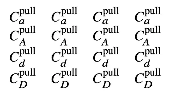
The more I look at the picture, the less I feel a need for “fixing”. Anyway, here's the experiment: I define a \fixA command that emits a negative kern. In the four columns, the kerns are zero, -1mu, -2mu and -3mu respectively, the last being the same as \!.

\documentclass{article}
\usepackage{amsmath}

\newcommand{\fixA}[1][1]{\mkern-#1mu}

\begin{document}

\spaceskip=1em

(C_{a}^{\mathrm{pull}}) (C_{a}^{\mathrm{pull}}) (C_{a}^{\mathrm{pull}}) (C_{a}^{\mathrm{pull}})

(C_{A}^{\mathrm{pull}}) (C_{\fixA A}^{\mathrm{pull}}) (C_{\fixA[2] A}^{\mathrm{pull}}) (C_{\fixA[3] A}^{\mathrm{pull}})

(C_{d}^{\mathrm{pull}}) (C_{d}^{\mathrm{pull}}) (C_{d}^{\mathrm{pull}}) (C_{d}^{\mathrm{pull}})

(C_{D}^{\mathrm{pull}}) (C_{D}^{\mathrm{pull}}) (C_{D}^{\mathrm{pull}}) (C_{D}^{\mathrm{pull}})

\end{document}

enter image description here

If you use IEEEtran, I recommend using newtx in order to get Times font also in math (the standard Computer Modern is really unsuited to go with Times). Now you can compare and see that using something like \fixA is better than hardwiring \!.

\documentclass{article}
\usepackage{amsmath}
\usepackage{newtx}

\newcommand{\fixA}[1][1]{\mkern-#1mu}

\begin{document}

\spaceskip=1em

(C_{a}^{\mathrm{pull}}) (C_{a}^{\mathrm{pull}}) (C_{a}^{\mathrm{pull}}) (C_{a}^{\mathrm{pull}})

(C_{A}^{\mathrm{pull}}) (C_{\fixA A}^{\mathrm{pull}}) (C_{\fixA[2] A}^{\mathrm{pull}}) (C_{\fixA[3] A}^{\mathrm{pull}})

(C_{d}^{\mathrm{pull}}) (C_{d}^{\mathrm{pull}}) (C_{d}^{\mathrm{pull}}) (C_{d}^{\mathrm{pull}})

(C_{D}^{\mathrm{pull}}) (C_{D}^{\mathrm{pull}}) (C_{D}^{\mathrm{pull}}) (C_{D}^{\mathrm{pull}})

\end{document}

enter image description here

egreg
  • 1,121,712
  • Instead \usepackage{newtx} can I only use \usepackage{newtxmath}? I observe that section titles also effected when I use newtxtext and fonts in listings; I believe journals wouldn't what their template section fons to be affected – alper Sep 28 '22 at 10:50
  • Or can we apply \usepackage{newtx} only for the math-mode? like the text in between $...$? and not not effect the text in between \section{ ... } – alper Sep 28 '22 at 10:55
  • @alper You might by doing \usepackage{newtxmath}, but the class uses ptm for text, which points to a very old font, whereas newtx is richer. – egreg Sep 28 '22 at 12:12