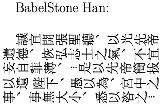
Not very good, but a quick and dirty solution using \kern and \raisebox, both tuned manually. In order to avoid font issues, I am using the Roman letter o for the traditional tone-mark circle, instead of the prescribed Unicode characters.
Doing it this way introduces infelicities in both leading and kerning, which I have also tuned manually. The result is still imperfect — among other things, the first line is one character shorter than the rest of the paragraph. I'd be grateful to hear of better solutions.
[In addition to 遺, I have marked both 菲 and 不 here, as they each have alternate píngshēng readings in the philological sources. Here we want their shǎngshēng and rùshēng readings, respectively.]
%!TEX TS-program = xelatex
\documentclass{bxjsarticle}
\usepackage{xeCJK}
\setCJKmainfont[Scale=MatchLowercase,Mapping=tex-text,RawFeature={vertical}]{SimSun}
\usepackage{setspace}  % Provides \setstretch
% To get overstruck ``o'' to represent traditional corner tone marks
% píngshēng 平聲: overstruck circle at lower left corner of character
\newcommand\pyng[1]{#1\kern-14pt{%
 \fontsize{25}{25}\selectfont\textbf{\raisebox{-1.6ex}o}}%
\kern2pt}
% shǎngshēng 上聲: overstruck circle at upper left corner of character
\newcommand\shaang[1]{#1\kern-40pt{%
 \fontsize{25}{25}\selectfont\textbf{\raisebox{-1.6ex}o}}%
\kern27pt}
% qùshēng 去聲: overstruck circle at upper right corner of character
\newcommand\chiuh[1]{#1\kern-40pt{%
 \fontsize{25}{25}\selectfont\textbf{\raisebox{0.6ex}o}}%
\kern27pt}
% rùshēng 入聲: overstruck circle at lower right corner of character
\newcommand\ruh[1]{#1\kern-14pt{%
 \fontsize{25}{25}\selectfont\textbf{\raisebox{0.6ex}o}}{}%
\kern2pt}
\begin{document}
\raggedright      % Reduce kerning distortion (default justified alignment is worse).
\setstretch{1.25} % Reduce leading distortion.
\fontsize{40}{40}\selectfont
Using \texttt{\textbackslash kern} and \texttt{\textbackslash raisebox}, hand-tuned:
誠宜開張聖聽、以光先帝\pyng{遺}德、恢弘志士之氣、\ruh{不}宜妄自\shaang{菲}薄、…是以先帝簡拔以\chiuh{遺}陛下、愚以為、宮中之事、事無大小、悉以咨之…
\end{document}

With all the other bells and whistles I am using to get the full rotated text and adjusted punctuation marks, the result is tolerable:

I'll put the full code in, for reference by interested hands — I'd still be grateful to see a more elegant solution.
%!TEX TS-program = xelatex
\documentclass{bxjsarticle}
\usepackage{xeCJK}
\setCJKmainfont[Scale=MatchLowercase,Mapping=tex-text,RawFeature={vertical}]{SimSun}
\setCJKfallbackfamilyfont{rm}[Script=CJK,RawFeature={vertical}]{SimSun-ExtB}
% To get IPA font, set as nominally \texttt
\setmonofont[Scale=1,Mapping=tex-text]{Doulos SIL}
% The following adjustments improve kerning.
\usepackage{newunicodechar}
\newunicodechar{。}{\hspace{0pt}。\hspace{0pt}}
\newunicodechar{,}{\hspace{0pt},\hspace{0pt}}
\newunicodechar{﹐}{\hspace{0pt}﹐\hspace{0pt}}
\newunicodechar{︐}{\hspace{0pt}︐\hspace{0pt}}
\newunicodechar{;}{\hspace{0pt};\hspace{0pt}}
\newunicodechar{:}{\hspace{0pt}:\hspace{0pt}}
\newunicodechar{、}{\hspace{0pt}、\hspace{0pt}}
\newunicodechar{!}{\hspace{0pt}!\hspace{0pt}}
\newunicodechar{?}{\hspace{0pt}?\hspace{0pt}}
\newunicodechar{(}{\hspace{0pt}(\hspace{0pt}}
\newunicodechar{)}{\hspace{0pt})\hspace{0pt}}
\newunicodechar{《}{\hspace{0pt}《\hspace{0pt}}
\newunicodechar{》}{\hspace{0pt}》\hspace{0pt}}
\newunicodechar{「}{\hspace{0pt}「\hspace{0pt}}
\newunicodechar{」}{\hspace{0pt}」\hspace{0pt}}
\usepackage{xeCJKfntef} % enable \CJKunderline etc.
\usepackage{setspace}  % enable \setstretch
% Settings for a 90-degree rotated "flowframe" to enable vertical typesetting
% (Following https://tex.stackexchange.com/a/402025/3935)
\usepackage{flowfram}
\newflowframe{\textheight}{\textwidth+2em}{0pt}{\textheight}[mainframe]
\setflowframe{1}{angle=-90}
% Command to properly align roman characters with Chinese characters:
% (Following https://tex.stackexchange.com/a/402025/3935)
\let\CJKsymbolOrig\CJKsymbol
\let\CJKpunctsymbolOrig\CJKpunctsymbol
\newcommand\CJKmovesymbol[1]{\raise.35em\hbox{\CJKsymbolOrig{#1}}}
\newcommand\CJKmovepunctsymbol[1]{\raise.35em\hbox{\CJKpunctsymbolOrig{#1}}}
\newcommand*\CJKmove{\punctstyle{plain}
  \let\CJKsymbol\CJKmovesymbol
  \let\CJKpunctsymbol\CJKmovepunctsymbol
}
% To get overstruck ``o'' to represent the four traditional corner tone marks
% píngshēng 平聲: overstruck circle at lower left corner of character
\newcommand\pyng[1]{#1\kern-14pt{%
 \fontsize{25}{25}\selectfont\textbf{\raisebox{-.4ex}o}}}%
%\kern2pt}
% shǎngshēng 上聲: overstruck circle at upper left corner of character
\newcommand\shaang[1]{#1\kern-40pt{%
 \fontsize{25}{25}\selectfont\textbf{\raisebox{-.4ex}o}}%
\kern27pt}
% qùshēng 去聲: overstruck circle at upper right corner of character
\newcommand\chiuh[1]{#1\kern-40pt{%
 \fontsize{25}{25}\selectfont\textbf{\raisebox{1.9ex}o}}%
\kern27pt}
% rùshēng 入聲: overstruck circle at lower right corner of character
\newcommand\ruh[1]{#1\kern-14pt{%
 \fontsize{25}{25}\selectfont\textbf{\raisebox{1.9ex}o}}}%
%\kern2pt}
\begin{document}
\CJKmove % Adjusts positioning of Roman font vis-à-vis CJK, and also CJK punctuation
\raggedright        % Makes parskip unnecessary here, more neatly.
\setstretch{1.25} % Reduce leading distortion.
\vspace*{\fill}
\pagenumbering{gobble}          % No page-numbering starting here
\fontsize{40}{40}\selectfont
誠宜開張聖聽、以光先帝\pyng{遺}德、恢弘志士之氣、\ruh{不}宜妄自\shaang{菲}薄、…是以先帝簡拔以\chiuh{遺}陛下、愚以為、宮中之事、事無大小、悉以咨之…
\vspace*{\fill}
\end{document}


〪? – David Carlisle Dec 20 '22 at 09:36Microsoft JhengHeihas the first two, but not the rules.Code2003has the first two and the rules for horizontal mode but not vertical. I would expect a Japanese font to be unlikely to have Chinese tone mark rules (it may). Unrelated - the font switches do not take arguments. Not unrelated - using grouping with{...}will break the font's positioning rules if it has any (glyphs have anchor points, and the {} between glyphs will hide that). – Cicada Dec 20 '22 at 15:36tikzpackage could be used to "manually" position the marks. Alternatively, kerning with\kern...command, and use of\raisebox, is an option. – Cicada Dec 20 '22 at 15:42{\ITMtones{〪}}, the vertical functionality breaks. If I don't use the inner ones, TeX then thinks the tone mark is part of the name of the\ITMtonescommand, and it won't compile. So I guess that's why you're saying all three features must be present in the same font. – brannerchinese Dec 20 '22 at 19:04tikz,stackengineand\kern. But in my experience, highly tuned adjustments of this kind sometimes break when LaTeX versions change, and when there are other complexities (such as rotating the page, adjusting the font size of Western-language text, and so on — things not in the MWE). – brannerchinese Dec 20 '22 at 19:13o. In traditional times, these marks consisted simply of a circle or a brush-tip-shaped dollop of ink. (The traditional punctuation mark 、 has the same origin, although it was placed outside the form of the character it applied to, rather than on top of it.) – brannerchinese Dec 20 '22 at 22:29