3

NB. I guess the question has a little dependency on Language (Bengali). I would try to explain every font in transliterated format.

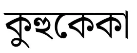
I like to use a character a below/above another character b. In my use-case a is either a - (hyphen) or (stop character in Bengali). So for an example word "কুহুকেকা" (transliteration: "KuHuKeKa")

কুহুকেকা

(please note the horizontal line on the top is continuous through each of the four (composite) characters); if I want to a - below the third character কে (Ke) Or add a above the second character হু ('Hu') of the word,

কুহু\abelowb{কে}কা কু\aoverb{।}{হু}কেকা

the horizontal line is not remaining continuous at all - ideally it should look just as the first image but with the later modification.

First I implemented in classy way with amsmath package

\newcommand{\abelowb}[1]{$\underset{\hbox{\text{-}}}{\text{#1}}$}
\newcommand{\aoverb}[1]{$\overset{\raise0em\hbox{\text{#1}}}{\text{।}}$}

After a close observation I realised this problem arises only when ে ৈ ো and ৌ vowel modifiers (having ে common in appearance), are adjacent or in the b eg. মাতৃদেবো (MaTriDebo) মাতৃদেবো.

Later I suspected the switch in mathmode and textmode may creating this disturbance. So I tried to handcraft the commands like the following:

\newcommand{\myabelowb}[1]{\sbox1{-}\sbox0{#1}#1\raisebox{\dimexpr-
0.5\baselineskip\relax}{\kern\dimexpr-0.5\wd0-0.5\wd1\relax-}\kern\dimexpr0.5\wd0-
0.5\wd1\relax}
\newcommand{\myaoverb}[1]{\sbox1{।}\sbox0{#1}#1\raisebox{\dimexpr0.6\baselineskip\relax}
{\kern\dimexpr-0.5\wd0-0.5\wd1\relax।}\kern\dimexpr0.5\wd0-0.5\wd1\relax}

With these I could fix some issue partially:

  1. \myaoverb is giving the same problem কু\myaoverb{।}{হু}কেকা using command কু\myaoverb{।}{হু}কেকা [Case 1]
  2. \myabelowb is working for this word কুহু\myabelowb{কে}কা কুহু\myabelowb{কে}কা [Case 2a], but not here কু\myabelowb{হু}কেকা with command কু\myabelowb{হু}কেকা [Case 2b]
  3. amsmath is maintaining a distance from b to a by some proportional way. My handcrafted commands cannot do that, eg.

\abelowb{কু} \myabelowb{কু}


What I Observed:

  • If there were a concept of XeLaTeX cursor; once the cursor finds ে ৈ ো or ৌ -- under normal cases, it adds extra joining horizontal line to the left of this so that continuity preserves. Otherwise, once some a comes around ে ৈ ো or ৌ XeLaTeX forgets to go back to the last observed valid character - Case 1 or Case 2b - so that it can glue the horizontal line.

What I want: I want to have some commands that can alley by the problem of discontinuous horizontal line and also can maintain proportional distance from b.


An MWE:

\documentclass{article}

\usepackage{fontspec,amsmath} \usepackage{polyglossia} \setdefaultlanguage[numerals=Bengali,changecounternumbering=true]{bengali} \setmainfont[Script=Bengali]{Noto Serif Bengali} \newfontfamily\latinfont[Script=Latin]{Noto Serif} \setotherlanguages{latin}

\newcommand{\abelowb}[1]{$\underset{\hbox{\text{-}}}{\text{#1}}$} \newcommand{\aoverb}[1]{$\overset{\raise0em\hbox{\text{#1}}}{\text{।}}$}

\newcommand{\myabelowb}[1]{\sbox1{-}\sbox0{#1}#1\raisebox{\dimexpr-0.5\baselineskip\relax}{\kern\dimexpr-0.5\wd0-0.5\wd1\relax-}\kern\dimexpr0.5\wd0-0.5\wd1\relax} \newcommand{\myaoverb}[1]{\sbox1{।}\sbox0{#1}#1\raisebox{\dimexpr0.6\baselineskip\relax}{\kern\dimexpr-0.5\wd0-0.5\wd1\relax।}\kern\dimexpr0.5\wd0-0.5\wd1\relax}

\begin{document} কুহু\abelowb{কে}কা\ কু\aoverb{।}{হু}কেকা\ কুহু\myabelowb{কে}কা\ কু\myaoverb{।}{হু}কেকা\ কু\myabelowb{হু}কেকা

\noindent
\abelowb{কু} \begin{latin} $\longleftarrow$ using \verb|\abelowb{}| \end{latin}

\myabelowb{কু} \begin{latin} $\longleftarrow$ using \verb|\myabelowb{}| \end{latin}

\end{document}
David Carlisle
  • 757,742
  • 1
    There is a very similar question, except that it asks how to create the accents in Devanagari, rather than Bengali. So, not a duplicate. – Davislor May 16 '23 at 05:02
  • By the way, although it’s the Latin script (and Polyglossia therefore supports \latinfont to set the font for all Western European languages), you appear to be using English as your secondary language, not Latin. If you \setotherlanguage to English, you’ll get the correct hyphenation patterns. – Davislor May 16 '23 at 16:47
  • Note that solution to this question actually deals with Combining Characters in Bengali language for representing tones and available fonts. Thus the problem reported in the question is a side-effect of my lack of knowledge about presence of Combining Characters. Also while dealing with tone characters in Bengali, author has very few choices for fonts available in Bengali. – Debanjan Dutta May 16 '23 at 19:42
  • I suggest running albatross 0x0951 to get a complete list of all the fonts on your system that support this combining accent. Many fonts that you can download also have a preview form that you can use to test its support for and placement of the tone marks. I unfortunately cannot help you find or make new fonts. – Davislor May 16 '23 at 20:02
  • @Davislor Thanks for your answer and some information that you provided via comment. By ‘author’, I wanted to mean the person who is composing the document -- not the author to the solution of the question. But again your comment helped me with the information of albatross. – Debanjan Dutta May 17 '23 at 04:04

2 Answers2

2

Use a Bengali font with Unicode support for the Vedic tone accents, such as recent versions of Noto Serif Bengali (I tested with version 2.003) and Noto Sans Bengali.

\documentclass{article}
\tracinglostchars=3 % Make it an error when the font does not have a character!

\usepackage{fontspec,amsmath} \usepackage{polyglossia} \usepackage{setspace} % for \doublespacing

\setdefaultlanguage[numerals=Bengali,changecounternumbering=true]{bengali}

\setmainfont[Script=Bengali]{NotoSerifBengali} \newfontfamily\latinfont[Script=Latin]{Noto Serif} \setotherlanguages{latin}

\newcommand\udatta[1]{#1^^^^0951} \newcommand\anudatta[1]{#1^^^^0952} \doublespacing

\begin{document} \noindent কুহু\anudatta{কে}কা\ কু\udatta{হু}কেকা\ কুহু\anudatta{কে}কা\ কু\udatta{হু}কেকা\ কু\anudatta{হু}কেকা

\noindent
\anudatta{কু} \begin{latin} $\longleftarrow$ using \verb|\anudatta{}| \end{latin}

\end{document}

Noto Serif Bengali sample

You might want to increase the line spacing in order to leave room for the udattas. You definitely want to add a \tracinglostchars= command, since without one, TeX will silently ignore if the current font does not have a character it should display (and write a warning in the middle of the .log file). Set this to 3 to make this an error, or 2 to at least print a warning message to the console.

Davislor
  • 44,045
  • I find this answer most significant. I do also appreciate that you have pointed out the matter on \tracinglostchars. However, I again noticed the relative vertical spacing between the udatta symbol and the symbol b on which it is applied is somewhat large -- if b is a font other than Devnagari. I tested it with English, Bengali and Devnagari fonts. Can you please suggest a work around? – Debanjan Dutta May 16 '23 at 06:54
  • Try another font with different spacing? I’m afraid I don’t know any Bengali, but at a glance it looks to me like the anudatta accent is positioned to fit below the lowest descender, and the udatta to fit above an ascender (which happen not to be present here). – Davislor May 16 '23 at 07:05
  • Exception Found: কু\udatta{হৌ}কেকা - You can find the discontinuity over the horizontal line. At the same time this exception justifies that the unicode U+0951 is keeping the maximum distance a character b (in this case হৌ and in earlier case হু) can make -- it is not maintaining a proportional gap anyway at least for Bengali language. – Debanjan Dutta May 16 '23 at 08:18
  • @DebanjanDutta I’m not sure what rule the কু\udatta{হৌ}কেকা example is an exception to. When I test it, there is a continuous horizontal line, the tone mark is placed over the ascender, and it is vertically aligned with the other udattas. – Davislor May 16 '23 at 15:59
  • @DebanjanDutta It would be possible to edit the font tables in LuaLaTeX, so as to change the positioning of these accents, but if I understand you correctly, your dissatisfaction is with the appearance of the font. I just used the same one you chose. – Davislor May 16 '23 at 16:01
  • I am using XeLaTeX 3.14 (default in Overleaf) to compile the document and using Noto Serif Bengali as font. I later tested it locally and then also the there appears a horizontal rule disconnected at the end of second and the beginning of third character in that example. You have though correctly identified that the problem is with font. I am separately commenting it. BTW, Can you give some reference to ‘... to edit the font tables in LuaLaTeX’ or if possible in ‘XeLaTeX’? – Debanjan Dutta May 16 '23 at 19:34
  • The Noto Sans Bengali is producing error free appearance, Noto Serif Bengali is giving a short discontinuity as discussed and some well known fonts like Rupali, Kalpurush and Lohit have no U+0951 in their font system. – Debanjan Dutta May 16 '23 at 19:35
  • @DebanjanDutta I’m not noticing a break with version 2.003 of Noto Serif Bengali, but maybe it’s subtle. – Davislor May 16 '23 at 20:08
0

If I understand correctly (which I may not, as I can not read the script) what you really want is a Bengali font with a combining _ under accent and a combining over |

I could not find these but perhaps just because I was searching for the wrong terms, but to show how it might work I can show an over accent U+0981 BENGALI SIGN CANDRABINDU and an under accent U+09CD BENGALI SIGN VIRAMA which can be added without disturbing the spacing of the surrounding characters

enter image description here

\documentclass{article}

\usepackage{fontspec,amsmath} \usepackage{polyglossia} \setdefaultlanguage[numerals=Bengali,changecounternumbering=true]{bengali} \setmainfont[Script=Bengali]{Noto Serif Bengali} \newfontfamily\latinfont[Script=Latin]{Noto Serif} \setotherlanguages{latin}

\begin{document}

\def\xxx{^^^^09cd} \def\yyy{^^^^0981} \noindent কুহু\yyy কেকা\ কুহ\xxx কেকা

\end{document}

sorry this is not so useful, but perhaps other fonts have more combining characters that could be used

David Carlisle
  • 757,742
  • It’s possible the marks the OP wants are with the Devanagari script in Unicode. – Davislor May 15 '23 at 22:19
  • @David: I would call the as (- and ।) rather say some formatting modifiers, than calling it a font in Bengali. But yes, the two ঁঁ and ্ you are referring are actually a part of Bengali Script. That's why your example (which I forgot to observe) shows that XeTeX has functionality to make these tweaks with other modifiers too. NB: using these two modifiers ঁঁ and ্ as an alternative to - and । does not help in my use-case. But your answer gives a right direction. Thanks. I would then love to know how to implement those modifiers as an equivalent to ঁঁ and ্. – Debanjan Dutta May 16 '23 at 04:31
  • @Davislor : I am shy to use some fonts (real character or vowel modifiers) as they may apper in the b itself and then there would have no distinction between a and b, making it confusing. If a happens to be some punctuation mark then there would have no problem. Thus with your comment and David's answer the question reduces to how to make and - functional like ঁঁ and ্ without creating new font or unicode but using TeX only. – Debanjan Dutta May 16 '23 at 04:41
  • @DebanjanDutta Legacy TeX was never designed with non-European languages in mind, although someone tried to jury-rig support for Bengali decades ago. You will find it much, much easier to use Unicode in a modern engine, if that meets your needs. – Davislor May 16 '23 at 04:54
  • @Davislor I am using XeLaTeX while preparing this document. The reference in comment that you have made for near duplicacy, is actually helpful but quite involved with map, tec and what not. I would try to apply those solution and will post if that worth here. – Debanjan Dutta May 16 '23 at 05:57
  • @DebanjanDutta I did not mean for you to use those characters but for example U+0331 is combining macro below so adds the underbar eg which is a U+0331 but the noto bengali font does not have the character. A different font might... – David Carlisle May 16 '23 at 08:33