2

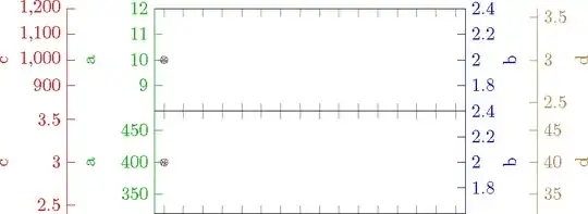
I am producing two figures with the pgfplots package, where one is on top and another one is on bottom. There is blank space between them. How do I remove that blank? Additionally, how can I make all content to be as wide as \textwidth?

\documentclass{article}
\usepackage{lmodern}
\usepackage{pgfplots}
\pgfplotsset{compat=1.8}
\usepackage{tikz}
\usepackage[showframe]{geometry}
\begin{document}
\begin{figure}
    \centering
    \pgfplotsset{
        scale only axis,
        enlargelimits=false,
        width=0.4\textwidth,
        height=2cm,
        xmin=0.5,
        xmax=16.5,
        xticklabel=\empty,
        xtick={1,2,...,16},
        leftinnery/.style={
            every y tick label/.append style=green!75!black,
            ytick style=green!75!black,
            ylabel=a,
            ylabel style=green!75!black,
            axis y line*=left,
            y axis line style=green!75!black,
            },
        rightinnery/.style={
            every y tick label/.append style=blue,
            ytick style=blue,
            ylabel=b,
            ylabel style=blue,
            axis y line*=right,
            y axis line style=blue,
            },
        leftoutery/.style={
            every y tick label/.append style={red,xshift=-1.7cm},
            ytick style={red,xshift=-1.7cm},
            ylabel=c,
            ylabel style=red,
            axis y line*=left,
            y axis line style={red,xshift=-1.7cm},
            },
        rightoutery/.style={
            every y tick label/.append style={brown,xshift=1.4cm},
            ytick style={brown,xshift=1.4cm},
            ylabel=d,
            ylabel style=brown,
            axis y line*=right,
            y axis line style={brown,xshift=1.4cm},
            },
        }
\begin{tikzpicture}
        \begin{axis}[leftinnery]
            \addplot[green!75!black, mark=o, draw] table[x index=0]{
                1   10
                };
            \node[anchor=north west] at (rel axis cs:0,1) {东湖};
        \end{axis}            
        \begin{axis}[rightinnery]
            \addplot[blue, mark=x, draw] table[x index=0]{
                1   2
                };
        \end{axis}
        \begin{axis}[leftoutery]
            \addplot[red, mark=+, draw] table[x index=0]{
                1   1000
                };
        \end{axis}
        \begin{axis}[rightoutery]
            \addplot[brown, mark=Mercedes star, draw] table[x index=0]{
                1   3
                };
        \end{axis}
\end{tikzpicture}\\
 \begin{tikzpicture}[yshift=-\lineskip]
        \begin{axis}[leftinnery]
            \addplot[green!75!black, mark=o, draw] table[x index=0]{
                1   400
                };
            \node[anchor=north west] at (rel axis cs:0,1) {东湖};
        \end{axis}            
        \begin{axis}[rightinnery]
            \addplot[blue, mark=x, draw] table[x index=0]{
                1   2
                };
        \end{axis}
        \begin{axis}[leftoutery]
            \addplot[red, mark=+, draw] table[x index=0]{
                1   3
                };
        \end{axis}
        \begin{axis}[rightoutery]
            \addplot[brown, mark=Mercedes star, draw] table[x index=0]{
                1   40
                };
        \end{axis}
\end{tikzpicture}

\end{figure} \end{document}

This produces the following:

enter image description here

It seems there a little blank space to the left of the figure, so the figure is a little bit to the right. How can I remove this blank space too? How to align all the labels and y axes? I guess it is difficult. Using groupplot may do these, but how to draw multiple y axes?

Y. zeng
  • 1,885
  • 2
    Have you considered using PGFPlots' groupplot environment for this task? It may also help to simplify your work, because currently, you're using eight different axis environments across two TikZ picture environments just to create a single graph. – gz839918 Sep 22 '23 at 08:41
  • @gz839918 I don't know how to merge groupplot with multiple y axes. – Y. zeng Sep 22 '23 at 08:49
  • Have you read reference manual for pgfplots? You'd probably have more options stacking two plots inside pfgplots and have more control over margins (guess). You could try to append inner sep=0pt, outer sep=0pt to tikzpictures options but I doubt it will have a good effect. Finally, try to make a custom style and avoid repetitions. This answer provides example on using multiple parameters in custom styles. – Celdor Sep 22 '23 at 10:55
  • @Celdor Not work: ! Package pgfkeys Error: I do not know the key '/pgfplots/inner sep', to which you passed '0pt', and I am going to ignore it. Perhaps you misspelled it. . Let me check it now. – Y. zeng Sep 22 '23 at 11:00
  • @Y.zeng inner sep and outer sep are keys in /tikz/ namespace and are usually used to set inner and outer margins for tikz nodes. I meant to append them in tikzpicture in the following way: \begin{tikzpicture}[inner sep=0pt, outer sep=0pt]...\end{tikzpicture}. However, I tested it and it doesn't work anyway. You could also have a look at section 4.20 The Picture’s Size: Bounding Box and Clipping of the documentation and see if you could reduce bounding box to inner axes. – Celdor Sep 22 '23 at 11:21
  • @Celdor If we don't know what is it of the left, we can't clip it perfectly. – Y. zeng Sep 22 '23 at 11:50
  • 1
    @cfr Yes. I think you are right. I have deleted the updated contents. Thanks for your kind reminder. – Y. zeng Sep 23 '23 at 02:31
  • @Y.zeng Thanks. – cfr Sep 23 '23 at 02:32

1 Answers1

2

The trick is to use scope instead of a new tikzpicture. I aligned the y lables using ylabel absolute which also put all the labels on top of each other.

\documentclass{article}
\usepackage{lmodern}
\usepackage{pgfplots}
\pgfplotsset{compat=1.8}
\usepackage{tikz}
\usepackage[showframe]{geometry}
\begin{document}
\begin{figure}
    \centering
    \pgfplotsset{
        scale only axis,
        enlargelimits=false,
        width=0.4\textwidth,
        height=2cm,
        xmin=0.5,
        xmax=16.5,
        xticklabel=\empty,
        xtick={1,2,...,16},
        ylabel absolute,
        leftinnery/.style={
            every y tick label/.append style=green!75!black,
            ytick style=green!75!black,
            ylabel=a,
            ylabel style=green!75!black,
            axis y line*=left,
            y axis line style=green!75!black,
            },
        rightinnery/.style={
            every y tick label/.append style=blue,
            ytick style=blue,
            ylabel=b,
            ylabel style={blue, yshift=\dimexpr -0.4\textwidth-2.1cm},% 2.1cm by trial and error
            axis y line*=right,
            y axis line style=blue,
            },
        leftoutery/.style={
            every y tick label/.append style={red,xshift=-1.7cm},
            ytick style={red,xshift=-1.7cm},
            ylabel=c,
            ylabel style={red,yshift=1.7cm},
            ylabel shift=-1.7cm,
            axis y line*=left,
            y axis line style={red,xshift=-1.7cm},
            },
        rightoutery/.style={
            every y tick label/.append style={brown,xshift=1.4cm},
            ytick style={brown,xshift=1.4cm},
            ylabel=d,
            ylabel style={brown, yshift=\dimexpr -0.4\textwidth-2.1cm-1.4cm},
            axis y line*=right,
            y axis line style={brown,xshift=1.4cm},
            },
        }
\begin{tikzpicture}
    \begin{scope}
        \begin{axis}[leftinnery]
            \addplot[green!75!black, mark=o, draw] table[x index=0]{
                1   10
                };
            \node[anchor=north west] at (rel axis cs:0,1) {东湖};
        \end{axis}            
        \begin{axis}[rightinnery]
            \addplot[blue, mark=x, draw] table[x index=0]{
                1   2
                };
        \end{axis}
        \begin{axis}[leftoutery]
            \addplot[red, mark=+, draw] table[x index=0]{
                1   1000
                };
        \end{axis}
        \begin{axis}[rightoutery]
            \addplot[brown, mark=Mercedes star, draw] table[x index=0]{
                1   3
                };
        \end{axis}
    \end{scope}
    \begin{scope}[yshift=-2cm]
        \begin{axis}[leftinnery]
            \addplot[green!75!black, mark=o, draw] table[x index=0]{
                1   400
                };
            \node[anchor=north west] at (rel axis cs:0,1) {东湖};
        \end{axis}            
        \begin{axis}[rightinnery]
            \addplot[blue, mark=x, draw] table[x index=0]{
                1   2
                };
        \end{axis}
        \begin{axis}[leftoutery]
            \addplot[red, mark=+, draw] table[x index=0]{
                1   3
                };
        \end{axis}
        \begin{axis}[rightoutery]
            \addplot[brown, mark=Mercedes star, draw] table[x index=0]{
                1   40
                };
        \end{axis}
    \end{scope}
\end{tikzpicture}

\end{figure} \end{document}

deno

John Kormylo
  • 79,712
  • 3
  • 50
  • 120
  • Thanks. How did you know the space between them is 2cm, as you take this way of \begin{scope}[yshift=-2cm]. And if there are three figures in a column, how to deal with it? I tried to add a new scope block, but the second the third will overlap each other. Is there away to align the labels of axes? – Y. zeng Sep 23 '23 at 01:55
  • Okay. I know how to deal with it. Every time, just add -2cm . Thanks. – Y. zeng Sep 23 '23 at 02:02
  • Is there a way to align the y axes labels? – Y. zeng Sep 23 '23 at 02:34
  • I got the 2cm from the [scale only axis, height-2cm]. Aligning the y labels is possible, but I'll have to check the manual. Worst case, add a node using (axis rel cs:). – John Kormylo Sep 23 '23 at 14:25