I am not sure if this is the right place to ask about this but you guys are usually both nice and knowledgable so I will give it a try.
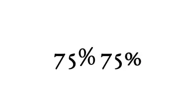
The percentage symbol in EB Garamond looks terrible. Consider this MWE:
\documentclass{memoir}
\usepackage{ebgaramond}
\begin{document}
The 70,% limit is a\ldots
\end{document}
I mean for example I might expect it to be two zeroes in EB Garamond font but clearly it is not:
It really stands out and looks like a completely different style to me... (Could it be that this is some sort of placeholder symbol that was forgotten about?)
Nevertheless, can something be done?


per centsee for example https://tex.stackexchange.com/questions/97723/what-is-the-correct-way-of-writing-a-percentage-next-to-oldstylenums – David Carlisle Nov 13 '23 at 10:27fontspecpackage, with OpenType EBgaramond, you can do some custom tweaking. The size of individual characters can be tweaked using theScaleAgain=valuepseudo-feature, and the width can be stretched or shrunk using theFakeStretch=valuepseudo-feature. And of course you can use\raiseboxto move things up or down, and\kernto adjust their relative horizontal positions. – rallg Nov 22 '23 at 18:17