You have two issues with your MWE:
- You are trying to mix
tikz macros within pgfplot's axis environment.
- Your domain for the function you are tying to plot is incorrect.
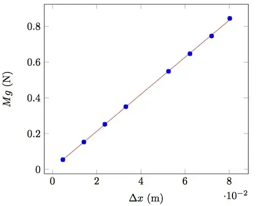
1. Manual Fit Line:
So using another \addplot and correcting the domain to 0:08:
\addplot [color=red, domain=0:0.08, mark=none] {0.0051026+10.372231*\x};
you get:

Code:
\documentclass{article}
\usepackage{pgfplots}
\usepackage{pgfplotstable}
\begin{document}
\begin{tikzpicture}[domain=0:8]
\begin{axis}[xlabel={$\Delta x$ (m)}, ylabel={$Mg$ (N)}]
%    \draw[color=red, domain=0:1000] plot (\x,{0.0051026+10.372231*\x}) node[below right] {};
\addplot [color=red, domain=0:0.08, mark=none] {0.0051026+10.372231*\x};
\addplot[scatter, only marks, scatter src=\thisrow{class},
      error bars/.cd, y dir=both, x dir=both, y explicit, x explicit, error bar style={color=mapped color}]
      table[x=x,y=y,x error=xerr,y error=yerr] {
x      xerr      y        yerr     class
0.0047 0.0007071 0.054039 0.000098 0
0.0142 0.0007071 0.152651 0.000098 0
0.0237 0.0007071 0.252051 0.000098 0
0.0332 0.0007071 0.350466 0.000098 0
0.0525 0.0007071 0.548380 0.000098 0
0.0622 0.0007071 0.646893 0.000098 0
0.0720 0.0007071 0.746195 0.000098 0
0.0802 0.0007071 0.844709 0.000098 0
};
\end{axis}
\end{tikzpicture}
\end{document}
2. Automatic Fit Line:
Alternatively you could let pgfplots compute the regression line for you by using the same data with:
\addplot [red, mark=none] table[y={create col/linear regression={y=y}}
Notes:
- Note that in this case the regression line is automatically only between the extreme points. You would need to adjust your domain to get the same results.
- You should not duplicate the data as I have done.
Code:
\documentclass{article}
\usepackage{pgfplots}
\usepackage{pgfplotstable}
\begin{document}
\begin{tikzpicture}[domain=0:8]
\begin{axis}[xlabel={$\Delta x$ (m)}, ylabel={$Mg$ (N)}]
%    \draw[color=red, domain=0:1000] plot (\x,{0.0051026+10.372231*\x}) node[below right] {};
\addplot[scatter, only marks, scatter src=\thisrow{class},
      error bars/.cd, y dir=both, x dir=both, y explicit, x explicit, error bar style={color=mapped color}]
      table[x=x,y=y,x error=xerr,y error=yerr] {
x      xerr      y        yerr     class
0.0047 0.0007071 0.054039 0.000098 0
0.0142 0.0007071 0.152651 0.000098 0
0.0237 0.0007071 0.252051 0.000098 0
0.0332 0.0007071 0.350466 0.000098 0
0.0525 0.0007071 0.548380 0.000098 0
0.0622 0.0007071 0.646893 0.000098 0
0.0720 0.0007071 0.746195 0.000098 0
0.0802 0.0007071 0.844709 0.000098 0
};
\addplot [red, mark=none] table[y={create col/linear regression={y=y}}] {
x      xerr      y        yerr     class
0.0047 0.0007071 0.054039 0.000098 0
0.0142 0.0007071 0.152651 0.000098 0
0.0237 0.0007071 0.252051 0.000098 0
0.0332 0.0007071 0.350466 0.000098 0
0.0525 0.0007071 0.548380 0.000098 0
0.0622 0.0007071 0.646893 0.000098 0
0.0720 0.0007071 0.746195 0.000098 0
0.0802 0.0007071 0.844709 0.000098 0
};
\end{axis}
\end{tikzpicture}
\end{document}

\addplot [blue, mark=none] table[y={create col/linear regression={y=y}}] {with the same data will create a linear regression line to fit the given data. If you want to use the function you already computed you need to use a separate\addplot. – Peter Grill Oct 10 '12 at 04:03