14

I want to plot this function with a big range says, (-10,000:10,000), unfortunately I couldn't figure out how to set the domain, or xrange correctly to scale the graph nicely. This is what I have so far:

\begin{tikzpicture}[scale=1.0]
    \draw[] plot[id=ff] function{
        set xrange [-10:10.5];
        plot 14*x - x**2;
    };
\end{tikzpicture}

I wonder is there a simple way to draw a function with large domain? I tried some values, gnuplot always complain about the domain is too large! then how I could I draw says x = (-100, 10000)? Any suggestion would be greatly appreciated.

roxrook
  • 9,907

3 Answers3

17

While tikz can do basic graphs, you should use pgfplots for graphing:

enter image description here

As hpesoj626 commented, sometimes it is better to have the axis lines in the middle. This also shows some of the other options that pgfplots provides:

enter image description here

Code:

\documentclass[border=2pt]{standalone}
\usepackage{pgfplots}

\begin{document}
\begin{tikzpicture}[scale=1.0]
\begin{axis}
    \addplot[domain=-10000:10000, blue, ultra thick] {14*x - x^2};
\end{axis}
\end{tikzpicture}
\end{document}

Code:

\documentclass[border=2pt]{standalone}
\usepackage{pgfplots}

\begin{document}
\begin{tikzpicture}
\begin{axis}[
        axis x line=middle, 
        axis y line=middle, 
        ymax=0.1E8, ylabel=$y$, 
        xlabel=$x$
        ]
    \addplot[domain=-10000:10000, blue, ultra thick] {14*x - x^2};
\end{axis}
\end{tikzpicture}
\end{document}
Peter Grill
  • 223,288
  • 1
    For someone who is teaching high school math, I would prefer axis x line=middle, axis y line=middle. But that's just me. :) – hpesoj626 Oct 20 '12 at 00:30
  • 1
    @hpesoj626L: Good point. Have used that as an excuse to illustrate some of the pgfplots options. – Peter Grill Oct 20 '12 at 00:49
  • @Chan I don't want to sound nitpicky about a very big domain like you are suggesting. But when you look at the plots it appears that the vertex of the parabola is at the origin when in fact it's not. A smaller smaller domain like -10:24 appears okay with me. Unless, of course, you just used the parabola 14x-x^2 as an example. – hpesoj626 Oct 20 '12 at 01:20
  • @hpesoj626: Yes, you made a good point. It was my mistake by not looking at the domain first. Thanks for pointing out. – roxrook Oct 20 '12 at 02:04
  • @PeterGrill: I've found out that I completely ignore one of the greatest package for drawing graph. I'm excited to learn this great tool now. – roxrook Oct 20 '12 at 02:05
  • I have modified your second graph to graph a polynomial with x running from -5 to 5 and y running from -10 to 10. Along the y-axis it only labels y=5 and y=10. How do I get it to label more y values. – J126 Sep 06 '13 at 19:42
  • @JoeJohnson126: I think it is best if you ask a new question as this question is not about adding labels. You can reference this answer as the source. Also, apologizes for the delay in getting back to you -- had to rebuild my PC. :-( – Peter Grill Sep 09 '13 at 04:02
6

There is another package tkz-fct by Alain Matthes who is a regular in this site. (At this point though, the manual is still only in French. I just picked up the bits and pieces of code from the examples in the manual--which are a lot.) I use it once in a while to draw my graphs. Unlike pgfplots, tkz-fct requires that you have gnuplot installed. There is an advantage to this as Harish Kumar has already noted. You also have to invoke the --shell-escape option when compiling in order to draw the graph.

enter image description here

Code

\documentclass[tikz]{standalone}
\usepackage{tkz-fct}
\begin{document}
\begin{tikzpicture}[>=stealth']
\tkzInit[xmin=-15,xmax=25,
         ymin=-250,ymax=50,
         xstep=5,ystep=50]
\tkzAxeXY
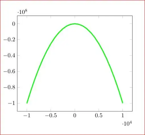
\tkzFct[domain=-10:24,color=blue,very thick,<->]{14*\x-\x**2}
\end{tikzpicture}
\end{document}

Upon the suggestion of Peter Grill, I have done some tweaking to remove some labels to make the graph more pleasing to the eye.

enter image description here

Code

\documentclass[tikz]{standalone}
\usepackage{tkz-fct}
\begin{document}
\begin{tikzpicture}[>=stealth',scale=2]
\tkzInit[xmin=-15,xmax=25,
ymin=-250,ymax=50,
xstep=10,ystep=100]
\tkzAxeXY[fill=white]
\tkzFct[domain=-10:24,color=blue,ultra thick,<->]{14*\x-\x**2}
\end{tikzpicture}
\end{document}
hpesoj626
  • 17,282
  • One minor improvement here would be to explicitly specify where the tick marks are to be placed so that you can leave out x=15, and y=-50. – Peter Grill Oct 20 '12 at 02:38
  • @PeterGrill I don't know if that can be done in tkz-fct using a combination of the \tkzInit and \tkzAxeXY commands but there is always the option to use nodes to place the tick labels. Might ask Alain when I chance upon him in chat. I have updated my answer though by scaling the figure and changing xstep and ystep. – hpesoj626 Oct 20 '12 at 07:21
  • 1
    I did not know that. Is there something special you need to do when you run this to see the graph? I am only seeing the axis - Do see a console message: Plot data file.tkzfct.table' not found.` – Peter Grill Oct 20 '12 at 07:30
  • @PeterGrill I assume that you have gnuplot installed. You have to compile your file with the --shell-escape option. – hpesoj626 Oct 20 '12 at 12:21
4

You can use gnuplot within tex in this way:

\documentclass{article}
\usepackage{pgfplots}

\begin{document}
\begin{tikzpicture}[scale=1.0]
\begin{axis}%%[domain=-10000:10000, no markers,ultra thick]
%
\addplot[domain=-10000:10000, no markers,green,ultra thick] gnuplot{14*x - x^2};
%
\end{axis}
\end{tikzpicture}

\end{document}

enter image description here

You have to use --shell-escape for pdftex. (I did pdflatex --shell-escape myfile.tex)

Advantage : gnuplot is better in doing calculations.