The graph below is currently plots a point at each value of x that is an integer between -10 and 10 and connects them.
What I'd like to do instead is more like this:
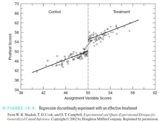
First, I'd like to add a red, light line at x = 0.
Second, I'd like to unconnect the points and have them be presented as just a scatter plot.
Third, I'd like to add a known trend line for the 10 points that are from x < 0 and another known trend line for the points that are from x > 0.
Specifically, suppose the trend line for x < 0 is y = -0.002x + 0.003 and the trend line for x > 0 is y = 0.002x + 0.003
(Those are not the actual values.)
Here is the MWE:
\documentclass{beamer}
 \usepackage{graphicx}
 \usepackage{filecontents}
\usepackage{pgfplots}
\usepackage{tikz}
 \usetikzlibrary{arrows,shapes,positioning,fit,shapes.misc,matrix,decorations.text,shapes.geometric}

 \begin{document}

 \begin{filecontents}{drc1.dat}
 -10 0.0635084
 -9  0.037563
 -8  0.0460021
 -7  -0.0020816
 -6  0.0224089
 -5  0.0303281
 -4  0.0101534
 -3  0.0214043
 -2  0.0278317
 -1  -0.0336859
 1   0.0866865
 2   0.0599577
 3   -0.0087226
 4   -0.0334984
5   -0.0582118
6   -0.0628758
7   -0.0703382
8   -0.0815326
9   -0.0941923
10  -0.055196

\end{filecontents}

\frame
 {
 \frametitle{Frame Title}
\centering
\begin{tikzpicture}
  \begin{axis}
    [
      axis x line = bottom,
      axis y line = left,
      width      = 1.0\textwidth,
      height     = 0.60\textwidth,
      title      = Picture Title,
      xmax       =  10.2,
      xmin       = -10.2,
      xshift     = -6cm,
      ymax       =  1.05,
      ymin       = -1.05,
      xtick      = {-10, -5, 0, 5, 10},
      xticklabels= {-10, -5, 0, 5, 10},
      ytick      = {-1, -0.5, 0, 0.5, 1},
      yticklabels= {-1, -0.5, 0, 0.5, 1}
    ]
    \addplot file {drc1.dat};
   \end{axis}
 \end{tikzpicture}
 }

\end{document}
