I've searched all over, seen some examples, but none of them are barely close to my challenge. See image attatched.
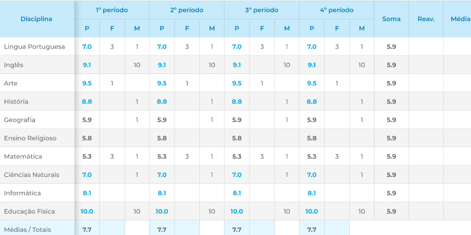
Obviously locking a column won't work. I'm out of ideas.
I've searched all over, seen some examples, but none of them are barely close to my challenge. See image attatched.
Obviously locking a column won't work. I'm out of ideas.
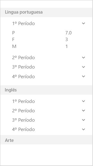
I had a Similar challenge at work, but instead of fitting the table in the small screen, we rearranged the information to create a list. Here is an example of something you could do:
I was doing some research on this some time ago. One example that I found is to show one column (or a couple if it fits) at a time and provide a way to navigate to the other columns. One basic example can be found here: https://daverupert.com/2016/05/responsive-comparison-tables/
You may be able to fit the Disciplina and 1 periodo columns in the view and have a nav element to jump to the other periodo.