Situation: I need to design a view in a mobile application (iOS + android) to scan qr-codes. The view needs a toggle to switch the flashlight "on" and "off".
Problem: I first designed the switch that represented the current state of the flashlight (V1). This means that when the flashlight is "off" the icon shows a crossed out light bulb and when the flashlight is "on" the icon shows a glowing light bulb.
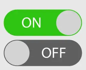
Like toggles work in settings for example:
When I tested my design in a prototype (Adobe XD) is feels very strange to turn on the flashlight by clicking on an icon that shows a crossed out light bulb.
For this reason I have created another variant that shows exactly the opposite:
- When I want to turn "on" the light, I click on the icon with the light "on "
- When I want to turn "off" the light, I click on the icon with the light "off".
It's like a play and pause button on a music player
- When I want to play the song, I click on the play icon
- When I want to pause the song, I click on the pause icon
I had a discussion with a colleague about whether it makes sense to display what the user wants to achieve, or the current state. Displaying the current state makes less sense to me in this context, because the user knows that the flashlight is off when sitting in the dark. And as I said it feels weird to click on this crossed out icon. Now I am successfully confused how to solve this problem. I think it's not good to break the switch behavior everyone is used to know, even if it feels weird to me.
What do you guys think?


