14

I have some pretty large forms mostly consisting of text fields and dropdowns. However, there are also checkboxes scattered here and there. I'm trying to figure out the best way to lay them out. Here's the problem:

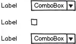
If I align my label to the right and the control itself to the left, then my checkboxes are not in the same column as all my other controls

mockup

download bmml source – Wireframes created with Balsamiq Mockups

If I align the control to the right, then its label isn't aligned with the rest of the controls and I'm afraid it may be missed.

mockup

download bmml source

The solution seems to be to separate the label from the control. What bothers me in this solution is that the target region of the checkbox is small and even if I make it larger, users may think they need to "snipe" into the checkbox itself.

mockup

download bmml source

To solve this I've been playing around providing both a general label and a specific one for the control, but in most cases it feels very unnatural and forced. Instead of saying for example "Include timestamp" I'm forced to do things like "Timestamp: Include", which sounds terrible.

mockup

download bmml source

It seems to me that the best option is 3, but maybe I'm missing something. Are there any guidelines or any better solutions for this?

Vitaly Mijiritsky
  • 31,167
  • 12
  • 84
  • 146

3 Answers3

20

I would try to group as many checkboxes as possible under a single label:

mockup

download bmml source – Wireframes created with Balsamiq Mockups

fdmsaraiva
  • 625
  • 4
  • 7
9

You can also replace the single checkbox with a pair of radiobuttons. That will give you both an independent "description" label and a labeled control for the user input.

mockup

download bmml source – Wireframes created with Balsamiq Mockups


A positive side-effect of this solution is that you get an implicit third value, namely "unanswered".
In some circumstance it might be important that the user actually chose "Yes" or "No" by action.

mockup

download bmml source


Yet another positive side-effect is that you can provide better default values.

mockup

download bmml source

Jørn E. Angeltveit
  • 12,588
  • 4
  • 41
  • 79
  • "A positive side-effect of this solution is that you get an implicit third value, namely "unanswered"." That value is not very useful when you can't get to its state from any other state. The rest of your answer is perfectly fine, but I feel the need to point out the frustration that radio buttons can cause if used in the way you describe. Having to reload an entire page and sometimes also purge browser cache to be able to change one's mind about a selection (changing a radio button to being unselected) is an incredibly expensive process. – A.M. Aug 07 '13 at 02:19
  • @A.M. I partly agree with you. In many situations this third value could be added as a selectable option - but then you will have an implicit fourth value ;-). And that's exactly the point of having radiobuttons (or dropdown) instead of a single checkbox. The implicit second option should be visible to the user in most cases. "Unchecked" is not always the same as "the opposite of checked". – Jørn E. Angeltveit Aug 07 '13 at 08:07
  • You are right that in its usual implementation, a set of radio buttons has an implicit value. It doesn't have to be that way, though. Also, I would say the point of a radio button set (vs checkbox set) is it's XOR nature (allowing one and only one choice), not the implicit value capability. (Ditto for a drop-down box.) – A.M. Aug 07 '13 at 12:40
  • One way I have seen the impossible-to-return-to-state problem addressed is setting a default value for the radio button set. ...simple and effective. If that is not palatable for fear of biasing users toward the default choice or of having them be more likely to forget to make a choice for that section, then you can also make the implicit explicit and add a selection for "no choice". A great way I have seen that done is with a checkbox named something similar, which, when selected, greys out the radio buttons. – A.M. Aug 07 '13 at 12:41
  • Even then, though, users can be bothered if even greyed out radio buttons show choices they do not want. (This is more for online forms more than for program settings, where users might want to know their last choices when returning to them.) The way to solve that is to have selection of the "no choice" checkbox not only grey out the radio buttons, but remove any selection made there as well. – A.M. Aug 07 '13 at 12:41
  • Just to clarify: I didn't mean that "the implicit value is the purpose of radiobuttons". Of course not. The "pick one" feature is the main purpose. :-) What I'm saying is that it is a side-effect that might add (an implicit) value to the data you collect. Setting a default value will definitely not give you the same information. And making all radiobuttons requred can be a real pita. I can assure you that adding too many "just-in-case" values to a set of radiobuttons will turn out to be silly, ugly or even useless. I bet we agree on that :-) – Jørn E. Angeltveit Aug 07 '13 at 15:01
  • I do agree. You have to choose how many options to add for any radio button set, and when to cut it off and put everything else in the "other" bin. For any given scenario, though, making that last (valid) option explicit instead of implicit only means one extra option, and it saves trouble determining whether the user actually meant to select it. – A.M. Aug 07 '13 at 15:31
  • When you say "making all radiobutton[sets] required can be a real PITA", though, what do you mean (and do you mean for the developer or the user)? If it is for the user, then I supposed if it is bad enough then it might trump input validation, but I doubt it. (Since we are so far below your answer, by the way, I want to repeat that I actually do agree with it. :) I particularly like the last mock-up in it, and think just about all checkboxes should be replaced with dual radio button sets like that!) – A.M. Aug 07 '13 at 15:35
  • We're on good foot here, so don't you worry. :-) The main difficulty here is that forms are challenging. Even the simplest ones. And "chatting" like this over the topic might be very imprecise and lead to misunderstandings. Well. The pita I was referring to, was for the user. Being "forced" to tick of lots of questions can be bad for the experience. Likewise, being "forced" to alter lots of default values might be just as bad. I agree that good defaults should be required, but I have seen (and created) lots of forms where it's just fine that several questions are skipped. – Jørn E. Angeltveit Aug 07 '13 at 16:02
  • At the end of the day, the "rules of the form" is depending on the situation, the form, the task and the nature of the data collection etc etc. – Jørn E. Angeltveit Aug 07 '13 at 16:03
  • Yes, though for must-answer questions I think a good default is not having defaults. ;) ...and making changes irreversible is annoying in most contexts. – A.M. Aug 07 '13 at 16:39
8

Quickly skimming through the usual style guides, I can’t find explicit guidelines, but, based on the examples in the style guides, Apple appears to favor your second option. Dividers or white space is used to make the check box stand out and not appear to be subordinate to the control above.

In Windows and Gnome, check boxes are flush left with the labels for field controls:

enter image description here

If you stare at it long enough, it starts looking weird, but it’s uncluttered (no excess words) and space efficient. It's used lot, and I haven’t seen anyone react negatively to it (or even notice it), so I guess it’s okay.

Another option, if you have the vertical space, is to left align the controls, and put the label on top of the fields, which may have some efficiency advantages when a user first fills out a form.

enter image description here

Michael Zuschlag
  • 37,870
  • 4
  • 57
  • 105