21

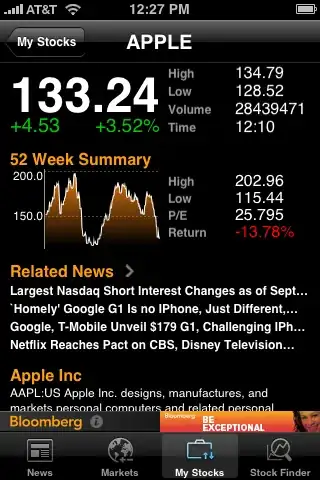
I was asked today to look into designing a stock monitoring windows 8 application and I was looking around for design ideas when I noticed an interesting trend where it seems like most of these stock monitoring or financial apps are on black or dark backgrounds.

enter image description here

enter image description here

enter image description here

Now I understand white text on a black background is generally used when we want to draw our attention to something but its not a good idea when there is a lot of information to read because of this reason (as per this article from UX Movement) :

The kind of text that users read is paragraph text. You should avoid using white text on a dark background when displaying paragraph text to make it easier from them to read. Forcing users to fixate on the white text for a long time can strain the user’s eyes. This is because white stimulates all three types of color sensitive visual receptors in the human eye in nearly equal amounts. This makes reading white paragraph text on dark backgrounds stressful on the user’s eyes.

White also reflects all wavelengths of light. Because the words and letters in paragraph text are compact and close together, when white text reflects light, the reflected light scatters and runs into neighboring words and letters. This makes the shape of the words and letters harder to perceive, which affects the user’s readability. Compare that with black text, where the black absorbs the light around each word and letter, making them easy to distinguish.

So my question is " Considering most financial apps show a lot of data which are often close together and dynamically updated, why do they use white text on a black background when it has been proven that it would be hard to read over a period of time"

Mervin
  • 43,967
  • 8
  • 104
  • 188
  • 6
    This may be entirely off base, but I'd always read it as being the other way around - staring at a white screen with black text strains your eyes more than a black screen with white text. In addition, monitors typically emit light rather than reflecting it - so I'm not sure the UX Movement article is accurate here. – kastark Aug 30 '12 at 07:33
  • @dhmholley interesting, do you have any articles about it ? – Mervin Aug 30 '12 at 07:40
  • No articles, just personal and anecdotal experience unfortunately (which isn't really proof of anything). It would be very interesting to read some actual studies, if any have been performed. – kastark Aug 30 '12 at 07:44
  • No worries,I was just curious – Mervin Aug 30 '12 at 08:15
  • I have always perceived light-on-dark interfaces to be much more confident - even aggressive - than their dark-on-light siblings. I can't substantiate that claim, but it would make darker schemes more suitable for authoritative apps that try to attract driven users - like stock monitoring programs. – Jimmy Breck-McKye Aug 30 '12 at 08:37
  • Because Black is the new Black :-) – Steven McGrath Jul 06 '13 at 06:40
  • @dhmstark white text on a black GUI background all runs together in my eyes, just like how the article explains. It's why I've configured all my terminal windows to be black on white. – RonJohn Jun 07 '19 at 07:29

6 Answers6

13

The dark and complex interface is a badge of honour

This was tackled by IDEO when they set out to redesign the Bloomberg terminal (see the article). They found that...

...the design also incorporated certain “badge of honor” elements inspired by expert users of the previous system...

and

...an estimated 75,000 machines in use worldwide—including one in the Vatican—users find the aesthetic is dated ...

Bloomberg dominate the space and therefore influence the context.

Traders are a fairly exclusive club. I've lost count of the terms and acronyms that I can't decipher. With a Bloomberg terminal you are 'set up' by an expert. You tailor the interface to your needs and then ... it is a steep and fairly long learning curve. The traders spend a lot of time mastering and perfecting their activities.

There is a lot of resistance to change.

Many decisions are based on current systems and personal preference

My observation is that often (not always), design decisions are not made by designers. At least not to discover and solve a design decision. This is especially the case with the sort of large organisations that build big trading platforms.

Its often personal preference and branding that defines the broad approach. Therefore you can't always read into the trends (I can't offer much proof here, but these are my experiences).

However given the recent increase in prominence of UX in these organisations I'd expect this to change with platforms to be released in the next few years. Change will occur because competition is fierce.

Charts and graphical elements display better on a dark background

I am aware of research that states it is easier to perceive colour and shading differences on dark backgrounds than light. The multilayered and complex charts you might see in such interfaces are easier to view.

When viewing smaller text it is easier to view dark on light.

The best source for this is another answer of UX.SE - https://ux.stackexchange.com/a/23429/15613

If this is true the optimal solution would be to have a dark background behind charts and a light one behind text. However this cases its own issues. A fragmented look and contrast clash for example. Therefore a compromise has to be made.

Some alternative approaches

here are some examples I found with different approaches.

Light grey chart area with dark grey interface: example 1

Light interface and text with dark chart area example 2

Jay
  • 4,320
  • 1
  • 22
  • 34
  • Light gray on dark grey has to be the Worst Idea Ever in UI design. The fool who thought of that must have been 22 years old with perfect vision. – RonJohn Jun 07 '19 at 07:32
5

My guess (and it's just a guess) is that these apps use black because their aim is to bring attention to specific elements in the UI. In this case, graph and numbers. People naturally focus on brighter areas. Now, black is generally associated with bad readability, but this is mainly in the case of blocks of text (so the "Top News" screen is a miss for me).

In dark environments, light background can strain the eyes; in very bright environments a dark one will make things easier to see. So that might be a reason. Unfortunately I don't have the knowledge (of the subject or the studies these apps may have conducted, as well as how many of them are using dark UIs) to go further, but definitely want to hear some opinions on this.

Don't know if you've seen it. There are some very interesting points in these answers: What are the negative and positive aspects of dark color scheme?

Yisela
  • 3,079
  • 15
  • 26
4

I would say that everyone is just following the herd. If all financial apps are dark, new financial apps will be made dark too, to fit in with the herd.

However, I'm sorry to say that the UX Movement article is a load of rubbish. To get the facts straight:

• If white strains the eye, then a dark background would be preferred, because it shows much less white. However, there's no evidence at all that white strains the eye more than black does, except when looking right into a bright light.

• However, there is a valid argument for using dark text on light background, which is not mentioned anywhere in the article. A dark background will make your pupil expand, which will make your eye more sensitive to light. This means that a white text might irritate the eye, depending on the amount of contrast. So, in case of light text on dark background, it can make sense to decrease the contrast by using light grey for text, rather than white. Other than that, I wouldn't worry about it and either go with the herd or not, depending on your aims with the product.

Igor Asselbergs
  • 1,156
  • 5
  • 7
  • 1
  • for "following the herd". Dark colours are often used by 'professionals' - look at the clothes they wear.
  • – PhillipW Apr 29 '17 at 10:34