Currently we are working on a project that includes many datatables. Before deciding to use zebra stripes to make datatables easier to manage, I wanted to ask if you could advise a better solution than it.
Asked
Active
Viewed 1.2k times
76
4 Answers
102
It depends on your definition of "better", but whether you define user performance or user preference as your metric, there are studies that objectively measure zebra striping (which can be done in more than one way).
A study was done in 2008 that looked at how effective zebra striping is on tables, and it drew some interesting conclusions.
The study tested the following table designs and measured both user performance and user preference:

User Performance
The study found that zebra striping doesn't harm, and in some cases improves, user performance:
The table shows that for three of the eight questions, the striped version yielded a more accurate response than did the plain and lined versions. A fourth question comes very close to being statistically significant. For the remaining four questions, the difference in accuracy between all three styles is so small that it cannot be statistically separated from random noise. In these cases, performance with zebra striping is just as good as—and certainly no worse than—the plain or lined version.
This means that, in this study at least, zebra striping doesn’t harm performance—and in many cases, it actually leads to an improvement.

User Preference
Not only did the striping improve performance, but users indicated a clear preference in favor of them (and a strong aversion to plain tables):
The typical zebra striping approach (single-color, single-row) is the most preferred: 31% of participants rated it as the table that helps the most and only 4% rated it as the table that helps the least. (Note that the maximum margin of error on these estimates is 2.8%.)
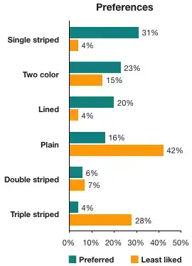
Take away
What I would take away from this study with regard to your question is that you have several options available:
- Plain Table
- Double striped
- Lined
- Triple striped
- Single striped
- Two color striped
There are measurable differences in how users react to and use these designs, and the study's results suggest that the single striped table is the best approach.
Charles Wesley
- 12,218
- 9
- 48
- 74
-
5This answer is nearly as good as it gets. I just feel I should add that zebra-striping is essentially an implementation of Gestalt's law of enclosure. From visual design perspective very pale, low-contrast background will do the job - both in the OP image and the one on this answer you could argue that the grey raws can be toned down yet achieve the same effect. – Izhaki Jul 02 '14 at 21:21
-
1Did the study consider how striping interacts with scrolling? I would think that when scrolling, it would be important to have the period of whatever form of striping is used to be more than twice the amount by which the data scrolls with each screen update; if data scrolls a line at a time, striping two lines our of four, or one out of three, would seem better than striping alternate lines. – supercat Jul 02 '14 at 21:42
-
6I think one of the problem with this study is that the plain version of the table was compared against zebra stripes and not against an optimized design of plain tables. The Darkhorse Analytics blog ( http://darkhorseanalytics.com/blog/clear-off-the-table/) suggests a design that is more effective than zebra stripes. – Michael Lai Jul 02 '14 at 23:30
-
1
-
4@MichaelLai: "that is more effective than zebra stripes" - not quite. The linked blog merely guesses that an alternative presented design might be more effective (whatever definition one applies for that) than zebra stripes. It does not provide any verifiable evidence for that claim. – O. R. Mapper Jul 03 '14 at 09:34
-
Double striped and triple striped don't work for me. There's too much shock between "change" and "no change." However I am a fan of quintuple striped, especially with numbered datasets (it picks out decade of 10 numbers very easily, and is sufficiently wide to follow when scrolling.) The 5-line convention is also used in certain types of writing (patents for example) where every fifth line number (5,10,15 etc.) is given in the margin for easy reference. – Level River St Jul 03 '14 at 12:45
-
5+1 for providing actual data. If all answers on this site were like this it would be much more useful. – Dan Hulme Jul 03 '14 at 17:20
-
@O.R.Mapper You are right, it is not tested and I would like to see it tested. Thanks for the correction. – Michael Lai Jul 03 '14 at 22:16
-
I would've loved to see double striped also included in the table as well as some timing data (I'd think that plain tables would particularly lead to much longer answering times). Still very cool research. – Voo Jul 03 '14 at 23:37
-
4If we're listing all kinds of striping, I personally prefer striped by line, but with three rather than two alternating colors (in a 1-2-3-1-2-3 pattern, not a 1-2-3-2-1-2-3 pattern). In my experience, that makes it less likely to accidentally "switch" the line for as soon as my gaze wanders off the interesting line, it is instantly clear to me whether I need to look back up or down. – O. R. Mapper Jul 04 '14 at 06:07
-
2I don't know that I'd consider those studies completely objective. There's subjectivity in that they compared very particular tables. A bad table without zebra stripes may be less desirable than one with zebra stripes. On the other hand, a very well laid out table may be more desirable that a poorly laid out one with zebra stripes. – DA01 Jul 06 '14 at 22:46
-
I'm also not a huge fan of UX decisions being based on one study (though I readily admit it's common.) – DA01 Jul 06 '14 at 22:47
-
1I miss the semantic argument here. When our zebra stripes span 3 rows, we make these rows visually related to each other. But: is the data also conceptually related in that very same way? We do not want to suggest a relation that is not present. – Ideogram Jul 07 '14 at 07:25
-
Research author admitted to designing the experiment where the plain table would fail (with some justification):
"I also agree that wide spacing between columns could have an effect. In fact, I deliberately designed the table this way for the second (country) study because:
- in the very first (screw) study, the columns were close together and readers thought that this might be why that study didn’t really find that zebra striping helped."
You can read the full comment and her justification here: https://alistapart.com/article/zebrastripingmoredataforthecase/#comment-14701
– ahong Oct 15 '21 at 06:47
14
It depends
As a web developer, I decide according to the data a particular table holds. Now why do I decide according to the data the element holds?
Say for example I am having a list of messages rendered in a tabular form, I tend to highlight rows for the messages say that are unread, or say I've another table with tasks listed, so I highlight the tasks according to the priority, so inhere, obviously zebra pattern isn't a way to go for.
To show you what I mean, I will attach an image from a System I am programming for business, where the user enquiry are logged and shown to the administrator where the admin has an option to mark the enquiry as unread... which is highlighted in mild yellow..

Apart from that, I often use highlight when a user hovers over table rows.. So using zebra pattern with similar highlight color will confuse your users.
So my approach towards this is to use a plain table with the header row highlighted and footer row highlighted (If a table has footer), you can optionally highlight few special rows or cells, just like I've done in the example below.


I've also used a chess pattern recently but that is useful when you want to show a user that none of the cells are related to each other... For example

The above pattern helps the user to focus on single cell.
So my suggestion to you is that use a simple table and use hover for rows.
Mr. Alien
- 326
- 3
- 10
-
You've said how you do it, and you've given advice, but you haven't actually said why you do it that way, or explained why your solution is better than alternatives. Could you expand your answer with some reasoning? – kastark Jul 04 '14 at 13:58
-
I don't get the reason behind the down vote but I think I explained it well in my answer that why I do it that way and also I stated that it depends on the scenario so I suggested a generic approach towards this – Mr. Alien Jul 04 '14 at 14:35
-
For data which will not be scrolled, another useful variation can be to add a small amount of extra space after every nth row (or if there are many small columns, every nth column). Such designs work very badly when scrolling, however, because many scrolling operations will cause some cells' baselines to move up and others to move down, with no apparent relationship to the scroll direction or distance. – supercat Jul 05 '14 at 19:12
-
1
3
Note that zebra-striping evolved as a way of helping users read tables on paper. If you've got the data in a computer, you can use dynamic highlighting, filtering, or other mechanisms to help users see how rows/columns are associated.
(Or, of course, pull the data out of a table entirely and present it in some more useful form.)
Also note that even in print, striping doesn't have to strictly line-by-line alternation. Two-and-two, three-and-three, or other combinations can work perfectly well, and sometimes better; the important thing is for users to have a clear visual reference nearby that they can use to track across the page. (I wouldn't normally go father than three-and-three, giving top/middle/bottom of each three-line group.)
keshlam
- 625
- 3
- 6
-
1"Two-and-two, three-and-three, or other combinations can work perfectly well, and sometimes better" this seems in direct contradiction to the other answer, which has extensive academic sources. – Jul 03 '14 at 03:06
-
I agree that we disagree. All I can say is that my experience diverges, especially for highly dense tables. It does depend on exactly how the shading is done, of course. – keshlam Jul 03 '14 at 05:08
-
6"If you've got the data in a computer, you can use dynamic highlighting, filtering, or other mechanisms" - while that is mostly true for traditional computers with pointing devices, things may be different with touch devices again - normally lacking a proper hover state, on-the-fly highlighting is less satisfiably feasible than with a pointing device such as a mouse. – O. R. Mapper Jul 03 '14 at 09:39
-
1@LegoStormtroopr: If information will need to scroll, certain zebra-stripe patterns may improve visual tracking; what pattern is optimal will depend upon factors like scroll speed and refresh rate. – supercat Jul 03 '14 at 20:22
-
1@LegoStormtroopr The contradiction can be resolved when you see that the most upvoted answer is first and foremost about computer. On A3 paper with 8pt lettering (like they used for share prices in our local newspaper), zebra stripes would not help the eye keep track of the row when wandering from far left to far right end of the page - so they striped five consecutive rows. – Alexander Jul 04 '14 at 12:38
0
I often use dynamic striping, i.e. alternatively white and light green, while the entire line the cursor is on is light yellow.
My tables tend to be rather wide :-)
Lenne
- 135
- 2
-
2
-
Highlighting the line of interest is often better than static striping... if you can easily select the line of interest, and if you have an active display rather than paper. – keshlam Jul 04 '14 at 14:26
There are certainly lots of ways to make data tables even better, but those will be specific to what the data actually is and what it will be used for.
– Sam Blake Jul 02 '14 at 17:30