115

This question has been bugging me ever since I've started learning usability.

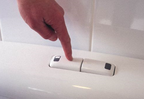
I am talking about the two buttons for the flush : Full and half container.

On one hand, the button shape has to represent its function. Thus a bigger button must mean the full container.

On the other, dangerous/heavy process triggers should be protected from being triggered by mistake and generally harder to trigger(If you press it, you mean it). From that point of view, the full container button should be smaller and further from the user and the half-container should be big and easy to reach/press.

Also, keep in mind, that I come from a country where water is scarce. So people are educated and encouraged from a very young age to conserve. But it's also a rising trend worldwide now...

While observing these interfaces all over the world, I didn't see any consistency in the matter. The buttons really go both ways. Sometimes the full container is the big one and sometimes it's the small one. It is inconsistent even within the country. I've also seen all kinds of unconventional designs. But again, nothing clear and intuitive from the moment you see it...

What are your thoughts on the matter? Have you ever seen a good, clear design, that is really intuitive? Do you know of any standards for this?

NOTE: Please don't suggest text as a solution. Icons may be interesting. But I've never seen a clear icon for that.

Palin Revno
  • 1,381
  • 2
  • 10
  • 10
  • 6
    Well, it would not be too hard to find icons for "poop" and "pee", but would you really want to see such icons? Imo the small and large buttons are perfect. You can enhance the UX by putting the 2 buttons on top of each other where the topmost is the small one, which further indicates that you will only be emptying part of the container. See http://cdn12.grohe.com/~mi/1327/1999/skate-cosmopolitan-wc-wall-plate.jpg – Bart Gijssens Jul 29 '14 at 10:02
  • 2
    Well, there's the obvious issue with your icons suggestion. Although it might prove effective. But the image you've posted is the exact thing that I'm talking about! What does the top button stand for? Is it the full or the half? I've seen many designs implement some version of that, while the small button is also providing more resistance to push and it's the full container. You can switch the placement. But it would still not be clear. Plus, the bottom one is harder to reach. Especially for tall people. – Palin Revno Jul 29 '14 at 10:09
  • 1
    There's yet another design which is a button whithin another one. Press the big button for a half flush, press the big and the small one for a full flush. See this example or this one. I just wanted to point that one purely for information purposes. In my opinion, this is the worst UX design. – refreshfr Jul 29 '14 at 11:15
  • 1
    Actually @refreshfr I think that this is one of the best examples, when it comes to solving the issue.

    Why do you think it's bad design?

    – Palin Revno Jul 29 '14 at 12:36
  • I don't really know... Subjectively, I don't like it, I find it not intuitive what the small button will do, you have no indication at all. With buttons of different size (design which we are almost all used to see) or icons (see my comments on other answers), I find it way better. Plus, it's sometimes hard to push the small part as it's sometimes a little bit recessed. And as I've seen before, if the button is old/stuck/clunky, it pushes the small part when you only press the bigger part: no water savings! – refreshfr Jul 29 '14 at 12:57
  • I completely agree with your point. I hate the buttons that have a small button surrounded or partially surrounded by the larger (full flush) button. I always press both because its so hard to avoid pushing the large button. – Dave Haigh Jul 29 '14 at 13:04
  • 1
    Sometimes the buttons are even more confusing - i've seen a single button that does full and short flush depending on how long you hold the button down. And they provide instructions for use that show it's counterintuitive to how you'd expect it to work. – JonW Jul 29 '14 at 13:17
  • 3
    I have a two-button toilet. The buttons are two parts of a circle and are nearly the same size. I have no idea what they mean, so I always press both at once. – Boann Jul 29 '14 at 17:43
  • How much water will be wasted if the big button is pushed when the small button is required? What if the small button is pushed when the big button is required? I wouldn't call the former button a "dangerous/heavy process trigger" unless the first quantity significantly exceeded the second, and I don't think I've ever seen a toilet where that was the case. – supercat Jul 29 '14 at 17:43
  • 11
    I can't be the only one who thinks a kickable UI would be much preferable to a digital/manual one. God knows what people do with their hands in there. – BinaryTox1n Jul 29 '14 at 20:38
  • 1
    I have seen it somewhat like you describe - a small circle that's harder to press (is placed inside larger outer circle, that it 'takes with it'). In reality though, these things are fitted by plumbers who likely couldn't care less which button does which. – OJFord Jul 29 '14 at 22:56
  • One more thing to consider: sometimes the user will need to use the button while still sitting on the toilet, and may not be able to see the buttons or any labels on the buttons. – Heng-Cheong Leong Jul 30 '14 at 02:03
  • 2
    This question kept playing on my mind for some time now too. I exactly asked myself: Is the big button the big flush or the flush supposedly used more often? The only way I could find out is the empiric way. Sadly I found out that it's not even standard. Most of the times the big button is the big flush but a few times it's the other way around. – André Stannek Jul 30 '14 at 06:52
  • 1
    I can't help but think the whole double-button thing is just avoiding the underlying problem regarding water conservation. – Pharap Jul 30 '14 at 08:30
  • I cannot add answers here because it's a new account, but one great solution I've seen is to have two nested circles. This indicates that one is a subset of the other in terms of amount of water. Not entirely what I mean, but close to it: http://www.finestfixtures.com/images/Samba%20actuator%20Dual%20Flush%20buttons%20for%20toilet.jpg – Cedric Reichenbach Jul 30 '14 at 09:04
  • @refreshfr, and here I was thinking my little button (for small flush or so I had assumed) was broken because it pushed the big button down at the same time. So I just mashed the whole thing every time anyway (rather than just hitting the big button). Poor UX I agree. – OGHaza Jul 30 '14 at 10:46
  • 2
    When I remodeled my bathroom last year, I bought a high efficiency toilet that had a full and half flush function right in the handle. No buttons. If I quickly push the lever, I get a half flush. If I hold the lever down, it drains the tank. Dead simple. No buttons. It does what I expect it to and I never thought about using buttons since. Looking at all the answers here makes me think buttons are not the answer to the problem. – TK-421 Jul 30 '14 at 16:55
  • 1
    In this day and age, you'd think it would be a single button and sensors would flush until the water is clean? I wonder if the Japanese, the masters of toilet design have already done it? – hookenz Jul 30 '14 at 20:39
  • 1
    @Matt - I don't know about some of the fancier electronic models, but the flush handles I've seen here in Japan (those that have different settings, at least) are marked with 大きい (Ooki - big) and 小さい (Chiisai - small). Of course, this doesn't help people that can't read Japanese/understand Kanji any... – Clockwork-Muse Jul 31 '14 at 03:08
  • 2
    Ideally, a toilet should be able to sense "input type" and flush accordingly. –  Jul 31 '14 at 18:39
  • In my grandparents' house in China: Big penguin and small overlapping penguins – Ming-Tang Aug 03 '14 at 03:06
  • 1
    From the "dangerous operation" point of view, it's the small flush that is "dangerous" (for a very small values of "dangerous", but still): Flushing "big business" with too little water is unhygienic, or may require extra flushes if it didn't flush properly. I'd argue that flushing "small business" with wasteful amount of water is less "dangerous". – hyde Aug 03 '14 at 10:06
  • @BartGijssens One thing I've seen a lot is a picture of one drop for half tank, and 3 or so for full tank. It's fairly clear what it means. – cpast Aug 03 '14 at 20:23
  • Did we try double click yet? – Crissov Sep 15 '23 at 10:27

20 Answers20

102

I think icons are the best possible way to convey the information about different flushing amounts. I see too much uncertainty by relying only on button relative sizes and ease of use.

It can be a simple pictogram showing the tank in the relative size of water what will be flushed upon pressing that button.


(source: sswm.info)

Or any other icons that conver relative size (like one droplet and 2 droplets) according to the style/design needs of the brand that produces those.

Harijs Deksnis
  • 2,116
  • 2
  • 12
  • 16
  • 4
    Here is a picture of buttons using "half-flush"/"full-flush" icons. Not as verbose as your suggestion but still pretty close: http://i.imgur.com/GNgo1T6.jpg – refreshfr Jul 29 '14 at 11:51
  • 4
    And here are two pictures with droplets: droplets + text and droplets only – refreshfr Jul 29 '14 at 11:52
  • 1
    Good find :) Yes, that I believe is most universal way how to address this issue, completely disarming the translation problem. – Harijs Deksnis Jul 29 '14 at 11:55
  • 1
    It looks like the images were added after the installation, due to the confusion. Seems to me, that it should be a combination of imagery and shape. What do you think?

    Also, I don't recall seeing these in the wild. Do you know where is it from(which country)?

    – Palin Revno Jul 29 '14 at 12:42
  • @Boranas Yeah, they seems to be added (especially the second droplet image). I don't know where they're from as I've grabbed them from google on random websites. But the idea is there: adding icons make it easier and users know what the different buttons do. – refreshfr Jul 29 '14 at 13:11
  • another nice half/full button by Kohler: http://www.otismaxwell.com/blog/wp-content/uploads/2009/09/KohlerCheaper.jpg – Max Jul 29 '14 at 17:20
  • @Max same question applies here. Does the size correspond to the amount? Although, in my experience, these specific types tend to have the small part as the full flush and tend to be quite consistent. Is that the case? – Palin Revno Jul 30 '14 at 08:10
  • Personally, I find the icons just as confusing as button size. Is the gray fill supposed to be water, or air? – Bob Tway Jul 30 '14 at 16:03
  • @Boranas the bigger of the two buttons was a full flush. the smaller, a half. – Max Jul 30 '14 at 17:54
  • -1 No matter how clever the icon, the two buttons will never make intuitive sense to people who come from areas where one (or zero) button toilets are exclusively used, especially when the resulting difference isn't easily observable. These icons don't make sense unless you already know what the buttons mean, in which case the icon choices are irrelevant. Personally, it took me at least three or four trips outside the US to figure out what those buttons meant, despite a wide range of icons and symbols. On first encounter I just generally mashed them both until the toilet did something. – Jason C Jul 31 '14 at 07:34
  • @JasonC What about the answer from @smpl? Do you think that even that would ring no bells to people who have never seen one with buttons? – Palin Revno Jul 31 '14 at 10:11
  • @Boranas In every day life I am more familiar with gallons than liters. I would probably have to ask somebody what the L stood for, not being familiar with the average capacity of a toilet tank (and thus not being able to say "6L"... what could that be... oh, a toilet contains 6 liters of water, it must be related to that). I cannot imagine connecting "3L" and "6L" to toilet flush levels intuitively when coming from a background of not knowing the capacity of a toilet, not being familiar with the idea of having a "lite-flush" button, and not readily associating L with liter. – Jason C Jul 31 '14 at 10:14
  • (And even then, again coming from a background of having no prior knowledge of the buttons or even the concept, once I did arrive at the conclusion that the L was for liters I don't know if I would immediately make the connection between seemingly arbitrary and mysterious fluid volume labels and flush levels). Basically, I think that virtually every icon and labeling system here assumes prior familiarity with the concept and simply distinguishes which button serves the already-known function to those who already know what to expect. The icons themselves are just thematic design preferences. – Jason C Jul 31 '14 at 10:16
  • Okay @Jason C. It's a bit off-topic, but how would you suggest designing that for new users then? – Palin Revno Jul 31 '14 at 10:21
  • @Boranas By putting a plaque on the wall that explains the concept of two flush toilets in multiple languages; other than that, you can't. After that, once a user understands that one button will always be more and one will be less, the specific design choice is arbitrary and only has to be the bare minimum necessary to convey the difference. These icons can't explain the concept if it is totally foreign. It's akin to deciding on the best font for letters on a keyboard: For familiar users any font is as good as any other; for users who don't have any concept of a keyboard, it's meaningless. – Jason C Jul 31 '14 at 10:25
  • Note that when I say "as good as any other" I mean as far as conveying the info goes, provided the letters are at least somewhat recognizable (and "recognizable" is a much looser if there are only two buttons); however, graphic design choice is a different story and you want something that is nice to look at. But this has no relation to the ability to convey the info to a new user here. – Jason C Jul 31 '14 at 10:27
  • If you think about it it's an interesting case of fitting information to known constraints. A user who understands these things knows that whatever markings are on the button must mean "more" or "less" water. They can then easily infer which is which from a huge variety of button markings (so the markings can be nearly anything), knowing that it must be those two meanings. A user who does not understand has no constraints to fit the markings to, therefore nothing is intuitive and "3L" is as incomprehensible as a box that is half dark and half light. – Jason C Jul 31 '14 at 10:31
  • Personally I find dropless awkwards, but the full/half containers are really brilliant! – o0'. Aug 01 '14 at 19:32
  • The problem with these icons is that after some use, they tend to get rubbed off due to regular use. There is no fall-back without the icons. – Adnan Khan Aug 05 '14 at 11:34
  • this is the best solution imo – Dave Haigh Aug 07 '14 at 14:22
62

OK, how about this?

enter image description here

Should be understandable by everyone, irrespective of culture.

Bart Gijssens
  • 17,607
  • 4
  • 49
  • 62
  • 62
    Almost as unpleasant as "pee" & "poo"! – DarrylGodden Jul 29 '14 at 10:31
  • 14
    Unpleasant, or fun? – Bart Gijssens Jul 29 '14 at 10:33
  • 2
    I think some people would find it fun, can't see it being acceptable in top restaurants, businesses etc... but good work! – DarrylGodden Jul 29 '14 at 10:34
  • 45
    I think a lot of people wouldn't take the effort to try to understand the color labeling and simply press a random button. – Christian Jul 29 '14 at 10:35
  • 1
    How about also labelling them: "nr 1" and "nr 2"? – Bart Gijssens Jul 29 '14 at 10:55
  • 2
    @BartGijssens "nr1/nr2" is not explicit for every language/culture. – refreshfr Jul 29 '14 at 11:55
  • 9
    I think that the main issue with this type of solutions is that it makes a decision for you. It switches the scope from "let's not waste water" to "what did I do and what to do with it"... – Palin Revno Jul 29 '14 at 12:25
  • 1
    There's also the confusion about what to press if you did neither (as in you were sick in the toilet). – Nzall Jul 29 '14 at 14:07
  • 53
    You are violating one of the basic laws of usability: You should not rely only on colour. Documentation: http://www.sitepoint.com/cant-rely-color/ and an article from Usability expert Jakob Nielsen which I seem not able to find now. – sergiol Jul 29 '14 at 14:13
  • 3
    And this is how that image will appear to a person with tritanopia. Hardly discernible. – user530873 Jul 29 '14 at 21:09
  • 2
    This question is only relevant for public restrooms, and possibly only for women (since men have urinals). So for 50% of the population, only the remaining part with tritanopia will have problems figuring out which button to press and might accidentally flush too little or too much. And even if the buttons are 100% clear, most people will use the full flush anyway. It's not that the water will be added to the bill. – Bart Gijssens Jul 30 '14 at 06:12
  • 3
    @BartGijssens: I'd understand that as meaning to press both buttons, one after the other. I hadn't known that English expression before reading your comment. – O. R. Mapper Jul 30 '14 at 07:18
  • 3
    @BartGijssens: I have yet to see a male restroom that has only urinals. – O. R. Mapper Jul 30 '14 at 07:21
  • @O.R.Mapper: Of course, but for those that do have urinals, the toilets will not be used for peeing. So the button question becomes irrelevant for those toilets. – Bart Gijssens Jul 30 '14 at 07:23
  • 4
    @BartGijssens: "but for those that do have urinals, the toilets will not be used for peeing" - where do you take that idea from? Do you have any reference? – O. R. Mapper Jul 30 '14 at 07:24
  • 2
    I do not have any statistical data on this, but I do observe that urinals are used intensively. Every pee taken in a urinal is one less in a regular toilet. In fact, if saving water is your objective, you should install urinals as much as possible. These days there are even waterless urinals (http://www.appropedia.org/Waterless_urinal). Now that will save you substantial amounts of water, not the design of your flush buttons. – Bart Gijssens Jul 30 '14 at 07:29
  • 1
    I thought this answer was a flippant one. is this not a joke? – Dave Haigh Jul 30 '14 at 08:16
  • Actually, it depends on context. In a business environment or top restaurant, this is not usable as Darryl Godden pointed out. In some instances (schools or youth hostels maybe) it could be considered fun. – Bart Gijssens Jul 30 '14 at 09:38
  • 1
    @Boranas "what did I do and what to do with it" - I say that every time I go to the bathroom, regardless of how many buttons are on the toilet (if a toilet was even involved at all). – Jason C Jul 31 '14 at 07:39
  • Because I'm in a darker room, my screen is on a high contrast theme with inverse video. I have no color blindness issues as far as I'm aware, and was confused to see a bright blue rectangle and a more pastel blue rectangle. I didn't understand the suggestion until I went back to standard (non-inverse) color. But it makes an important point: information conveyed through color alone is information that might be conveyed at all. (edit) I see @sergiol already commented about this. – Joshua Taylor Jul 31 '14 at 17:21
  • Well, the real flush buttons are not displayed on an LCD screen with reverse contrast. They will be physical buttons, painted with paint. Still, color blindness is an issue. – Bart Gijssens Jul 31 '14 at 19:01
  • creative solution. but it took a while for me to understand the meaning behind the color! – sudarsanyes Aug 01 '14 at 11:22
  • You could add visual texture to the brown one to make it clearer... you could add a few corns kernels, etc.. – QuantumDot Aug 01 '14 at 21:11
  • 1
    I think this is the best answer. Why? Because it made me laugh... I could just imagine the situation. Stand up from the "business", look for flush mechanism, why the hell is one yellow and one brown?... ponders (because it's unexpected and not immediately obvious)... then... ^_^

    I was just engaged in making a more conscious flush decision through humour. Toilet humour.

    –  Aug 05 '14 at 08:44
  • accessibility issue (color blind). Also, if you're pee is that color, you have issues. :) – DA01 Aug 07 '14 at 20:29
  • This is actually more or less how they do it in the International Space Station. Yellow is for urine, brown/red is for nr 2. http://en.wikipedia.org/wiki/Space_toilet – Bart Gijssens Oct 14 '14 at 19:53
55

Because litres are a unit used everywhere across the world, a non-language dependent text solution is to label the amount of water used. Typically the symbol "L" is recognised as litres in almost any scenario.

Here is an example:

Flush buttons, litres

In addition, the two labels could be used as "wave to flush" sensors, if spaced far enough apart, preventing the spread of germs in public restrooms.

Labelling the amount of water use in clear sight provides the benefit of educating users on water conservation. Anybody who uses a toilet with these buttons frequently could quickly respond to how much water a toilet uses.

user530873
  • 1,100
  • 9
  • 12
  • 5
    "Because litres are a unit used everywhere across the world" -> Is this true? Aren't Americans still using gallons? – Bart Gijssens Jul 30 '14 at 07:59
  • 8
    @BartGijssens North Americans are still taught to use gallons and other US customary units, but packaging does list SI units in many cases. Also note, a US gallon is not the same as an imperial gallon (sometimes used in countries such as Canada, England, Scotland and Wales), there's almost a litre difference between them. – Pharap Jul 30 '14 at 08:05
  • 41
    @BartGijssens We buy gallons of milk and wine, but 1L and 2L of carbonated soft drinks, and 1.5L of liquor. And, despite our apparent lack of education (e.g. only half of high school graduates can read their own diploma), I'm pretty sure most Americans know that 3 is less than 6. – phyrfox Jul 30 '14 at 13:20
  • 3
    My comment was not so much about understanding that 3 is less than 6, but mostly to the L abbreviation. If not everyone understands what it means, a user may probably not even understand that the button is a flush button. I have no clue if everyone in the world knows the L unit. – Bart Gijssens Jul 30 '14 at 13:43
  • @BartGijssens Typically people in the United States use both litres (or as some call them "liters") use both SI and US customary units in their daily lives. For example, one might go to the store and buy a 2-litre bottle of soda, or they might just buy a 20 fl oz (591 mL) bottle of soda. The food packaging and labelling act of 1992 requires packages have a SI measurement listed on it to be legal for trade, however does not require the equivalent customary measure. Many Americans even prefer SI units over customary (including myself)! Bottom line - even Americans will be able to understand "L". – user530873 Jul 30 '14 at 16:50
  • @Chris You bring up a valid point. I have never been blind or visually impaired myself (however I am colourblind). Could indenting the "6L" and "3L" into the button make it easier for the visually impaired? Braille text could also be printed "3 litres" and "6 litres" to help the visually impaired. – user530873 Jul 30 '14 at 16:56
  • I realize this is off topic, and apologize, but is there an actual source confirming "only half of high school graduates can read their own diploma", or was that a hyperbole? – Selali Adobor Jul 30 '14 at 19:01
  • @phyrfox We buy gallons off wine?!?! Next time you are at a liquor store, take a look at the measures ;) – user530873 Jul 31 '14 at 01:27
  • 1
    @smpl We buy both liters and gallons of wine. Just last week I bought a glass gallon jug of Burgundy (Carlo Rossi, I believe) wine, and there's a 3 gallon box of wine (a plastic bag is in the box with a nozzle, meant to be stored in a refrigerator). I also buy 750 ml of wine frequently. Admittedly, there's far fewer brands out there, but the point is that Americans do use both liters and gallons. For example, our engines are measured in liters of displacement, not gallons (e.g. 3.2L engine). – phyrfox Jul 31 '14 at 14:28
  • @AssortedTrailmix In all fairness, that may be an older statistic, or it may have been exaggerated. http://www.huffingtonpost.com/2013/09/06/illiteracy-rate_n_3880355.html from last year notes that almost 1 in 5 high school students can't read, and 14% of adults in America can't read-- at all. Literacy used to be a rare phenomenon, but in today's society, failure to learn to read falls somewhere between our failing education and a general lack of interest in reading (e.g. they believe it will never apply to them, or is too hard). – phyrfox Jul 31 '14 at 14:34
  • @phyrfox Are you sure it's wine? See 4.72. http://lamar.colostate.edu/~hillger/laws/alcohol.html – user530873 Jul 31 '14 at 15:36
  • 3
    @smpl You're right about the wine. I checked. I could have sworn it was in gallons. I guess we don't really always even pay attention to what we're buying! – phyrfox Aug 01 '14 at 05:23
  • 1
    @phyrfox - you can always use the Pink Floyd excuse: "I don't know - I was really drunk at the time..." :-) – Bob Jarvis - Слава Україні Aug 03 '14 at 03:12
  • 1
    @phyrfox - I believe you meant to say "ILliteracy used to be a rare phenomenon...". I also suspect that the under-reporting of illiteracy was common in the US. For example, one of my brothers-in-law was unable to read when he graduated high school and went to work as a machinist (a trade where you'd THINK literacy would be required, but...). When he subsequently got married and his wife found out, SHE sat him down and did what nobody else (including his mother, who was a teacher) had done - she taught him, and did not accept "no" for an answer. – Bob Jarvis - Слава Україні Aug 03 '14 at 03:30
  • 2
    I would go so far as saying the "L" isn't important and instead stick with "1" and "1/2". I would venture a guess that most people have no idea if their stuff requires 3 or 6 liters, but they are likely to know if what would need a Full or Half flush. – NotMe Aug 05 '14 at 02:19
  • Aside from the use of litres as the unit, in the UK at least, the toilet flush buttons / mechanism adhere to a standard and so are replaceable and can be used with any sized cistern so 3/6L may be inaccurate. – howard10 Aug 06 '14 at 12:52
  • @phyrfox but we Americans fail at fractions: http://www.nytimes.com/2014/07/27/magazine/why-do-americans-stink-at-math.html?smid=tw-share&_r=0 (search for 'burger' in that story. – DA01 Aug 07 '14 at 20:28
30

I've seen flush buttons with:

.

..

I think it's fairly obvious that . is the shorter flush and .. is the longer flush.

Obviously text, "Short" & "Full" are self explanatory, but from a manufacturing point of view it becomes a logistical problem and those terms may not translate well in other languages.

Example image:

image

JonW
  • 37,354
  • 24
  • 124
  • 158
DarrylGodden
  • 6,316
  • 14
  • 35
  • 2
    Yeah. I've seen these. But I don't remember them to be obvious. There are always issues of visibility, like dim light. But I do agree that this eliminates the confusion when you pay attention. – Palin Revno Jul 29 '14 at 12:34
  • Agreed, that doesn't mean to say they couldn't be coloured, I don't know why everything needs to be brushed chrome in bathrooms, companies must believe it present a sanitary look. – DarrylGodden Jul 29 '14 at 13:01
  • 1
    This example, if they are embossed markers is probably useful for using in the dark too (a common use for toilets, I imagine). – JonW Jul 29 '14 at 13:01
  • 2
    You can always have this design with colored dots (blue, gray, whatever), and having non-flat buttons is useful as you can feel it with your fingertips: blind-friendly (?) and "wake-up-in-the-night-and-don't-want-to-turn-the-light-on"-friendly – refreshfr Jul 29 '14 at 13:15
  • 3
    I really support the point for the sight impaired. But I'm not sure that you want to finger the buttons in a public toilet for too long... – Palin Revno Jul 29 '14 at 13:25
  • 1
    A market for low power 1 & 2 point LED's with sensor, sanitary & visual. – DarrylGodden Jul 29 '14 at 13:31
  • This one makes a lot of sense and helpful even for the visually impaired. To extend this, the button with 3 dots can actually by made small in dimension so that shorter and longer flush are conveyed even more easily. – Vinay Aug 03 '14 at 11:19
  • @Boranas do you flush after washing your hands? Do you even wash your hands?! You sir, disgust me. – Gusdor Aug 04 '14 at 14:57
  • @Gusdor I know many people who aren't too keen of touching them in public facilities, regardless of washing your hands later. That's why pedal-flush interfaces were invented in the first place. Plus, in many public places, the faucets and the sinks are in no better condition or don't work at all... – Palin Revno Aug 05 '14 at 09:46
23

One button (or lever) which only flushes while pressed

  • Saving water It only flushes while pressed, so that the user decides how much is enough.
  • International There is no need for icons or labels, because there is only one button to press.
  • Barrier-free One big button is easy to press for visual impaired. No additional instructions needed.
  • Flexible design It could be a lever, a button or even a light sensor. It doesn't matter as long as it's only one.

Examples


As a lever

With a lever you could also control the water flow by pressing it only a little bit.

lever

I think a single lever was common in germany a few decades ago. Then there was a short hype 15 years ago, because they are saving water. But now they disappeared completely.


As a button.

The following button normally stops flushing when pressed on the top. It shouldn't be a problem to make it stop on releasing it.

Christian Strempfer
  • 1,458
  • 10
  • 14
  • I like some older toilets here in Sweden behave. There's a nob on the top that you pull upward -- if you pull it up and immediately let go, you get sort of a half-flush, if you hold it for a bit longer you get a full flush. Not using a button also avoids problems with long fingernails, which can be quite annoying (esp. with smallish buttons). – zrajm Jul 29 '14 at 16:02
  • 1
    That works and probably also conserves the most water. Because nobody wants to stand there more than required. But that also poses the usability issue - you must be physically present for the whole duration. – Palin Revno Jul 29 '14 at 16:03
  • 6
    @Boranas: Maybe when they stay and see their remains, they will finally start using the toilet brush. ;) – Christian Strempfer Jul 29 '14 at 16:06
  • @Chris Oh, they are still alive! I have one, pretty new, works fine. But: you need a lot of pressure to make them work - and a lot of flow too, actually. Not sure it's saving that much. Also, they do not just stop, but have a delay, and can be adjusted to spend 6 to 12 l before closing, after one short push. May not be solving our use case. – Volker Siegel Jul 29 '14 at 21:16
  • @VolkerSiegel: Good point. I added another design for the button. I cannot answer if the delay is a problem in comparison to other solutions with a fixed flush volume, however as this is about the "user interface" it's out of scope. – Christian Strempfer Jul 29 '14 at 21:29
  • Oh, sorry, I was referring to water pressure - I see that was unclear. – Volker Siegel Jul 29 '14 at 21:46
  • 3
    A system like this may be confusing to the user. A user should never even have to question how to flush the toilet. – user530873 Jul 30 '14 at 03:54
  • 2
    @smpl: This is the simplest solution. They don't have to choose between different buttons, there is only one direction to press. Why do you think this is confusing? – Christian Strempfer Jul 30 '14 at 05:03
  • 1
    @smpl: I agree with Chris. Either users know that it’s a button with stop function, or they assume that it’s a full flush button. Assuming a full flush button, when they press it lightly, they’ll feel that the button wasn’t pushed in fully and moves back to its default position, and they’ll hear and see that their push corresponds to the amount of flush. I can’t think of any confusion potential here. The worst thing that can happen is that users don’t recognize the stop function, so they always full flush (but they’d have to press it for a relatively long time for that). – unor Jul 30 '14 at 21:26
  • 1
    The button I have (very similar to your 2nd screenshot) says "Stop" on the top and has a water icon on the bottom (both tactile). – unor Jul 30 '14 at 21:32
  • 2
    @unor: Or else they push the button briefly to the tactile stop, get a wimpy flush, again push the button briefly to the tactile stop, get another wimpy flush, and maybe try a third time before mumbling about how some companies can't even make a toilet that works properly. – supercat Aug 03 '14 at 22:06
  • What happens when the mechanism starts sticking? You will either have a long term maintenance problem or a water usage problem. – Gusdor Aug 04 '14 at 14:59
  • @Gusdor: I don't know the technique, but isn't that a problem with the other solutions, too? However both examples allow a manual stop by pulling the lever or pushing the button on the top. – Christian Strempfer Aug 04 '14 at 15:14
  • @supercat I agree. Toilets in the US (don't know how this generalizes) operate with the button/lever as a trigger for the flushing, and not as a valve. Changing the semantics of the flushing interface is guaranteed to cause confusion. – Trey Jackson Aug 07 '14 at 20:44
19

A google image search for toilet flush buttons brings up a surprising variety of designs. I didn't realise there were so many!

I reckon the small and large buttons representing small and large flushes respectively are the best. And then couple this with separating the buttons apart so that the large one is not easily pressed when you try to only press the small one.

e.g.

enter image description hereenter image description here

And then if icons were imprinted on top of these too e.g. large/small droplets then that may help further distinguish what they are.

Dave Haigh
  • 6,151
  • 3
  • 34
  • 44
  • Many "flush plates" as a google image search. Many, but very consistent. – Volker Siegel Jul 29 '14 at 21:56
  • 4
    The issue with these designs is that the larger touch area of the button is most likely going to yield more pushes. See this article: https://medium.com/@chazeah/flushing-a-toilet-the-right-way-5221950c5ce8 – SwankyLegg Jul 29 '14 at 23:17
  • Also consider the following 3 examples: http://2.bp.blogspot.com/-BM4v5-0qp9E/T5GnhekV4fI/AAAAAAAAFn8/PLU51Cw4m5s/s1600/C0068177-Toilet_dual_flush_button-SPL.jpg http://www.finestfixtures.com/images/Samba%20actuator%20Dual%20Flush%20buttons%20for%20toilet.jpg http://www.theworldisnotflat.com/sites/theworldisnotflat.com/files/images/Blogsndogs%20Banff%20Dec%202005%20010.jpg – Pharap Jul 30 '14 at 07:47
16

A possible alternative could be a slider:

PUSH RIGHT    small        BIG FLUSH
--------------------------------------
| |===\         o             O O    |
| |====>       o o           O O O   |
| |===/                       O O    |
--------------------------------------

You push it half way to the right for a little flush and all the way to the right for a big flush. A Big flush would be more work, as you have to push the slider all the way to the right. If the Slider has an Arrow-Shape and there is a small drop half-way and a big Drop on the right, it would be easy to understand.

Since some people said many people will just push with random violence against the slider and get it all the way to the right, because stopping halfway is cumbersome and needs concentration, here a mechanical help: The construction could feature a damper/mechanical resistance, so your first push would stop at the small flush and you have to increase the push more to get all the way to the right...

Falco
  • 2,118
  • 1
  • 12
  • 12
  • 3
    It might be worth noticing, depending the on the design on the slider, it might be hard to push. E.g. someone with weak fingers (which might be able use an elbow on a large enough button), on maybe more commonly, users with long fingernails might have problems inserting their fingers far enough to get a good grip. I.e. sliders of this kind should err on the side of bigness, to allow for that. – zrajm Jul 29 '14 at 15:46
  • 2
    +1. Great, intuitive concept. This is more natural because this is already how faucets work. And I think there are ways to make this concept usable by people with weak fingers, too. – Ryan Jul 29 '14 at 19:51
  • 11
    Mind that Apple may have a patent on this ;) – Bart Gijssens Jul 30 '14 at 07:56
  • @zrajm I would probably not use a flat slider, but one with a raised edge which you can easily grab and move with your whole hand! Like the slide locks on old barn and toilet doors – Falco Jul 30 '14 at 08:00
  • It wasn't clear to me if the slider should point to the setting, or cover the setting. For example if it were over the small label then it would be pointing to big flush, but given your description that would set it to a small flush. – Celeritas Jul 30 '14 at 18:55
  • @Celeritas I would construct it in a way, so there is a mechanical click when you reach the first label, so you feel some resistance in this first anchor point. If you push further you get all the way to the right and get a big flush. And when you let go out moves back to the left while recharging – Falco Jul 31 '14 at 07:10
  • 1
    I would think a big flush would be less work, regardless of a click. You go to the bathroom, finish, and smack the thing to flush, likely pushing it all the way to the stop out of just wanting to get the job done; it's too menial and common a task to warrant any kind of thought from many people, I think. Just like a faucet; how many times have you simply turned a handle-faucet all the way on by just applying an arbitrary amount of force to it, or a knob faucet to some random location because you just want the water to be on for a moment? I would do left=>big and right=>small or something. – Jason C Jul 31 '14 at 07:43
  • Mile high menu bar logic tells me that "big" is easier to access (hint http://www.joelonsoftware.com/uibook/chapters/fog0000000063.html) – Tõnu Samuel Aug 01 '14 at 08:45
  • @TõnuSamuel This is not the same, since we can implement a mechanical barrier. If you just use a arbitrary amount of force you will get stuck at the small flush - and you have to use extra force to overcome the barrier and get to the big flush. There were test with Input devices which simulated this behaviour around window borders to ease access of buttons at the edge of windows ;-) – Falco Aug 01 '14 at 09:42
  • @Falco: Triggering a small flush when a big flush is required will on the units I've seen waste at least as much water as would using a big flush when a small flush would have sufficed. If the user triggers a small flush and notices it's ineffective but doesn't realize a different action is required to trigger a big flush, the user may trigger multiple small flushes before either figuring out that a different action is required or else leaving in frustration after using twice as much water as a big flush while failing to complete the job. – supercat Aug 01 '14 at 22:19
  • This is almost certainly not a feasible solution given the way most toilet cisterns work, at least without some sort of electric motor (which isn't workable). – Kit Grose Aug 06 '14 at 05:54
  • @KitGrose This should not be a problem. If the slider has a spring, the faucet will automatically close when the slider is pushed back. If you push over to big flush, there is an additional mechanical damper, which slows down the spring so it takes longer to retract the slider which results in longer flushing time. – Falco Sep 18 '23 at 08:26
  • 1
    @Falco It's been more than nine years since my comment, but I think I was referring to the fact that the buttons normally need to push down or pull up on the flush valve with quite a lot of force to work, not slide horizontally. They also don't normally need a spring because there's already free force supplied by the weight of water in the cistern. I'm willing to admit I'm no plumber though! – Kit Grose Oct 09 '23 at 04:24
14

The toilets my college use have a fairly intuitive design.
(Focus on the water droplets label on the handle itself.)

A toilet lever uses icons to differentiate between using less or more water.

That is, pull in the direction of 1 water droplet to flush with less water, and push in the direction of 3 water droplets to flush with more water.

This is me speculating, but I can also see how pulling/going up could relate to something being 'lighter' and thus mean less water, and vice versa.

I imagine a similar icon set could be used on buttons.

Alex
  • 141
  • 5
  • 7
    I'm in the habit of kicking these with my feet to flush so I never touch the lever. Tough to pull with your feet. – Brad Jul 29 '14 at 21:23
  • 3
    The icons look very small. Eventually people choose a direction randomly. Did you know which direction was for what, before writing this post? – Christian Strempfer Jul 29 '14 at 21:36
  • 3
    Also, I never, ever think to pull up on one of these levers. I'd bet that most students just hit the lever and it goes where it goes and flushes how it flushes. –  Jul 29 '14 at 22:23
  • I love the terms "liquid waste" and "solid waste" for, well, you know hat :D – André Stannek Jul 30 '14 at 06:45
  • Wow! There are actually real signs that address the waste type, in the wild? Or is it just a concept? – Palin Revno Jul 30 '14 at 08:16
  • Boranas, there are indeed, I just saw one of these exact signs the other day at IKEA in West Chester, OH. – doppz Jul 30 '14 at 13:04
  • 1
    @Chris, yes, mainly because the toilets were included as part of a 'green' building and all its bathrooms had pretty obvious signs explaining the lever.

    The image I found doesn't really do the actual handles justice; at least to me, the icons seemed decently-sized.

    – Alex Jul 30 '14 at 13:22
  • @Brad For what it's worth, the signs they posted explaining the lever claimed that the green part was treated with some sort of antimicrobial protection. (I understand, though; I'm not too fond of touching anything in a bathroom!) – Alex Jul 30 '14 at 13:27
  • +1 I support the text, because two-button toilets are completely foreign to me and it took me at least three or four trips outside the USA to figure out what was going on with them, despite various icons and symbols. – Jason C Jul 31 '14 at 07:31
14

My two cents. Any thoughts?

I started off with icons only and ran a test with my uncle who is in his 80's. He seemed a little confused but finally figured it out.

Adding text does facilitate icons but it might not assist in non-English speaking countries.

Toilet flush buttons

Usman.A
  • 175
  • 6
  • 2
    The text may make it even more confusing to non-english speakers. – user530873 Jul 30 '14 at 17:01
  • +1 I support the text, because two-button toilets are completely foreign to me and it took me at least three or four trips outside the USA to figure out what was going on with them, despite various icons and symbols. – Jason C Jul 31 '14 at 07:31
  • Another American who supports the text. Most users I’ve spoken with are unaware of the difference between the buttons, and in some cases haven’t even noticed that there are two options. They both flush the toilet, so the difference is very subtle from the user’s perspective, and while you can get an ‘Aha!’ from people by explaining it, they really do need that first explanation. Any options for someplace where this type of toilet is new or rare need to take this into account. If most of your users speak English, an option like this will reach people who wouldn't even think about the icons. – Karen Jul 31 '14 at 13:46
  • Many researchers have shows that Icons are hard to memorize. Without training or prior experience they may not be easy to interpret. Especially for people with cognitive disabilities, text with an icon makes it much more accessible. In my opinion, maximum usability can be achieved by minimizing cognitive load. – Usman.A Jul 31 '14 at 16:31
12

Among those I have seen, I prefer the "small droplet" <-> "large droplet" one. If I want much water, I press the large droplet. If I want less water, I press the small droplet. (Both buttons are equally sized.)

user52332
  • 121
  • 2
  • This plays well into Darryl's solution. If the imprints in his solution are droplets, users receive a stronger visual signal, as well as the tactile one. – SwankyLegg Jul 29 '14 at 23:19
6

Buttons are not a good UI when the operator is likely to have soiled hands when using them. Auto-flush toilets have existed for many years now, and the technology is both cheap and mature. The only barrier to adoption is patents and the common requirement that bathrooms have minimal electrical wiring.

user
  • 419
  • 1
  • 4
  • 9
6

Have you ever noticed how questions about toilets always make it to the hot questions list? :)

Anyway, the best option I see would be to have two buttons like this:

First of all, the buttons are equal size, so that isn't confusing. Also, it has water droplets on it so someone can see the right button will give more water. If you make it large enough, the blue water "waves" will give the user a quick indication without a lot of mental activity.

Curious what the little "tab" is there for? (It's the little red squiggle over the left button) I think that might be a good idea for a user. If they push the right button, it'll technically push down both buttons. If they push down the left button, it would push down only one button. I don't know if users would appreciate this, but it might be only logical that if they push half of the buttons, they get half of the water. I'd say do a little more research (especially with younger children) to see if they get this or not before implementing this.

Of course, a weight sensor would solve all of this D:

6

Take the decision out of the hands of users. Have one button but make the toilet smart based on level of displacement, it wouldn't need an electronic sensor, just a better designed bulb in the reservoir right? Or possibly an extra pressure tube similar to how a barometer works? As the toilet is filled higher and with denser material the physical pressure of that mass should dictate how much water is used. For special cases they may need to flush twice.

Mark Sloan
  • 306
  • 1
  • 4
  • Not making a claim on the UX suggestion, but the assumptions on how to engineer this are wrong. Bulb in the reservoir measures the water level in the reservoir, and is unrelated to the contents of the bowl. – Mr.Mindor Aug 01 '14 at 22:02
  • Also the water level in the bowl can give no indication of the density of the contents. Most toilets work on gravity pushing then pulling the water through the S trap (see shape of which in icons of totymedli's answer.) As anything enters the bowl, it will fill to the point the water reaches the top of that loop, and starts trickling down the other side. If water enters the bowl fast enough (as in a flush) water passes over the top fast enough to fill the entire cross section of other side of the tube creating a siphoning effect which pulls the rest of the water (and contents) with it. – Mr.Mindor Aug 01 '14 at 22:09
  • unless clogged, the water level will not go beyond that point to rise regardless of the cause. – Mr.Mindor Aug 01 '14 at 22:15
  • You would have to setup a flowmeter in the S trap. I wonder if the material cost would be worth it? – Wayne Werner Aug 05 '14 at 03:55
  • So yes, it sounds like it wouldn't be in the reservoir but the question for me was more around possibilities of making smarter toilets instead of multiple buttons. Thanks Mr.Mindor, that sounds like it is a tricky problem. – Mark Sloan Aug 19 '14 at 00:16
4

I think Falco's answer is a good start, but the general idea could also work with the existing lever design: push the lever half-way for a "light" flush, or all the way for the full flush. The lever should take a bit more force to complete the full flush so that people don't unwittingly always push it as far as it will go.

Since the feedback is occurring in real-time, the user will instantly know if the flush was, ahem, insufficient. And in that case, a natural response is to push the lever again, but harder.

If you wanted to let folks know exactly what was happening, you could post a diagram on the wall showing the lever depressed half-way with one drop of water beside it, and fully depressed with three drops of water beside it.

Todd K
  • 41
  • 1
3

There's a trend in the US to get rid of the handles and buttons completely. Sensors determine when the person has moved and auto flush. Sinks dispense water while hands are under the faucet and dryers auto turn on.

Pretty much the only thing left in a bathroom to physically touch is the door on the way out. Which, ultimately, is why I prefer single dispense paper towels over air dryers. Seems to me that the best thing for humans is to have as little contact as possible in that room.

I just don't think there is a good water use case that would require the user to pick from 2 different flush settings. As the designer, pick the smaller one. If it's not enough, a second flush should take care of whatever was left. If it doesn't then you probably need to look at your toilet design anyway.

Also, I've seen several places with urinals that do not require flushing. I haven't bothered to look into how that works or whether it's better/worse for the environment but it certainly represents another approach.

example of a toilet with a flush sensor

NotMe
  • 466
  • 4
  • 10
  • I was using a restroom and saw a dude walk out after using the urinal without touching the faucet. I have never comfortably touched a bathroom door since. – Wayne Werner Aug 05 '14 at 03:59
  • I've seen sensors on sinks, dryers and urinals. But never on the toilet itself. Any references? – Palin Revno Aug 05 '14 at 09:52
  • @Boranas: Just google toilet sensor flush. The sensor looks exactly like the ones for urinals. – NotMe Aug 05 '14 at 17:18
  • Off topic - but there are some sensor loos wich I use: the problem is that the sensor looks like a button, so there is a tendency for users to try to touch the sensor - which obviously totally undermines the point of a 'no touch' means of activating the loo / sink – PhillipW Aug 05 '14 at 20:46
  • @ChrisLively Didn't find anything about two modes. There's almost nothing about actual toilet sensors. Most of them are urinals. The ones that are actually toilets have one mode only. – Palin Revno Aug 07 '14 at 08:12
  • @Boranas: I didn't say two modes. I was trying to say, just have a single mode at the lower setting and use a sensor to detect when the person moved. Flush at that point. If the flush didn't get it all, the person can push 1 button to perform a second flush. This takes the initial decision out of the users hand and defaults to the most common operation. I added a link to google for a toilet with a sensor on it. – NotMe Aug 07 '14 at 20:12
2

I don't really see why there needs to be a choice of buttons:

One button should be fitted which is the water saving option and then if the user finds that this is insufficient a second flush (within a certain time period) should then produce a larger flush of water.

UPDATE

Bearing in mind the comments below I'd modify my suggestion to one button which can be just pressed as needed: short (small distance down) press down for small amount of water, longer (further depression) press for larger amount of water. So one button with a two stage action.

PhillipW
  • 11,290
  • 2
  • 33
  • 55
  • 2
    From the users perspective it is not so great experience. First, you have to wait a certain time (which will add up to hours, even days, over the lifetime since we use the lavatory many times), second, you have to look at whatever you left there and see whether the water amount is enough to flush it away and then make further choices.

    I think people want to be done with it as soon as possible and get to washing their hands as soon as they press the button first time.

    – Harijs Deksnis Jul 30 '14 at 09:41
  • 4
    Secondly, a large flush means a greater pressure. This is some times needed to clear the can, and is not fascilitated by two smaller flushes. – Nix Jul 30 '14 at 17:35
  • We have "efficient" flush toilets. And there are times (not sayin' who) that even 3 or 4 flushes aren't enough. – Wayne Werner Aug 05 '14 at 03:57
  • Public restroom users would never take the time to 'check' and re-flush. They hit the button and are gone. Leaving the unpleasants to the next user. :) – Joshua Dance Aug 05 '14 at 15:42
2

Acoustic sensor in the u-bend that detects the density of the deposit you have made using pulses of sound. Place a single button to trigger a flush. The on board computer can then detect a #1 or #2 and flush accordingly. Computer then charges battery using a water wheel.

FLAWLESS. What could possibly go wrong?

Gusdor
  • 670
  • 4
  • 10
1

I cannot remember where now or find a picture, however I have seen in the past the buttons being roughly equally sized but the half flush symbolized by a half circle and the full flush a full circle.

This to me makes the meaning clear without giving the implications given by different sized buttons.

Vality
  • 140
  • 5
  • There's one in the comment by @refreshfr here

    But personally, I find the circles confusing. Probably because it's hard to connect them to the container with that color.

    – Palin Revno Jul 29 '14 at 15:58
  • 1
    @Boranas I'd say it's more the shape that's flawed. When was the last time you saw a toilet with a cylindrical tank? – Pharap Jul 30 '14 at 08:25
0

I find toilet buttons a huge design flaw because after nearly two decades of toilet usage I have to find out the truth from a question in User Experience.

I always tried to find out why there are two buttons and what the size means. I thought one button empties all the tank and the other button flush water as long as I press it, because sometimes I really just need a little flush. Never mind, after I tried it I realized I am wrong.

Icons make it totally understandable, so I mixed a few answers here to create the one solution which I think is the best.

Toilet flush button redesign

After reading the comments I came up with a rethought design:

Toilet flush button re-redesign

totymedli
  • 889
  • 8
  • 15
  • 14
    I can understand what you're saying, but someone who does not know how toilets work might find it confusing that the 6L toilet is less full than the 3L toilet. –  Jul 31 '14 at 18:33
  • 2
    I totally agree that it's flawed. That's why I asked the question. For such a trivial thing we still have no clear answer. – Palin Revno Jul 31 '14 at 18:33
  • 5
    To me the pictures don't match the quantities. The 3L toilet has more water in the tank than the 6L. :/ – scunliffe Aug 01 '14 at 04:03
  • I agree with the point that the 6L liter toilet has less water. However, I do like the bigger splash for the 6L. – Anonymous Penguin Aug 01 '14 at 14:37
  • It seems as though this would be perfect if you simply didn't picture how much is in the tank (that requires to much processing in my opinion because it's contrary; less water in the tank for more water being used). Black out the whole tank, and it's as simple as little splash vs big splash, which I think everyone gets. – xtraorange Aug 01 '14 at 19:21
  • 2
    Why's the water flying out of the toilet anyway? I can't imagine the fear I'd feel if I'd just flushed the toilet and the contents were forcibly projected out! – Matt Fletcher Aug 02 '14 at 11:38
  • Confusing that 6L looks visually like much less than 3L. – Joshua Dance Aug 05 '14 at 15:41
0

The colour and text concepts... priceless! I believe the visuals which show a lot of information regarding water level and toilet shape are too much. This is definitely somewhere you need to have simple and elegant design language.

The button I see most often is akin to a Yin-yang symbol. One slightly smaller than the other.

Getting across the amount of water used is obviously the main attribute here and this can be done so simply. Here is my suggestion for an elegant solution, the same methodology is used on many things. (for example, air flow on a hairdryer)

Dual flush iconography

Marty Dunlop
  • 101
  • 5
  • 1
    One would argue that the smaller button should be the full tank(and have the 3 waves). In any case, this type of design has been discussed several times here. There are mechanical issues with it. Namely, the small button gets tangled with the big one and both are pressed always. This is partially due to the design itself. The buttons are too small for the wire-up behind it. – Palin Revno Aug 05 '14 at 09:43
  • The technical issues I have found is that they don't use a robust enough plastic, there are effectively stalks of plastic which protrude through narrow holes into the cistern, these stalks need to be fatter or just a more robust ABS. – Marty Dunlop Aug 05 '14 at 15:04
  • This was mentioned by the OP in the question. The full tank should be harder to press (perhaps smaller) because it is the most expensive action. – Joshua Dance Aug 05 '14 at 15:43
  • I believe that if the full flush was the smaller button, that would draw users to utilise the larger button more because of it's size (in most cases, all that is needed (on a ratio of 2:1 for leak and drop)). Yet this would be an easy enough change to adapt to because you understand, to complete the expensive task, it should be harder to initiate. Take for instance a reset button on a gameboy, it's tiny and hidden so as not to initiate accidentally as it is costly. – Marty Dunlop Aug 07 '14 at 11:52