The problem here is that the ellipsis button in this table is placed to the left. I inherited this pattern, but I am not sure if it's correct, practical, or normal. From other things I've seen, the convention of putting an ellipsis to the right is most common. Thoughts?
-
What does this button do? – Andre Dickson Oct 01 '16 at 18:23
-
This button is a dropdown menu that has multiple options such as Edit (or View), Delete, etc. Secondary actions. Users can double click on the row itself to view it, but this button is mostly used for accessibility requirements (keystrokes). – bobbyo23 Oct 01 '16 at 18:29
2 Answers
Terminology
Luke Wrebowski calls this menu choice the meatballs menu.
Note that your buttons don't look like ellipses (); They look more like square dots (▪▪▪). I would fix this to ensure that users who have seen this pattern before can immediately get it.
Placement
You should take a look at this question for some ideas on how to think of placement of controls. But the short answer is to place it where the user reading the row would expect to find it. I have a strong urge to see this menu aligned to the right as you do. Firstly, it would group the Action and Menu controls, thereby keeping data separate from controls. Secondly, it aligns with left-to-right reading, so users would get to the controls after they have read the data in the row.
As a counter-example, below is a data-table from the webapp for the Deezer music streaming service. Each row has four controls including the meatballs menu and they are positioned on the sides of the row as well as within the row. I use this UI daily and I think it works.
- 2,816
- 16
- 24
-
Andre so you believe that the meatball menu should be placed on the RIGHT of the row, correct? Such that the user is reading the row left to right and then making their decision. – bobbyo23 Oct 01 '16 at 19:24
-
The ellipsis (or meatballs, like Andre said) should be to the right, and there's an explanation for this, it's not like some day someone said "let's use meatballs as menu icons", but it's a legacy UI from a known convention.
See the images below:
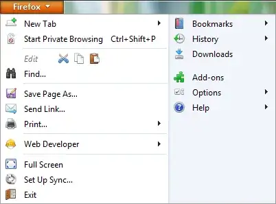
Did you notice the pattern? Just in case: any action that has a further action has an.... ellipsis. A real one, not an icon.
From Ellipsis
The ellipsis is used as an operator in some programming languages. The precise meaning varies by language, but it generally involves something dealing with multiple items
Thus, as any ellipsis, it's placed on the right of the associated element, because you simply can't display a set of associated child actions before you show the parent, it simply makes no sense!
And the same way, when you use the icon, it should be to the right, because it means there's an action associated to that element.
All the above being said, I'm not sure that placing of the icon is the biggest problem in this UI. Just think about this: what if you want to delete several items at the same time? Opening a menu, selecting Delete, confirming it and starting again with the next item is very bad UX, so I'd suggest to replace that icon with a checkbox and add a set of global actions whenever possible, then the ellipsis on the right of the item, just like in Andre's example.
And if the actions aren't more than a few, then repeat icons per row. For example, I think just an edit icon should suffice and it will be way more clear than an ellipsis, no matter where it's placed
- 37,944
- 15
- 79
- 140
-
2Interesting, I've never made the connection between this icon and the sub-menu hints from desktop applications. – Andre Dickson Oct 01 '16 at 21:20
-
Thanks Devin. In our particular use case, users do not need the option to delete multiple selections. If that were the case, then I would agree that a checkbox would be necessary to solve that problem. I do like the idea of just an "edit" icon with a label is best to make it obvious what actions are available. Thank you! – bobbyo23 Oct 04 '16 at 13:42


