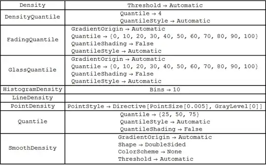
To get the options available for various ChartElementDataFunctions you can use:
 {#, Column[ChartElementData[#, "Options"]]} & /@
   ChartElementData["DistributionChart"] // Grid[#, Frame -> All] &
For "HistogramDensity", any bin specification accepted by Histogram > MoreInformation can be used as the setting for the suboption "Bins":

data = Table[RandomVariate[NormalDistribution[RandomInteger[5], 1], 100], {3}];

Partition[Table[DistributionChart[data, ChartStyle -> "SolarColors",
ChartElementFunction -> (ChartElementDataFunction["HistogramDensity", "Bins" -> i]),
PlotLabel -> Row[{"\"Bins\"", "->", ToString@i}], ImageSize -> 200],
{i, {10, 5, {.3}, {0, 8, .5}, {{0, 1, 2, 5, 6, 8}},
 Automatic, "Sturges", "Scott", "FreedmanDiaconis", "Knuth",
 "Wand", "Log",
 {"Log", "Sturges"}, {"Log", "Scott"}, {"Log",
  "FreedmanDiaconis"}, {"Log", "Knuth"}}}], 4] //
Grid[#, Frame -> All, Spacings -> 5] &

... including custom bin specifications like
binFunc1 = Union[IntegerPart[#]] &;
binFunc2 = Quantile[#, {0, .05, .1, .25, .5, .75, .9, .95, 1.}] &;
binFunc3 = First[HistogramList[#, "FreedmanDiaconis"]] &;
binFunc4 = Sort@#[[RandomSample[Range@Length@#, 10]]] &;

Partition[Table[DistributionChart[data, ChartStyle -> "Rainbow",
 ChartElementFunction -> (ChartElementDataFunction[
   "HistogramDensity", "Bins" -> i]),
 PlotLabel -> Row[{"\"Bins\"", "->\n", ToString@i}],
 ImageSize -> 300],
 {i, {binFunc1, binFunc2, binFunc3, binFunc4}}], 2] //
 Grid[#, Frame -> All, Spacings -> 5] &

For "Quantile", "FadingQuantile", "GlassQuantile" and "DensityQuantile", the settings for suboption "Quantile" can be either an integer n (short for the n-1 quantiles 100 i/n (i = 1, ... , n-1) or an explicit list of integers between 0 and 100. Furthermore, each of the explicitly specified quantiles can be styled individually using the suboption "QuantileStyle".
Partition[Table[DistributionChart[data,
ChartElementFunction -> (ChartElementDataFunction["GlassQuantile",
   "Quantile" -> i,
   "QuantileStyle" -> (Directive[Thick, Hue[#/100]] & /@ i),
   "QuantileShading" -> True]),
PlotLabel -> Row[{"Quantiles:  ", ToString@i}], ImageSize -> 300],
{i, {4, {25, 50, 75}, {10, 90}, {5, 10, 25, 50, 75, 90, 95}}}], 2] //
Grid[#, Frame -> All, Spacings -> 5] &

The option setting for "Threshold" seems to control symmetric trimming at the two tails as the following examples suggest. (Perhaps, further fishing may reveal that it accepts additional values to control the bandwidths)
Row@Table[DistributionChart[data,
 ChartElementFunction -> (ChartElementDataFunction["SmoothDensity",
  "ColorScheme" -> "DeepSeaColors", "Threshold" -> i]),
 ImageSize -> 300], {i, {.05, .1, .5}}]

Row@Table[DistributionChart[data, ChartStyle -> "SolarColors",
 ChartElementFunction -> (ChartElementDataFunction["Density", "Threshold" -> i]),
 ImageSize -> 300], {i, {.05, .1, .5}}]


ChartElementFunction, but that turned out to be very daunting indeed. – Raphael Sep 25 '12 at 20:17