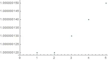
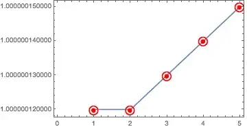
Here is an approach that essentially sidesteps whatever problem ListPlot seems to have in creating an appropriate plot range and ticks. Instead of plotting the values themselves, it may be more useful to plot the differences between the values and the minimum to highlight a trend. The rest of the code is just there to create some reasonably readable ticks, expressed in "parts per billion difference" on the vertical axis:
ListPlot[
 list - Min[list],
 PlotStyle -> {Red, PointSize[0.02]},
 PlotRange -> {{0.5, 5.5}, Automatic},
 PlotRangePadding -> {None, Scaled[0.1]},
 Frame -> True, Axes -> None,
 FrameLabel -> {None, Style["difference / ppb", Black, 16]},
 FrameTicks ->
  {Automatic,
   Function[{min, max},
    With[{vals = Subdivide[0, Round[max, 1*^-8], 6]},
     Transpose@
      {vals, Rationalize[1*^9 vals, 0]}
    ]
   ]
  },
 FrameTicksStyle -> Directive[Black, 12]
]

As an aside, this is an example of the kind of gymnastics that are sometimes necessary to produce a decent-looking plot in MMA, and a strong case for the use of e.g. SciDraw, which makes some of these adjustments quite a bit more flexible.


PlotRangespecs has to bePlotRange -> {{xmin, xmax}, {ymin, ymax}}, where one or both{min,max}can beAutomatic. So you can doListPlot[list, PlotRange -> {Automatic, {Min[list], Max[list]}}]– Marius Ladegård Meyer Jun 01 '16 at 14:17MinMax, e.g.PlotRange -> {Automatic, MinMax[list]}. – rcollyer Jun 01 '16 at 18:00Standardizeis useful here I think. – chuy Jun 01 '16 at 20:09Standardize, that looks promising. – mrz Jun 01 '16 at 21:50ListPlot[Standardize[list], PlotRange-> All,Frame-> True, Axes-> False, Filling-> Axis]is one possible way. The y-axis now represents how many standard deviations a point is away from the mean. – chuy Jun 02 '16 at 13:53