11

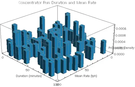
I'd like to modify this chart to relocate the z axis label so it's not over printing the values.

data = RandomReal[{0, 100}, {100, 2}];
Histogram3D[data, 20, "ProbabilityDensity", 
AxesLabel -> {Style["Mean Rate (tph)", "Text"], 
Style["Duration (minutes)", "Text"], 
Style["Probability Density", "Text"]}, ImageSize -> Large, 
PlotLabel -> Style["Concentrator Run Duration and Mean Rate", 18], 
ChartStyle -> TSGblue, ViewPoint -> {Pi, Pi, 2}]

enter image description here

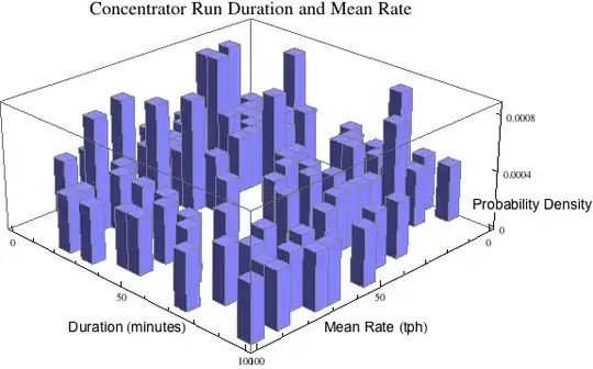
I can rotate the label but the values are still over printed.

enter image description here

Cam
  • 1,596
  • 12
  • 20

4 Answers4

8

Some improvement can be achieved by filling in the background of the axess labels and by reducing the number of ticks on z.

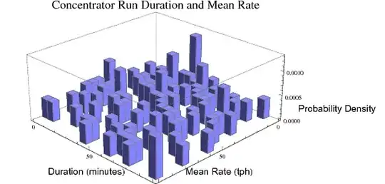
AxesLabel -> {Style["Mean Rate (tph)", "Text", Background -> White], 
 Style["Duration (minutes)", "Text", Background -> White], 
 Style["Probability Density", "Text", Background -> White ]}

Ticks -> {Automatic, Automatic, {0, .0004, .0008}}

Mathematica graphics

DavidC
  • 16,724
  • 1
  • 42
  • 94
4

It's not an elegant solution but if you include ImagePadding and also offset the label with whitespace, this should work:

data = RandomReal[{0, 100}, {100, 2}];
Histogram3D[data, 20, 
"ProbabilityDensity",AxesLabel -> {Style["Mean Rate (tph)", "Text"], 
Style["Duration (minutes)     ", "Text"], 
Style["                Probability Density", "Text"]}, 
ImageSize -> Large, 
PlotLabel -> Style["Concentrator Run Duration and Mean Rate", 18], 
ChartStyle -> TSGblue, ViewPoint -> {Pi, Pi, 2}, 
ImagePadding -> {{40, 150}, {0, 0}}]

histogram with image padding

Jonathan Shock
  • 3,015
  • 15
  • 24
4

Seems very hard to control the position of the labels. But at least it's easy to make the labels more readable.

Histogram3D[data, 20, "ProbabilityDensity",
 AxesLabel -> {Panel@Style["Mean Rate (tph)", "Text"],
   Panel@Style["Duration (minutes)", "Text"],
   Framed[Panel@Style["Probability Density"], 
     FrameMargins -> 25, 
     FrameStyle -> None]},
 PlotLabel -> 
  Panel@Style["Concentrator Run Duration and Mean Rate", 18],
 ChartStyle -> "Pastel",
 ImageSize -> 600,
 ViewPoint -> {Pi, Pi, 2}]

enter image description here

cormullion
  • 24,243
  • 4
  • 64
  • 133
  • Are those OSX Panels? By the way, you are hardly a "Mathematica novice" at this time; you should remove that from your profile. – Mr.Wizard Mar 15 '13 at 02:01
  • @Mr.Wizard Yes, I'm on OSX, but I don't know how their appearance differs on other platforms. (And I still feel relatively novice-like compared with you lot!:) – cormullion Mar 15 '13 at 07:37
  • 1
    On Windows 7 they are boring: http://i.stack.imgur.com/JsLZz.png. (True, you're not Leonid yet but you are no novice either.) – Mr.Wizard Mar 15 '13 at 07:47
0

I may be late to this party but another helpful hack is to include line breaks in the axis labels. Something like this worked for me:

AxesLabel -> Table[Style[zz, Background -> White], {zz, {"x0","x","\n \n \n \n \n v"}}]
CMichael
  • 161
  • 7