19

I noticed that all important "Geoprojections" are available in projections for a spherical reference models: GeoProjectionData function;

1 - I am trying using the sinusoidal projection for astronomical data purposes. I want to use the frames of this projection to plot astronomical points in that map , using right ascension and declination as the coordinates, both in degrees.

In the link below, is a data that can be used, the format is { {RA,DEC, Velociy},....}. Just need the RA, DEC parameters.

DataSample

a. I got the data in {Dec, Ra} :

p = Reverse[#] & /@ rad[[All, {1, 2}]]

b.then I transformed the parameters DEC RA, to sinusoidal numbers:

dat = GeoGridPosition[GeoPosition[p], "Sinusoidal"][[1]]

c. I did the following code:

 GeoListPlot[dat, GeoRange -> All, GeoProjection -> "Sinusoidal", 
 GeoGridLines -> Automatic, 
 GeoGridLinesStyle -> Directive[Dashing[{0.0005, 1 - 0.9950}], Green],
  GeoBackground -> Black, Frame -> True, 
 FrameLabel -> {"RA (\[Degree])", "DEC (\[Degree])"},  
 PlotMarkers -> Style[".", 10, Red]]

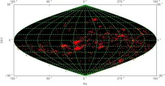
And the resulting plot is:

SINUSOIDAL PROJECTION PLOT

But no data was plotted.

And the ranges of Frame Axis are wrong: the horizontal axis has to be middle to left 0 90 180, and middle to right 0 (or 360) 270 180.

In the Vertical Axis: -90(bottom) 0(center) +90(top)

EDIT 1:

The link to wolfram math world about sinusoidal projection : Sinusoidal

J. M.'s missing motivation
  • 124,525
  • 11
  • 401
  • 574
locometro
  • 861
  • 5
  • 14

2 Answers2

22

Edit: for general approach to Ticks, go there: GeoProjection for astronomical data - wrong ticks


data = Cases[ Import[FileNames["*.dat"][[1]]],
              {a_, b_, c_} :> {b, Mod[a, 360, -180]}]; (*thanks to bbgodfrey*)

To show points you have to stick with GeoGraphics. GeoListPlot is designed for Entities.

To add something more to the question I changed Ra to hours.

    GeoGraphics[{Red, Point@GeoPosition@data}, 
      GeoRange -> {All, {-180, 180}},
      PlotRangePadding -> Scaled@.01,
      GeoGridLinesStyle -> Directive[Green, Dashed], 
      GeoProjection -> "Sinusoidal", 
      GeoGridLines -> Automatic, 
      GeoBackground -> Black, 
      Axes -> True, 
      ImagePadding -> 25, ImageSize -> 800, 
      Ticks -> {Table[{N[i Degree], Row[{Mod[i/15 + 24, 24]," h"}]}, {i, -180, 180, 30}], 
                Table[{N[i Degree], Row[{i, " \[Degree]"}]}, {i, -90, 90, 15}]}, 
      Background -> Black, 
      AxesStyle -> White, 
      TicksStyle -> 15]

enter image description here

Or change every option with Axes to Frame and:

enter image description here


With coloring:

pre = Cases[ Import[FileNames["*.dat"][[1]]], {a_, b_, c_} :> {b, Mod[a, 360, -180], c}];
data = pre[[All, {1, 2}]];
col = Blend[{Yellow, Red}, #] & /@ Rescale[pre[[All, 3]]];


GeoGraphics[{AbsolutePointSize@5, 
  Point[GeoPosition@data, VertexColors -> (col)]}, ...

enter image description here


pics = Table[
   GeoGraphics[{AbsolutePointSize@5, 
     Point[GeoPosition[{#, Mod[#2, 360, -180 + t]} & @@@ data], 
      VertexColors -> (col)]}, PlotRangePadding -> Scaled@.01,
    GeoGridLinesStyle -> Directive[Green, Dashed], 
    GeoProjection -> "Bonne", GeoGridLines -> Automatic, 
    GeoBackground -> Black, ImagePadding -> 55, ImageSize -> 400, 
    GeoRange -> "World", GeoCenter -> GeoPosition[{0, t}],
    Background -> Black, FrameStyle -> White, FrameTicksStyle -> 15],
   {t, -180, 170, 5}];

Export["gif.gif", pics, "DisplayDurations" -> 1/24.]

enter image description here

Kuba
  • 136,707
  • 13
  • 279
  • 740
  • 1
    I interpret the first bullet under "Details and Options" in the GeoListPlot documentation to mean that it accepts information acceptable to GeoPosition, which takes numerical locations as well entities. In any case, nice job! – bbgodfrey Jan 25 '15 at 17:24
  • @bbgodfrey Good point! and it works: GeoListPlot[{GeoPosition /@ data},... but you have to Map... which is slower... Don't ask me why one have to map.. – Kuba Jan 25 '15 at 17:32
  • Kuba , amazing..Well, only thing is that the horizontal scale is inverted. The correct would be: 12....4...2 0 20...18....12. Think that you are running as a clock to the left from zero, turn around in the "back" of the map and returning through th right corner. But camon, it almost an masterpiece what both guys have done, :). A last question, I need to use a coloring (function or data) for each point, is that possible ? Lets say that I have data = {{a,b,c},....} , where c, is parameter that I want do color the points {a,b}, it is the Velocity parameter in the sample. – locometro Jan 25 '15 at 18:20
  • @locometro Thanks, I will come back here as soon as I understand (or fail) what's going on there. – Kuba Jan 25 '15 at 18:43
  • @locometro coloring added. unfortunately I don't know how to reverse Ra quickly. But I will try one day, don't have more time now. Good luck. – Kuba Jan 25 '15 at 20:30
  • Masterpiece.Thanks again – locometro Jan 25 '15 at 23:11
  • Marvelous. How to modify it to work with Mollweide projection? I mean, it works when Sinusoidal is changed to Mollweide, but then the (white) ticks do not coincide with (green) lines. I used today for the first time the Geo... commands so I have no idea how does it work. I expected than a simple change of projection would make everything fit. – corey979 Jul 31 '15 at 20:34
  • @corey979 sorry for delay, a lot on my head lately, hope I've answerd all your questions. :) – Kuba Aug 03 '15 at 08:55
12

Import data (from wherever it is located):

rad = Import["C:/Temp/DadosRad2014_RADECVELOC_15124_1024.dat"]

Reverse first two elements of each sublist of rad, assure that RA lies in between -180 and 180, and discard third element;

p = Cases[rad, {a_, b_, c_} -> {b, Mod[a, 360, -180]}];

Fix GeoGridLines, adjust ImageSize, and adjust FrameTicks and FrameLabel to reflect that angles are measure in radians:

dat = GeoGridPosition[GeoPosition[p], "Sinusoidal"][[1]];
grid = GeoListPlot[dat, GeoRange -> All, GeoProjection -> "Sinusoidal", 
  GeoGridLines -> Automatic, GeoGridLinesStyle -> Directive[Dashing[{.01, .005}], Green], 
  GeoBackground -> Black, Frame -> True, FrameLabel -> {"RA (rad)", "DEC (rad)"}, 
  PlotMarkers -> Style[".", 10, Red], ImageSize -> Large,
  FrameTicks -> {{-Pi, -Pi/2, 0, Pi/2, Pi}, {-Pi/2, 0, Pi/2}}]

grid

Although, for reasons that are unclear, the data points do not appear on the grid, they can be plotted separately.

data = ListPlot[dat, PlotStyle -> Red, Axes -> False, Frame -> True, 
  FrameLabel -> {"RA (rad)", "DEC (rad)"}, ImageSize -> Large, 
  PlotRange -> {{-Pi, Pi}, {-Pi/2, Pi/2}}, 
  FrameTicks -> {{-Pi, -Pi/2, 0, Pi/2, Pi}, {-Pi/2, 0, Pi/2}}]

data

Although attempting to directly overlay the two plots with Show generates errors, it is possible to overlay the Graphics Part of grid with data to obtain the desired result. (The order of the two plots in Show matters.)

Show[grid[[1]], data, ImageSize -> Large]

grid plus data

Update

It turns out that GeoListPlot did not display the data points in the procedure above, because GeoPosition is not Listable. This can be overcome by Threading Geoposition over the data points (or Mapping it, as suggested by Kuba in a Comment):

GeoListPlot[Thread[GeoPosition[p]], GeoRange -> All, GeoProjection -> "Sinusoidal", 
 GeoGridLines -> Automatic, GeoGridLinesStyle -> Directive[Dashing[{.01, .005}], Green], 
 GeoBackground -> Black, Frame -> True, FrameLabel -> {"RA", "DEC"}, 
 PlotMarkers -> Style[".", 20, Red], ImageSize -> Large, 
 FrameTicks -> {{{-Pi + .001, Row[{180, " \[Degree]"}]}, {-N[Pi/2], Row[{90, " \[Degree]"}]},
 {0., Row[{0, " \[Degree]"}]}, {0.5 Pi, Row[{270, " \[Degree]"}]}, 
 {Pi - .001, Row[{180, " \[Degree]"}]}}, {{-0.5 Pi, -Row[{90, " \[Degree]"}]}, 
 {0., Row[{0, " \[Degree]"}]}, {0.5 Pi, Row[{90, " \[Degree]"}]}}}]

(The choice of FrameTicks is motivated by one of the OP`s Comments.)

threaded result

bbgodfrey
  • 61,439
  • 17
  • 89
  • 156
  • I thought two things, first the RA range runs from 0 to 360, my doubt is if sinusoidal conversion takes this account. As in geographic coordinates it has 0 -> 180, or 0 -> - 180, there is no long above +- 180. – locometro Jan 24 '15 at 22:53
  • maybe,but If you see the graphic, just one side is plotted. – locometro Jan 25 '15 at 01:33
  • bb, its almost there... SO I think if I could creat my own sinusoidal plot, with frames etc... I know that geographics plot are not ideal for using astronomical data, but while wolfram does not see astronomical area closer, we ll have to improvised...Or do a specific code for astro plotting... – locometro Jan 25 '15 at 12:44
  • 1
    @locometro Glad I could help. If the Answer meets your needs, please accept it. Also, if you do not mind, I may ask a more general Question about whether GeoListPlot does not work due to a bug or because we choose the wrong options. I have learned a lot investigating the guts of GeoListPlot, but not enough to know the root cause. – bbgodfrey Jan 25 '15 at 13:43
  • Inverted in which respect, left to right, top to bottom, something else? Easy to fix. – bbgodfrey Jan 25 '15 at 15:27
  • To be clear, you would like tick horizontal labels to be 180, 90, 0, 270, 180 (from left to right)? Perhaps, vertical labels of -90, 90 (from bottom to top) too? These can be done but probably not until this evening. Does the figure itself need changes? By the way, you might want to delete any old Comments of yours that no longer are relevant. I just eliminated a few of mine with no archival value. – bbgodfrey Jan 25 '15 at 16:04
  • yes, the labels are like that, the vertical would be : top 90, center 0, bottom -90 (of course, the points are not in degrees , but the ticks represents the planisphere scale in degrees, I know the right would be using the same scale of sinusoidal points, but for a question of clarity the ticks in degrees are more suitable for positioning in sky understandings) – locometro Jan 25 '15 at 16:10