Is there a built-in way in pgfplots to make rug plots? The rug refers to the tick marks on the inside of the axis. There is one tick mark per datapoint represented in the plot.
Like this:

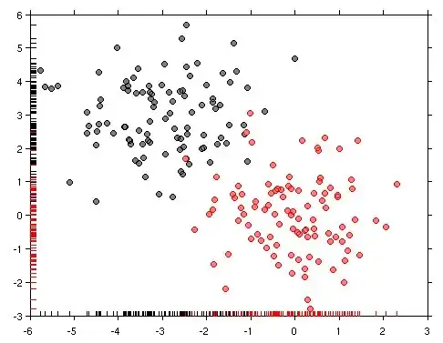
(source: pydata.org)
or even this:
?
I don't know if its just my not reading the manual correctly, or if it isn't there.
Thanks
.
edit: Here is some histogram data I made up. I've added the code I think should make the ticks: Plotting a 2D gaussian sample and I've changed the fill opacity to see if that helped, which it didn't.
\usepackage{pgfplots}
\usepackage{pgfplotstable}
\begin{document}
\begin{tikzpicture}
\begin{axis}[
    xlabel={$x$},
    ylabel={Count},
    axis lines = left,
    every outer x axis line/.append style= {-},
    every outer y axis line/.append style= {-},

    xmin=-3, xmax=3,
    ybar=0pt, bar width=1,
   xtick=data,
    xticklabel=\empty,
    extra x ticks={-3,...,3},
    every extra x tick/.style={
        tick align=outside,
        xticklabel=\pgfmathprintnumber{\tick}
    },
]
\addplot[
black,
fill=red,
  fill opacity=0.02,
hist={bins=12},
]
    table[row sep=\,y index=0] {
        data\
-0.3662\ 0.8510\ -0.6391\ -1.8496\ 1.3160\ -0.3006\ -0.1287\ 0.9324\ 0.4970\ -2.1474\
0.0184\ 0.2656\ -0.4691\ 0.4598\ -0.3074\ -0.9293\ 0.6791\ -0.9676\ -0.5833\ 2.7928\
0.4582\ 0.7967\ 0.8900\ -0.9640\ 0.1757\ -0.8618\ 0.8212\ 0.0399\ 0.9268\ -0.5465\
1.4702\ -2.0286\ 0.4796\ -1.3354\ -1.8256\ -0.9834\ 0.5041\ -0.5414\ 1.1379\ 1.2965\
0.1740\ 0.4718\ 0.9251\ -0.2399\ 0.0854\ -2.7529\ -0.1187\ 0.8095\ -0.3766\ 0.8983\};
\end{axis}
\end{tikzpicture}
\end{document}

xtick=datato theaxisoption. Then you would get a tick at every data point (of course only in one color). But because you don't want to have each of the ticks labeled, you should also addxticklabels={}to the axis options. To then have the normal axis ticks and labels you can use theextra x ticks. The same could be done for the y-axis. – Stefan Pinnow Aug 08 '17 at 06:28