3

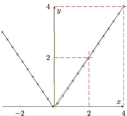
I found very strange that the points in the first quadrant of the first picture in https://tex.stackexchange.com/a/310508/132405 are not aligned with the origin point (the red line doesn't pass by the red dot):

enter image description here

The code (from Torbjørn T.) is:

\documentclass{article}

\usepackage{pgfplots} \begin{document}

\begin{tikzpicture} \begin{axis} [ axis lines = {center}, width = {0.6\linewidth}, ylabel = {$y$}, xlabel = {$x$}, ytick distance = {2}, minor y tick num = {1} ]

\addplot    [
            mark = x, domain= -3:4
            ]
            {abs(x)};

\end{axis} \end{tikzpicture}

\end{document}

This code is correct, but shows the bug.

If we look carefully, we see that the distance in the y-axis between 0 and 1 is smaller than the distance between 1 and 2 or between 2 and 3 on the y-axis: see the lime lines in the next picture (all have the same height):

enter image description here

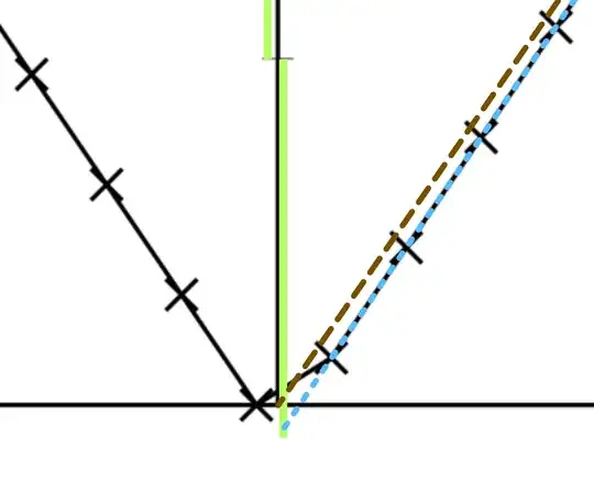
With a zoom on origin:

enter image description here

The dots (x marks) must be on the brown line.

Is there a workaround? I read at https://github.com/pgf-tikz/pgfplots/issues/400#issuecomment-893904915 that the maintainer is almost inactive.

In the wait of the correction of the package, how can we known when this severe bug occurs (for a plotting tool, it's a severe bug) and what to use instead?

Bug opened on https://github.com/pgf-tikz/pgfplots/issues/423.
Stefan Pinnow
  • 29,535
quark67
  • 4,166
  • 1
    Not a bug I think, try setting ymin=0. – Torbjørn T. Jan 13 '22 at 14:53
  • Or try adding \node at (axis cs:1,1) {\pgfkeysvalueof{/pgfplots/ymin}}; just before \end{axis} to see what ymin actually is. – Torbjørn T. Jan 13 '22 at 14:55
  • @TorbjørnT. Why must we setting ymin=0 when with the plotting of the function y=x, we don't have to do it (function plotted between 0 and 4 for example)? – quark67 Jan 13 '22 at 14:57
  • In that case you'll get a data point at y=0. So probably that in combination with whatever axis lines=center does with regard to axis limits, but haven't checked. – Torbjørn T. Jan 13 '22 at 15:00
  • With some primary school math you will arrive at domain=-3:4,samples=29. – Henri Menke Jan 13 '22 at 15:02
  • 1
    The fact is that the function is calculated at the sample points, and in the example no sample point hits y=0; so pgfplots concludes you do not need 0 in the y range and the x-axis is not at y=0. – Rmano Jan 13 '22 at 15:06
  • 1
    Note altso that axis lines=center implies enlargelimits=false, which in turn means no extra space is added inside the axis. If axis lines had been replaced by grid in the original code, the confusion wouldn't have happened in the first place I think, because 0 would be in the y-range. – Torbjørn T. Jan 13 '22 at 15:49
  • even simpler would be to use samples at={-3,0,4} instead of domain ... – Stefan Pinnow Jan 13 '22 at 16:43
  • @Henri Menke At primary school we learn (at least in France) that the horizontal axis with an arrow at the right is called the abscissa axis, and it has the equation y=0. – quark67 Jan 13 '22 at 17:28

1 Answers1

7

This is not a bug, just a misunderstanding ;-). In such cases, it is very useful the trick to print the values of the points; search in the manual for point meta and nodes near coords. But basically the idea is this:

\documentclass{article}

\usepackage{pgfplots}\pgfplotsset{compat=1.18} \begin{document}

\begin{tikzpicture} \begin{axis} [ axis lines = {center}, width = {0.6\linewidth}, ylabel = {$y$}, xlabel = {$x$}, ytick distance = {2}, minor y tick num = {1} ]

\addplot    [
            mark = x, domain= -3:4,
            nodes near coords, point meta=y,
            nodes near coords style={color=red, font=\tiny, anchor= east},
            ]
            {abs(x)};

\end{axis} \end{tikzpicture}

\end{document}

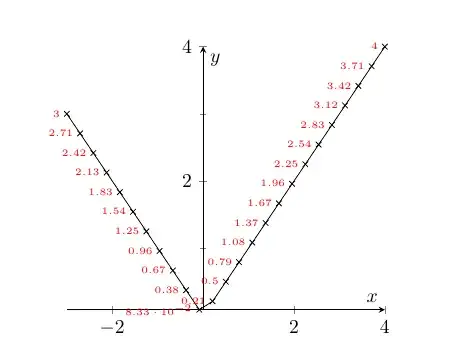
which gives:

enter image description here

where it is evident what is happening: the minimum value of y is 0.0833 which is where the x-axis is placed, as explained in the manual on page 273:

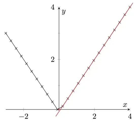
enter image description here

As an aside, texdoc pgfplots shows "Revision 1.18.1 (2021/05/15)", so it's quite maintained (although if you do not use the compat key you are asking for the old implementation, as the warning tells you).

Rmano
  • 40,848
  • 3
  • 64
  • 125
  • Yes, for me, the horizontal line with an arrow at the right was the abscissa axis, which has the equation y=0 (in France, we have learned this). But unfortunately, on GitHub, the maintainer of pgf-tikz has only one behaviour: insulting me, claiming I don't known basic math. I'm shocked by his rude behaviour. – quark67 Jan 13 '22 at 17:25
  • Well, you said that the package has a "fundamental flaw" without checking a bit more the subject. I think Henri felt that quite rude, too, so the best thing is calming down and add smiles :-). Thanks for the tick! – Rmano Jan 13 '22 at 17:35
  • BTW: usually the abscissa axis is y=0. But now always; if I am showing a range from 200 to 220, for example; or if the y axis is logarithmic. But I understand the misunderstanding; I quite remember having answered another similar question where the axis ended at y=1... Yes, found: https://tex.stackexchange.com/questions/584446/incorrect-graph-output-using-pgfplots – Rmano Jan 13 '22 at 17:38