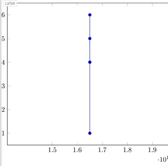
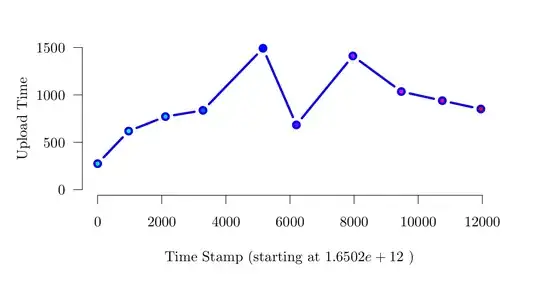
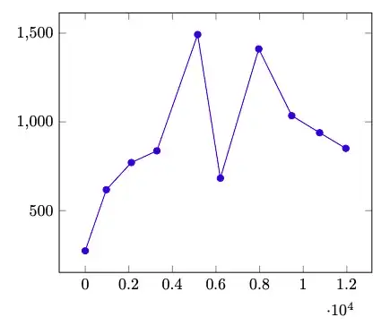
I'm a latex noob and I'm trying to plot the following csv, which contains linux epoch time, which is what i want to use as x axis, and uploadtime/totalDocs which i would like to plot on the y axis. However my latex code always plots it as a single line and using xmin/xmax did not improve my situation, could you please tell me how to improve the scale and maybe link me to the relevant documentation
Thank you
timestamp,uploadtime,totalDocs
1650200149709,274,10000
1650200150676,618,20000
1650200151824,771,30000
1650200152994,837,40000
1650200154867,1492,50000
1650200155908,683,60000
1650200157670,1411,70000
1650200159183,1035,80000
1650200160461,939,90000
1650200161664,851,100000
\begin{document}
\begin{tikzpicture}
\begin{axis}
\addplot table [x=timestamp, y=uploadtime, col sep=comma] {PICS/1_container_load_logs_edit.csv};
\end{axis}
\end{tikzpicture}
\end{document}


