The computer algebra system (CAS), Sage, knows about Bessel functions and, through the sagetex package it can calculate the points that LaTeX needs to plot with the tikz package.
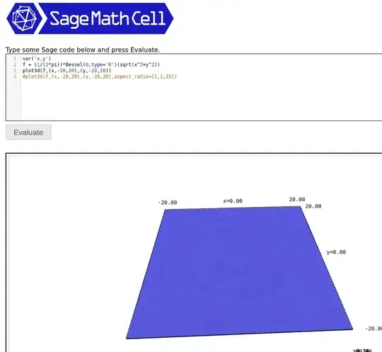
I don't have experience with the Bessel function, so after reading the documentations I went to a Sage Cell Server to see what the result should look like. Copy/paste the code below into the Sage Cell server:
var('x,y')
f = (1/(2*pi))*Bessel(0,type='K')(sqrt(x^2+y^2))
plot3d(f,(x,-20,20),(y,-20,20))
#plot3d(f,(x,-20,20),(y,-20,20),aspect_ratio=[1,1,25])
and press Evaluate then you will get a plot that, if you reach in and rotate it, will look something like:
Now remove the hashtag before line 4 and add a hashtag before line 3. Press Evaluate, rotate the plot, and you can get something like this:
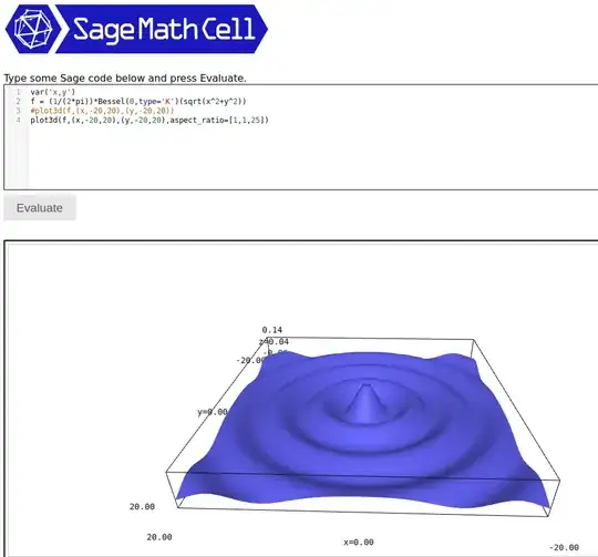
In summary, the accurate plot will have a small height and playing with the aspect ratio will show useful detail.
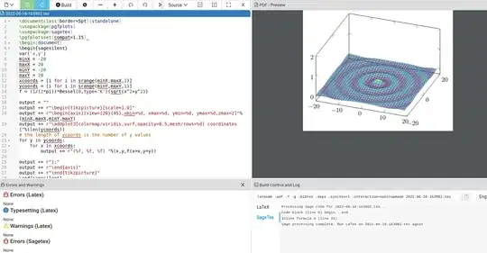
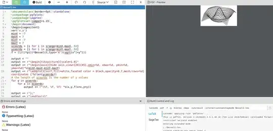
With that in mind the LaTeX code below will plot the modified Bessel function.
\documentclass[border=5pt]{standalone}
\usepackage{pgfplots}
\usepackage{sagetex}
\pgfplotsset{compat=1.15}
\begin{document}
\begin{sagesilent}
var('x,y')
minX = -20
maxX = 20
minY = -20
maxY = 20
xcoords = [i for i in srange(minX,maxX,1)]
ycoords = [i for i in srange(minY,maxY,1)]
f = (1/(2*pi))*Bessel(0,type='K')(sqrt(x^2+y^2))
output = ""
output += r"\begin{tikzpicture}[scale=1.0]"
output += r"\begin{axis}[view={20}{45},xmin=%d, xmax=%d, ymin=%d, ymax=%d]"%(minX,maxX,minY,maxY)
output += r"\addplot3[colormap/viridis,surf,opacity=0.5,mesh/rows=%d] coordinates {"%(len(ycoords))
the length of ycoords is the number of y values
for y in ycoords:
    for x in xcoords:
        output += r"(%f, %f, %f) "%(x,y,f(x=x,y=y))
output += r"};"
output += r"\end{axis}"
output += r"\end{tikzpicture}"
\end{sagesilent}
\sagestr{output}
\end{document}
The output is:
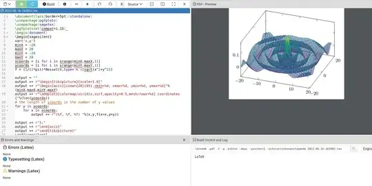
We know this plot has exaggerated the z-axis. This can be corrected to what you want by forcing a maximum z value. For example, I added zmax=2 on line 18 to get:
Sage is not part of LaTeX so you will either have to download it from the Sagemath site or open up a free Cocalc account. With the Cocalc account you can be up and running in 5-10 minutes; all you need to do is create a LaTeX document, copy/paste the code in, and press the Build button.
EDIT: With respect to your comment below, there are several methods for getting .png output. With Sage, it's trivial. The picture from the Sage Cell server has an "i" in a circle to the bottom right of the picture.
If you left click on it, a menu opens up with an option to create a .png.
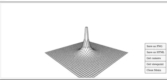
With respect to LaTeX, you can get a similar look with the following code:
\documentclass[border=5pt]{standalone}
\usepackage{pgfplots}
\usepackage{sagetex}
\pgfplotsset{compat=1.15}
\begin{document}
\begin{sagesilent}
var('x,y')
minX = -7
maxX = 7
minY = -7
maxY = 7
xcoords = [i for i in srange(minX,maxX,.5)]
ycoords = [i for i in srange(minY,maxY,.5)]
f = (1/(2*pi))*Bessel(0,type='K')(sqrt(x^2+y^2))
output = ""
output += r"\begin{tikzpicture}[scale=1.0]"
output += r"\begin{axis}[hide axis,view={20}{45},xmin=%d, xmax=%d, ymin=%d, ymax=%d]"%(minX,maxX,minY,maxY)
output += r"\addplot3[surf,fill=white,faceted color = black,opacity=0.7,mesh/rows=%d] coordinates {"%(len(ycoords))
the length of ycoords is the number of y values
for y in ycoords:
    for x in xcoords:
        output += r"(%f, %f, %f) "%(x,y,f(x=x,y=y))
output += r"};"
output += r"\end{axis}"
output += r"\end{tikzpicture}"
\end{sagesilent}
\sagestr{output}
\end{document}
The output is shown below:
You'll have to play around with the code to get the look you want. The pdf can be converted to png via an external program, such as GIMP.


gnuplotmode for TikZ plot, as recent version of gnuplot define them (needs installed gnuplot and compile with shell-escape). Behind the scene does what @user202729 suggested in his/her first comment. – Jhor Jun 16 '22 at 07:19