1

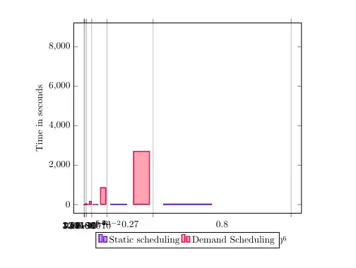
I am trying to draw this graph, one is linear another is exponential and proportional to the size of the data. The numbers are so different from each other, I don't know how to make it more understandable.

Is it possible to make this bar chart horizontal or a log line chart?

\documentclass{article}
\usepackage[margin=0.5in]{geometry}
\usepackage{textcomp}
\usepackage{pgfplots}
\pgfplotsset{width=10cm,compat=1.9}

\begin{document}

\begin{tikzpicture} \begin{axis}[ x tick label style={ /pgf/number format/1000 sep=}, xlabel=AST nodes, ylabel=Time in seconds, enlargelimits=0.05, legend style={at={(0.5,-0.1)}, anchor=north,legend columns=-1}, ybar interval=0.7 ] \addplot coordinates {(3,0.009)(30,0.003)(111,0.005)(354,0.019)(1083,0.097)(3270,0.044)(9831,0.064)(29514,0.501)(88563,2.276)(265710,7.439)(797151,27.578)(2391474,128.611)}; \addplot coordinates {(3,0.091)(30,0.495)(111,2.789)(354,3.390)(1083,5.021)(3270,20.149)(9831,48.015)(29514,158.442)(88563,857.381)(265710,2693.862)(797151,8771.571)}; \legend{Static scheduling,Demand Scheduling} \end{axis} \end{tikzpicture}

\end{document}

enter image description here

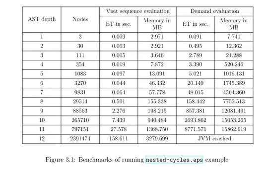
This is the source table: enter image description here

\begin{figure}[htbp]
\begin{center}
\scalebox{0.9}{
\begin{tblr}
{
colspec      = {X[c,m]X[c,m]X[c,m]X[c,m]X[c,m]X[c,m]},
cell{1}{1}   = {r=2}{},
cell{1}{2}   = {r=2}{},
cell{1}{3,5} = {c=2}{},
cell{14}{5}  = {c=2}{},
hlines,
vlines,
}
AST depth & Nodes             & Visit sequence evaluation &  & Demand evaluation &    \\
& & ET in sec.                 & Memory in MB & ET in sec.                   & Memory in MB \\
1 & 3 & 0.009 & 2.971 & 0.091 & 7.741 \\ 
2 & 30 & 0.003 & 2.921 & 0.495 & 12.362 \\ 
3 & 111 & 0.005 & 3.646 & 2.789 & 21.288 \\ 
4 & 354 & 0.019 & 7.872 & 3.390 & 520.246 \\ 
5 & 1083 & 0.097 & 13.091 & 5.021 & 1016.131 \\ 
6 & 3270 & 0.044 & 46.332 & 20.149 & 1745.389 \\
7 & 9831 & 0.064 & 57.778 & 48.015 & 4564.360 \\ 
8 & 29514 & 0.501 & 155.338 & 158.442 & 7755.513 \\ 
9 & 88563 & 2.276 & 198.215 & 857.381 & 12081.491 \\ 
10 & 265710 & 7.439 & 940.484 & 2693.862 & 15053.265 \\ 
11 & 797151 & 27.578 & 1368.750 & 8771.571 & 15862.919 \\ 
12 & 2391474 & 128.611 & 3279.699 &  \text{JVM crashed}&   \\

\end{tblr}} \end{center} \caption{Benchmarks of running \href{https://github.com/boyland/aps/blob/master/examples/nested-cycles.aps}{\texttt{nested-cycles}} example} \label{fig:nested-cycles-benchmark} The exponential nature of the demand schedule becomes evident as number of the AST nodes gets larger. \end{figure}
Node.JS
  • 685
  • 1
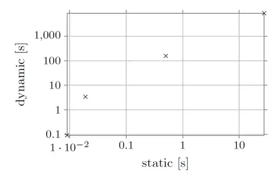
    Sorry, I don't think bars a a good communicator here. It starts with wondering what its width should mean. // A scatter plot with "AST depth" (probably) as x of lg(x), and both ET's as y or lg(y) will show more clearly. // Half-logs will show you exponential relationships, while double logs will show you (leading) polynomial relationship (e.g. try plotting y=x^n in lg-lg ... it's self-evident for the trained eye). // Anyway: What do you try to convey as message? – MS-SPO May 22 '23 at 17:11
  • I want to show the vast difference in the time it takes between "static scheduling" and "demand scheduling". The static scheduling is not thinking during the runtime, it's just following a predefined path. Demand schedule is thinking during the evaluation runtime. This is my PhD thesis, please help me out :) – Node.JS May 22 '23 at 17:22
  • 1
    Ok. Is there a way you can post the relevant table data? At the moment everybody has to type it again, or pick it from your code ... // Thanks /// BTW: why not trying a scatter plot (ET-1st-kind vs. ET-2nd-kind), probably as lg-lg? – MS-SPO May 22 '23 at 17:44

2 Answers2

4

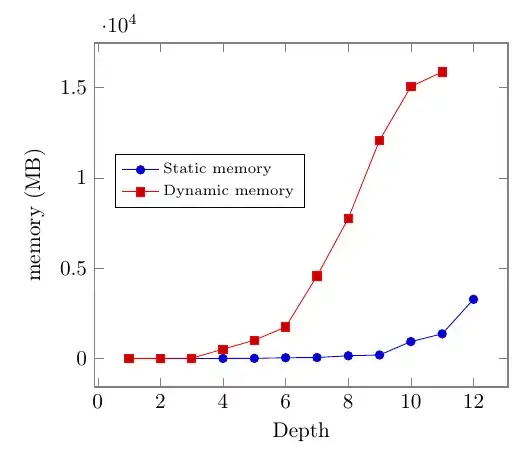
I am unsure what you want to plot here: you have a set of wildly different numbers, and it is unclear to me which are the independent variables. So I will plot memory usage against the depth, but you can adapt it quite easily to other scenarios, I hope.

I would suggest using pgfplots, loading the data whole, and then exploring the different diagrams to find one that conveys what you need. In the following example, I load the data in-memory with pgfplotstable (notice: nan means "not a number", and is useful to represent missing data), and then I plot on a linear scale the memory of the two approaches with the depth as the independent variable:

\documentclass[border=10pt]{standalone}
\usepackage[T1]{fontenc}
\usepackage{pgfplots}\pgfplotsset{compat=newest}
\usepackage{pgfplotstable}
\pgfplotstableread{
depth  Nodes    St       Sm        Dt        Dm
1      3        0.009    2.971     0.091     7.741
2      30       0.003    2.921     0.495     12.362
3      111      0.005    3.646     2.789     21.288
4      354      0.019    7.872     3.390     520.246
5      1083     0.097    13.091    5.021     1016.131
6      3270     0.044    46.332    20.149    1745.389
7      9831     0.064    57.778    48.015    4564.360
8      29514    0.501    155.338   158.442   7755.513
9      88563    2.276    198.215   857.381   12081.491
10     265710   7.439    940.484   2693.862  15053.265
11     797151   27.578   1368.750  8771.571  15862.919
12     2391474  128.611  3279.699  nan       nan
}\data
\begin{document}
\begin{tikzpicture}[]
    \begin{axis}[
        axis line style = {thick, gray},
        enlarge x limits,
        enlarge y limits,
        xlabel = {Depth},
        % every axis x label/.append style = {below, gray},
        ylabel = {memory (MB)},
        legend style = {nodes={right, font=\scriptsize},
            at={(0.05,0.6)}, anchor=west},
        clip mode = individual,
        ]
        \addplot table[x=depth, y=Sm]{\data};
        \addplot table[x=depth, y=Dm]{\data};
        \legend{Static memory, Dynamic memory}
    \end{axis}
\end{tikzpicture}
\end{document}

enter image description here

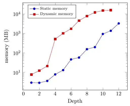
...details like formats of numbers and labels can be adjusted later. Maybe a logarithmic y-axis is better? Add

 ymode = log,

(and adjust the legend position at 0.05, 0.9) and you have:

enter image description here

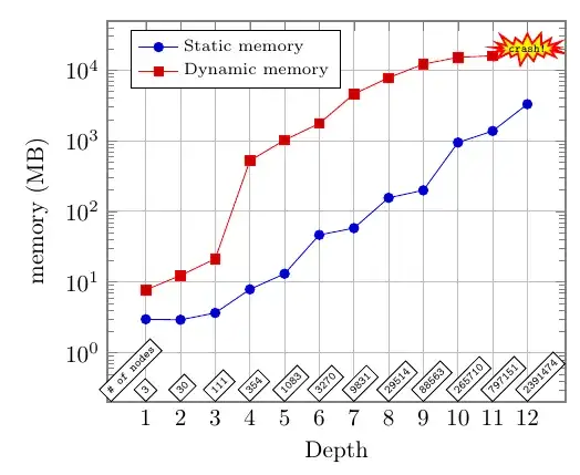
Maybe you want to add also the number of nodes for each run, and the information about the crash. This is a bit more complex, and I had to search a bit on this site, in the manuals of TikZ, and in the pgfplots/pgfplotstable's ones, but a proposal is:

\documentclass[border=10pt]{standalone}
\usepackage[T1]{fontenc}
\usepackage{pgfplots}\pgfplotsset{compat=newest}
\usetikzlibrary{shapes.symbols}% for starburst
\usepackage{pgfplotstable}
\pgfplotstableread{
depth  Nodes    St       Sm        Dt        Dm
1      3        0.009    2.971     0.091     7.741
2      30       0.003    2.921     0.495     12.362
3      111      0.005    3.646     2.789     21.288
4      354      0.019    7.872     3.390     520.246
5      1083     0.097    13.091    5.021     1016.131
6      3270     0.044    46.332    20.149    1745.389
7      9831     0.064    57.778    48.015    4564.360
8      29514    0.501    155.338   158.442   7755.513
9      88563    2.276    198.215   857.381   12081.491
10     265710   7.439    940.484   2693.862  15053.265
11     797151   27.578   1368.750  8771.571  15862.919
12     2391474  128.611  3279.699  nan       nan
}\data
\begin{document}
\begin{tikzpicture}[
    slanted blocks/.style={
        draw, fill=white, font=\tiny\ttfamily, rotate=45,
        anchor=south west, inner sep=2pt
    }]
    \begin{axis}[
        axis line style = {thick, gray},
        ymode = log,
        ymin = .2,
        xtick = {1,2,...,12},
        xlabel = {Depth},
        ylabel = {memory (MB)},
        legend style = {nodes={right, font=\scriptsize},
            at={(0.05,0.9)}, anchor=west},
        clip mode = individual,
        grid = major,
        ]
        \addplot table[x=depth, y=Sm]{\data};
        \addplot table[x=depth, y=Dm]{\data};
        \legend{Static memory, Dynamic memory}
        \pgfplotsinvokeforeach{0,...,11}{
            \node[slanted blocks] at ({#1+1},.2)
                {\pgfplotstablegetelem{#1}{Nodes}\of{\data}\pgfplotsretval};
        }
        \node[slanted blocks] at (0,.2) {\# of nodes};
        \node[starburst, fill=yellow, draw=red, thick, font=\tiny\ttfamily,
            inner sep=0pt, starburst point height=6pt]
            at (12, 2e4) {crash!};
    \end{axis}
\end{tikzpicture}
\end{document}

enter image description here

Anyway, I think that before starting coding the plot in LaTeX, you should get for example gnuplot, or matlab, and try to decide which graph you want, then code it.

Rmano
  • 40,848
  • 3
  • 64
  • 125
  • This looks amazing. How to scale up this? especially when I use linear scaling the difference doesn't become distinctive. – Node.JS May 24 '23 at 15:27
  • Sorry, I do not understand what you mean here... the two series are exponential (more or less) with the "depth" variable, but with a different coefficient. One is much smaller than the other, so in linear scale is very difficult to show this (unless you plot the smaller one multiplied by some fixed factor...) – Rmano May 24 '23 at 16:30
  • 1
    All good. Thank you so much for the answer – Node.JS May 24 '23 at 16:33
2

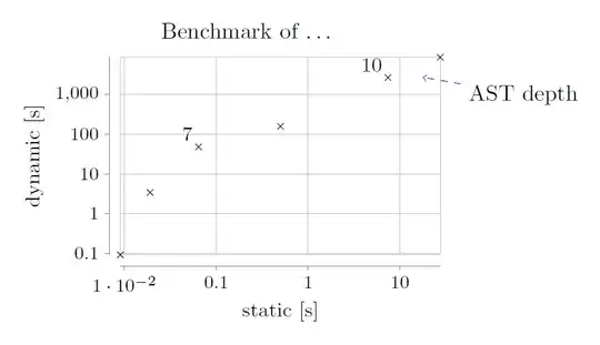
Here's a way to do it, without spending too much time into refinement (e.g. the 10 s axis could be highlighted, or ranges could be set equal, to show the vast difference; put a legend etc.) :

enter image description here

Because you didn't know for my last answer how to give credit to my solution, here's just the starting code for you, so you can claim having made progress:

\documentclass[10pt,border=3mm,tikz]{standalone}
\usepackage{tikz}
\usetikzlibrary{datavisualization}

\begin{document}

\begin{tikzpicture} \datavisualization[scientific axes, ... data{ x, y ... }; \end{tikzpicture} \end{document}

Some unfinished indication, what you could do using some more properties of said package and placing two nodes and a line:

result2

MS-SPO
  • 11,519