I'm trying to create a plot like this:

(source: uson.mx)
So far, I arrived here:
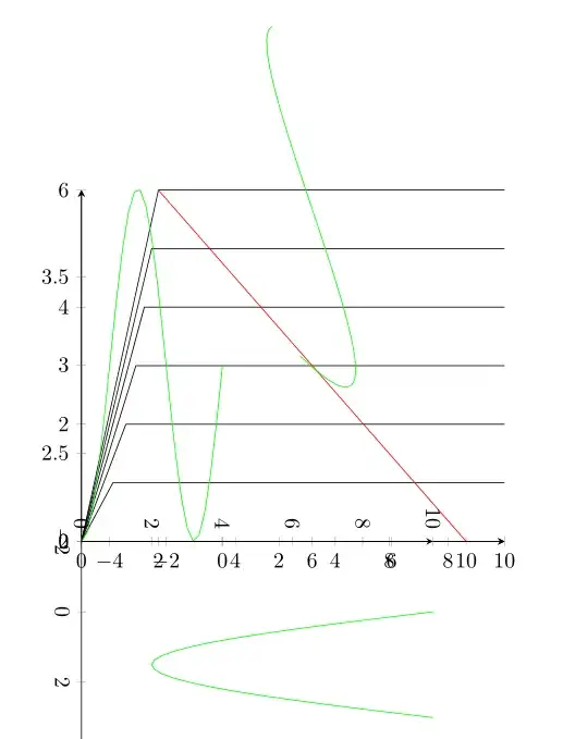
With the following (minimalized) code:
\documentclass{report}
\usepackage{pgfplots}
\pgfplotsset{compat=1.8}
\begin{document}

    \begin{tikzpicture}
    \begin{axis}[
            cycle list name=color list,
            axis x line=bottom,
            axis y line=left,
        ]

        \foreach \i in {1,2,3,4,5,6} {
            \addplot+[black] coordinates{
                (0,0)
                (sqrt(\i/1.5),\i)
                (11,\i)};
        }

        \addplot+[red] coordinates{(2,6)(10,0)};

        \end{axis}

            \begin{axis}[
            cycle list name=color list,
            axis x line=bottom,
            axis y line=left,
                xmin=-5,    xmax=10
                %axis lines=none
        ]

            \pgftransformshift{-100}

            \addplot+[green,domain=-5:0] {sin(x*90)+3};

        \end{axis}

            \begin{axis}[
            cycle list name=color list,
            axis x line=bottom,
            axis y line=left,
                xmin=-5,    xmax=10,
                axis lines=none
        ]

            \pgftransformrotate{30}

            \addplot+[green,domain=5:10] {sin(x/2*90)+2};

        \end{axis}


            \begin{axis}[
            cycle list name=color list,
            axis x line=bottom,
            axis y line=left,
                xmin=-2,    xmax=10,
                ymin=0, ymax=10
                %axis lines=none
        ]

            \pgftransformrotate{270}

            \addplot+[green,domain=0:3] {-sin(x/3*180)*8+10};

        \end{axis}

\end{tikzpicture}

\end{document}
So, my main problem is the rotation and alignment of the sine waves. I'm not sure if what I tried is the way to go since I see no possibility to align the four different axes with each other precisely, any hint is appreciated.
Edit 1:
This is my underlying plot, how can I move the center of the sine plot ontop of the red dot? I would provide code but it's rather long..

Edit 2:
Ok, got it. Some things may not seem very elegant, but maybe this can be of use for someone:
\documentclass[class=minimal,border=0pt]{standalone}
\usepackage{pgfplots}
\pgfplotsset{compat=1.8}
\usepackage{pgfplotstable}
\usetikzlibrary{patterns}
\usetikzlibrary{calc}
\begin{document}
\centering
\begin{tikzpicture}
[/pgfplots/y=8cm, /pgfplots/x=1cm] % To make sure all the plots use the same scale]


    %%
    %% VOLTAGE INPUT
    %%
    \begin{axis}[
        anchor=origin, % Shift the axis so its origin is at (0,0)
        rotate around={63.5:(current axis.origin)}, % Rotate around the origin
        xmin=0, ymin=0, clip=false, % We only want the positive y axis, hence `ymin=0`. `clip=false` is necessary so we can still see the negative component
        xmax=4.5, ymax=0.8,
        axis lines*=center, % Axis lines going through the origin
        xtick=\empty, ytick=\empty, % No tick marks
        enlarge y limits={upper, value=0.5}, % Make the y axis a bit longer than necessary
        axis y line=none
        ]
        \addplot [thick, blue, domain=1:4, smooth] {0.895*sin(x*120-120)} coordinate [pos=0.25] (input);
        \coordinate (aux) at (axis cs:0,0.895); % Name the coordinate on the axis for drawing the dashed lines later
    \end{axis}

    %%
    %% VOLTAGE OUTPUT
    %%
    \begin{axis}[
        anchor=origin, % Same as before
        rotate around={-90:(current axis.origin)},
        axis lines*=center,
        xtick=\empty, ytick=\empty,
        xmin=0, ymin=0, clip=false, % We only want the positive y axis, hence `ymin=0`. `clip=false` is necessary so we can still see the negative component
        xmax=5.25, ymax=0.8,
        hide y axis % The y axis coincides with the x axis of the previous axis, so we hide it to avoid drawing it twice
        ]
        \addplot [line join=round,thick, red, domain=2:3.62, smooth] {-0.80*sin(x*120-240)} coordinate [pos=0.45] (output); % half a sine wave
        \addplot [line join=round,thick, red, domain=3.61:4.89, smooth]   {0.2} coordinate [pos=0] (rail_volt);
        \addplot [line join=round,thick, red, domain=4.88:5, smooth] {-0.80*sin(x*120-240)}; % half a sine wave
    \end{axis}

    %%
    %% CURRENT
    %%
    \begin{axis}[
            anchor=origin,
            axis lines*=center,
            xtick=\empty, ytick=\empty,
            hide y axis,
            hide x axis,
            xmin=-12.25, ymin=0, clip=false, % We only want the positive y axis, hence `ymin=0`. `clip=false` is necessary so we can still see the negative component
            xmax=0, ymax=0.8,
            enlarge x limits={upper, value=1} % Extend the axis to the right
            ]
        \addplot [smooth,thick, black, domain=-12.5:-12.38] {0.4*sin(x*120+4560)}; % Shifted half sine wave
        \addplot [smooth,thick, black, domain=-12.39:-11.11] {-0.1} coordinate [pos=0] (rail_curr); % Shifted half sine wave
        \addplot [smooth,thick, black, domain=-11.12:-9.5] {0.4*sin(x*120+4560)} coordinate [pos=0.545] (current); % Shifted half sine wave
        \addplot [smooth,thin,  black, domain=-12.75:-9.2] {0};
    \end{axis}


    \begin{axis}[
            anchor=origin,
            at={(-84,-10)},
            cycle list name=color list,  %% AXIS FORMAT
            axis x line=bottom,
            axis y line=left,
            xlabel style={at={(current axis.right of origin)},align=center,yshift=-0.5em, xshift=-3em,  anchor=north west},
            ylabel style={at={(current axis.above origin)},align=center,yshift=0em, xshift=+2.5em, anchor=north east,rotate=270},
            xlabel={$V_{DS},\;\lbrack V\rbrack$},
            ylabel={$I_{DS},$\\$\lbrack A\rbrack$},
            xtick={0,2,...,10},                                                     % {0,2,...,10} (the same as {0,2,4,6,8,10}), {0,1,2,5,8,1e1,1.5e1} (a series of coordinates)
            minor xtick={0,1,...,11},
            %%extra x ticks={22},
            ytick={0,0.1,...,0.6},
            minor ytick={0,0.05,...,0.55},
            xmin=0, xmax=12,
            ymin=0, ymax=0.55,
            %x=1cm, y=1cm,
            %legend pos=south east,
            %grid=major,                                                % /pgfplots/grid=minor|major|both|none
            height=5cm,
            width=10cm,
            axis on top,
            yticklabel style={draw=none, inner sep=0pt, outer sep=0.3333em, fill=white, text opacity=1},
            xticklabel style={draw=none, inner sep=0pt, outer sep=0.3333em, fill=white, text opacity=1}
        ]
        \pgfplotstablenew[
            create on use/x/.style={create col/expr={0+\pgfplotstablerow*0.05}},
            create on use/y/.style={create col/expr={\thisrow{x}*0+0.65}},
            columns={x,y}]
            {43}
            \ftable
        \pgfplotstablenew[
            create on use/x/.style={create col/expr={0+\pgfplotstablerow*0.05}},
            create on use/y/.style={create col/expr={0.125*(\thisrow{x})^2}},
            columns={x,y}]
            {43}
            \gtable
        % Sort the second table by the x value, from largest to smallest
        \pgfplotstablesort[sort cmp={float >}]\gsorted{\gtable}
        %\pgfplotstabletypeset\gsorted
        % Concatenate the tables -- now filledcurve contains the edge of
        % a polygon bounded by curves f and g
        \pgfplotstablevertcat{\filledcurve}{\ftable}
        \pgfplotstablevertcat{\filledcurve}{\gsorted}

        \addplot+[opacity=0.8,fill opacity=0.3,draw=none,fill=yellow,postaction={pattern=north east lines}] coordinates {(11,0.55) (12,0.55) (12,0) (11,0)};
        \addplot[fill=gray,opacity=0.7,fill opacity=0.2,draw=none,postaction={pattern=north east lines}] table {\filledcurve};
        \foreach \i in {0.1,0.2,0.3,0.4,0.5} {
            \addplot+[black] coordinates{
                (0,0)
                (sqrt(\i/0.125),\i)
                (11,\i)};
            \addplot+[black,domain=11:12] {((x-11)^4*5)+\i};
        }

        \addplot+[gray,domain=0:2.2] {0.125*x^2};
        \coordinate (rail_abs) at (axis cs:10,0); % Name the coordinate on the axis for drawing the dashed lines later
        \addplot+[ultra thick, red] coordinates{(2,0.5)(10,0)};
        %%\node[red] at (axis cs:8.4,0.1) {\textbullet}; %(8.6666666666666666666)
        \draw[thick, black, fill=red] (axis cs:8.4,0.1) circle(1mm);
        \end{axis}


        \draw [densely dashed] (input) -- (aux); % Draw the dashed line

        \draw [densely dashed] (output) -- ($(aux)-(0,4.6)$); % Draw the dashed line
        \draw [densely dashed] (aux) -- ($(aux)-(0,4.0)$); % Draw the dashed line

        \draw [densely dashed] ($(rail_abs)-(0,0.6)$) -- (rail_volt); % Draw the dashed line


        \draw [densely dashed] (current) -- ($(aux)-(2.8,0)$); % Draw the dashed line
        \draw [densely dashed] ($(aux)-(2,0)$) -- (aux); % Draw the dashed line

        \draw [densely dashed] (rail_curr) -- ($(rail_abs)-(10.6,0)$); % Draw the dashed line


\end{tikzpicture}

\end{document}

