I am still not 100% sure if I have understood your question. I interpret it
as: You want to stack multiple axis environments which contain data from
different DAT files, right? If so, please have a look at the following code
which is done with PGFPlots only.
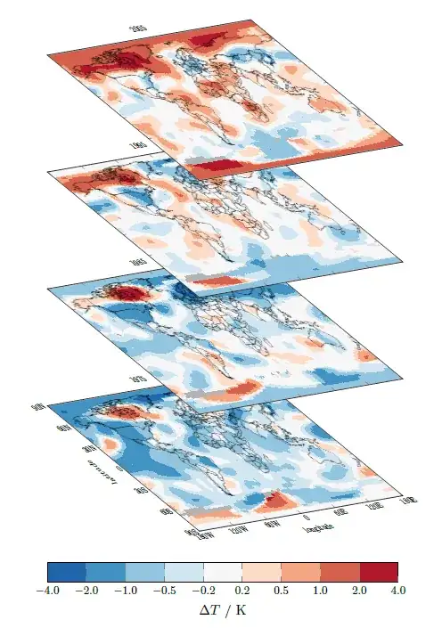
I used some data which can be downloaded from the web which show the
temperature anomalies. To have a better idea where they are, I also added
a world map to the plots which can also be downloaded.
Because of the large data sets, it is required to compile with LuaLaTeX. For more details please have a look at the comments in the code.
% data from <https://data.giss.nasa.gov/gistemp/maps/> using the settings
%   Data Sources:
%       Land: GISS analysis
%       Ocean: ERSST_v4
%   Map Type: Anomalies
%   Mean Period: Annual (Jan-Dec)
%   Time Interval: Begin = End: 1975, 1985, 1995, 2005
%   Base Period: Begin = End: 1990
%   Smoothing Radius: 1200 km
%   Map Projection: Equirectangular
% World map from <https://commons.wikimedia.org/wiki/File:World_V2.0.svg>
\documentclass[border=5pt]{standalone}
\usepackage{pgfplots}
    % because I want to use a nice colorbar suitable for this task I load the
    % `colorbrewer' library of PGFPlots
    \usetikzlibrary{pgfplots.colorbrewer}
    \pgfplotsset{
        % to use the advanced `colormap' operations use this `compat' level or higher
        compat=1.14,
        % load a suitable colormap ...
        colormap/RdBu-9,
        % ... and reverse its order
        % <https://tex.stackexchange.com/a/141338/95441>
        colormap={reverse RdBu}{
            indices of colormap={
                \pgfplotscolormaplastindexof{RdBu-9},...,0 of RdBu-9
            },
        },
        % then create and activate a custom colormap
        % here I want a non-uniform colorbar with constant samples
        colormap={CM}{
            of colormap={
                % state which colormap should be used, ...
                reverse RdBu,
                % ... state the target positions of the colors ...
                target pos={-4,-2,-1,-0.5,-0.2,0.2,0.5,1,2,4},
                % ... and don't interpolate between the colors
                sample for=const,
            },
        },
        % create an axis style to use for all of the plots
        my axis style/.style={
%            % if only the plane itself without the labels should be transformed
%            % then uncomment this line
%            % (more information is given below)
%            cm={cos(-60),cos(85),.7*sin(-60),.5,(0,0)},
            width=\textwidth,
            height=0.6667\textwidth,
            %
            xmin=-180,  xmax=+180,
            ymin=-90,   ymax=+90,
            xtick={-180,-120,-60,0,60,120,180},
            ytick={-90,-60,-30,0,30,60,90},
            % except for the first plot we don't want to show the ticklabels
            xticklabels={},
            yticklabels={},
            % so the ticklabels are shown, draw the `axis on top'
            axis on top,
            % give explicit meta data ...
            point meta=explicit,
            % ... and set their corresponding min and max values
            point meta min=-4.0,
            point meta max=+4.0,
            % use constant samples
            colormap access=piecewise constant,
            %
            % ignore the additional header row in the data files
            table/skip first n=1,
            table/x=lon,
            table/y=lat,
            % "missing data" are represented by the number 9999.0000
            % so you can either edit the data files directly and replace these
            % values by "NaN" or you can PGFPlots handle this itself
            % (here I just change all values >1000 which is an unrealistic value)
            table/meta expr={
                ifthenelse(\thisrow{array(i,j)}>1000, NaN, \thisrow{array(i,j)})
            },
            % we have to help PGFPlots a bit on how the data files are organized
            mesh/rows=90,
            mesh/cols=180,
            %
            % before plotting the acutal data fill the whole plot area with a
            % color which will represent missing data
            execute at begin axis={
                \fill [black!30] (rel axis cs:0,0) rectangle (rel axis cs:1,1);
            },
            % on top of the data we want to show the world, so we have an idea
            % *where* the temperature anomalies are and use the downloaded map
            % which is mentioned in the top comment.
            % To avoid an error regarding graphics extension I renamed the file
            % from its original name "2000px-World_V2.0.svg.png".
            % (Of course we could also "use" the SVG file, but that would
            %  need some more work, but isn't the point in this example.
            %  You will find a lot of useful hints on how to do this on TeX.SX
            %  e.g. <https://tex.stackexchange.com/q/2099>)
            execute at end axis={
                \addplot graphics [
                    xmin=-180,  xmax=+180,
                    ymin=-90,   ymax=+90,
                ] {2000px-World_V20.png};
            },
        },
        % create a style for the coordiante transformation of the plots.
        % Thus, there is only one place where you need to put changes, if needed.
        % (More details/comments will be given below before the first `scope')
        /tikz/transformed cs style/.style={
            cm={cos(-60),cos(85),.7*sin(-60),.5,(0,0)},
        },
    }
    % define a macro that stores the offset between the different stacked plots
    \pgfmathsetlengthmacro{\offset}{20ex}
\begin{document}
\begin{tikzpicture}
    % change the view of the plane where also the labels are transformed.
    % (not sure if done right, but it seems to be not totally wrong.
    %  To get an impression on how it works look at
    %  <https://tex.stackexchange.com/a/369495/95441>)
    % If only the plane itself and not also the labels should be transformed,
    % you can give the argument directly to the `axis' environment (see the
    % commented line above)
    % We do it in scopes so stacking the plots on top of each other can be done
    % using the non-transformed coordinate system
    \begin{scope}[transformed cs style]
        \begin{axis}[
            % load the above created style
            my axis style,
            % the first plot (only) shall show the axis labels ...
            xlabel=longitude,
            ylabel=latitude,
            % ... ticklabels
            xticklabels={180W,120W,60W,0,60E,120E,180E},
            yticklabels={90S,60S,30S,0,30N,60N,90N},
            title=1975,
            % name the plot to later use the "node" to set the offset coordinate
            name=plot 1,
        ]
            \addplot [surf,shader=interp] table {1975.txt};
        \end{axis}
    \end{scope}

        % give a coordinate at the place where the next stacked plot should be placed.
        % (Because we are outside the transformed coordinate system here, this is
        %  quite easy to accomplish.)
        % Here we want it to be placed vertically above the "lower" ones with the
        % given offset
        \coordinate (p1) at ([yshift=\offset] plot 1.south west);
    % again start the scope ...
    \begin{scope}[transformed cs style]
        \begin{axis}[
            % ... and load the style
            my axis style,
            title=1985,
            name=plot 2,
            % state, where the plot should be placed. Therefore we use the
            % above created coordinate
            % (the default `anchor` is `south west', so there is no need to
            %  state it explicitly)
            at={(p1)},
        ]
            \addplot [surf,shader=interp] table {1985.txt};
        \end{axis}
    \end{scope}

        \coordinate (p2) at ([yshift=\offset] plot 2.south west);
    \begin{scope}[transformed cs style]
        \begin{axis}[
            my axis style,
            title=1995,
            name=plot 3,
            at={(p2)},
        ]
            \addplot [surf,shader=interp] table {1995.txt};
        \end{axis}
    \end{scope}

        \coordinate (p3) at ([yshift=\offset] plot 3.south west);
    \begin{scope}[transformed cs style]
        \begin{axis}[
            my axis style,
            title=2005,
            name=plot 4,
            at={(p3)},
        ]
            \addplot [surf,shader=interp] table {2005.txt};
        \end{axis}
    \end{scope}

    % Below the first plot we want to place the `colorbar', which was/is used
    % for all the plots. Because we don't want it to be transformed, we create
    % it separate from the plots (again)
    \pgfplotscolorbardrawstandalone[
%        % because we didn't change the `colormap' inbetween we don't have to
%        % load it again
%        colormap name=CM,
        % again we state the point meta min and max values, ...
        point meta min=-4.0,
        point meta max=+4.0,
        % as well as that we want to
        colormap access=piecewise constant,
        % We want a horizontal colorbar ...
        colorbar horizontal,
        % ... and to show up as "legend".
        colorbar as legend,
        colorbar style={
            % In addition we want it to be placed vertically below the
            % north west corner of the plot ...
            at={(plot 1.below south west -| plot 1.north west)},
            % and state its `width'
            width=0.75\textwidth,
            xlabel=$\Delta T$ / K,
            % also we want the ticklabels to be smaller and show with one
            % decimal figure
            ticklabel style={
                font=\footnotesize,
                /pgf/number format/.cd,
                    fixed,
                    fixed zerofill,
                    precision=1,
            },
        },
    ]
\end{tikzpicture}
\end{document}