UPDATE: A version without hardcoded values. (Note that I use a not entirely harmless command: \globaldefs. The alternative will be longer. I believe that here using \globaldefs is OK.
\documentclass[tikz,border=3.14mm]{standalone}
\usepackage{pgfplots, pgfplotstable}
\usetikzlibrary{3d,calc,decorations.pathreplacing,arrows.meta}
% small fix for canvas is xy plane at z % https://tex.stackexchange.com/a/48776/121799
\makeatletter
\tikzoption{canvas is xy plane at z}[]{%
    \def\tikz@plane@origin{\pgfpointxyz{0}{0}{#1}}%
    \def\tikz@plane@x{\pgfpointxyz{1}{0}{#1}}%
    \def\tikz@plane@y{\pgfpointxyz{0}{1}{#1}}%
    \tikz@canvas@is@plane}
\makeatother
\pgfplotsset{compat=1.15}
\pgfplotstableread{
X Y Z m
2.2 14 0 0
2.7 23 0 0
3 13 0 0
3.55 22 0 0
4 15 0 0
4.5 20 0 0
4.75 28 0 0
5.5 23 0 0
}\datatable
\pgfplotstableread{
X Y Z m
2.2 0 0 0
2.7 0 0 0
3 13 0 0
3.55 0 0 0
4 15 0 0
4.5 0 0 0
4.75 0 0 0
5.5 0 0 0
}\datatabletwo


\pgfdeclareplotmark{fcirc}{%
          \begin{scope}[expand style={local frame}{\MyLocalFrame},local frame]
          \begin{scope}[canvas is xy plane at z=0,transform shape]
            \fill circle(0.1);
          \end{scope}
          \end{scope}
}%
% based on https://tex.stackexchange.com/a/64237/121799
\tikzset{expand style/.code n args={2}{\tikzset{#1/.style/.expanded={#2}}}}
\newcommand{\GetLocalFrame}{
    \path let \p1=($(1,0,0)-(0,0,0)$), \p2=($(0,1,0)-(0,0,0)$),
    \p3=($(0,0,1)-(0,0,0)$) in \pgfextra{
    \pgfmathsetmacro{\ratio}{veclen(\x1,\y1)/veclen(\x2,\y2)}
    \xdef\MyLocalFrame{
                x   =  {   (\x1,\y1)    },
                y   =  {    (\ratio*\x2,\ratio*\y2)     },
                z   =   {     (\x3,\y3)     }
            }
    }; }

\begin{document}
\begin{tikzpicture}[scale=1.5]
\begin{axis}
    [
    view={140}{50},
    xmin=1,xmax=6, ymin=5,ymax=40, zmin=0, zmax=10,
    % ytick=\empty,xtick=\empty,ztick=\empty,
    clip=false, axis lines = middle
    ]
    % read out the transformation done by pgfplots
    \GetLocalFrame
    \begin{scope}[transform shape]
    \addplot3[only marks, fill=cyan,mark=fcirc]
    table {\datatable};
    \end{scope}
    \addplot3[thick, red] table[y={create col/linear regression={y=Y}}] {\datatable}; % compute a linear regression from the input table

    \def\X{2.7}
    \def\Y{23}
    \draw [-{Latex[length=4mm, width=2mm]}] (\X,\Y+10,12.5) node[right]{$(x_1,y_1)$} ..controls (0,5) .. (\X,\Y,0);
    \draw [-{Latex[length=4mm, width=2mm]}] (9,30,20) node[left, align=right]{\scriptsize True Regression Line\\ \scriptsize $y = \beta_0 + \beta_1 x$} .. controls (5,2.5) .. (5,22.7,0);
    \draw [decorate, decoration={brace,amplitude=3pt}, xshift=0.5mm] (\X,\Y-0.1,0) to (\X,17,0) node[left, xshift=5mm, yshift=-1mm]{\scriptsize 1}; % brace

    \draw [thick,dash pattern={on 7pt off 2pt on 1pt off 3pt}] (1,17.1) to (\X,17.1);
    \draw [thick,dash pattern={on 7pt off 2pt on 1pt off 3pt}] (\X,17.1) -- (\X,5);
    \node[above] at (\X,4) {$x_1$};
    \node[right, align=left,yshift=0.5mm] at (1,17.1) {$E(Y|x_1)=\mu_{Y.x_1}$};

\end{axis}
\end{tikzpicture}
\end{document}

Old ANSWE: This is not an answer but just to show you what you get if do the projection.
\documentclass{article}
\usepackage{tikz}
\usepackage{pgfplots, pgfplotstable}
\usetikzlibrary{3d,calc}
% small fix for canvas is xy plane at z % https://tex.stackexchange.com/a/48776/121799
\makeatletter
\tikzoption{canvas is xy plane at z}[]{%
\def\tikz@plane@origin{\pgfpointxyz{0}{0}{#1}}%
\def\tikz@plane@x{\pgfpointxyz{1}{0}{#1}}%
\def\tikz@plane@y{\pgfpointxyz{0}{1}{#1}}%
\tikz@canvas@is@plane}
\makeatother
\pgfplotsset{compat=1.15}
\pgfplotstableread{
X Y Z m
2.2 14 0 0
2.7 23 0 0
3 13 0 0
3.55 22 0 0
4 15 0 0
4.5 20 0 0
4.75 28 0 0
5.5 23 0 0
}\datatable
\pgfplotstableread{
X Y Z m
2.2 0 0 0
2.7 0 0 0
3 13 0 0
3.55 0 0 0
4 15 0 0
4.5 0 0 0
4.75 0 0 0
5.5 0 0 0
}\datatabletwo
%\makeatletter
\pgfdeclareplotmark{dot}
{%
\fill circle [x radius=0.02, y radius=0.08];
}%
%\makeatother
\pgfdeclareplotmark{fcirc}
{%
\begin{scope}[x={(-21.20514pt,-9.26361pt)},
y={(2.54181pt,-1.57715pt)},z={(0.0pt,6.04706pt)}]
\begin{scope}[canvas is xy plane at z=0,transform shape]
\fill circle(0.1);
\end{scope}
\end{scope}
}%
\begin{document}
\section{table using raw data in 3D}
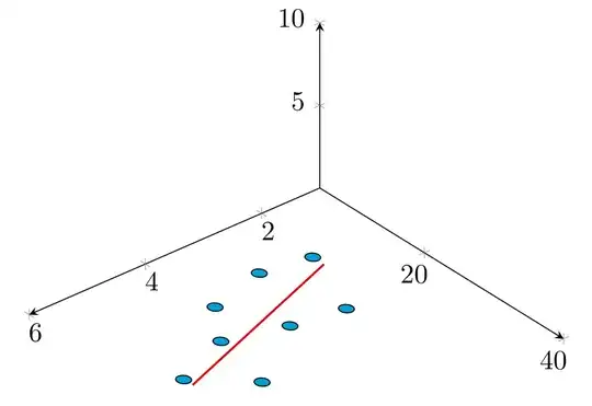
The below diagram tries to replicate in 3D, the Figure 12.3 found in \cite{devore} , page 472 \\
% https://tex.stackexchange.com/questions/11251/trend-line-or-line-of-best-fit-in-pgfplots
\begin{tikzpicture}[scale=1.5]
\begin{axis}
[
view={140}{50},
xmin=1,xmax=6, ymin=5,ymax=40, zmin=0, zmax=10,
% ytick=\empty,xtick=\empty,ztick=\empty,
clip=false, axis lines = middle
]
% read out the transformation done by pgfplots
\path let \p1=($(1,0,0)-(0,0,0)$), \p2=($(0,1,0)-(0,0,0)$),
\p3=($(0,0,1)-(0,0,0)$) in \pgfextra{\typeout{
\x1,\y1;\x2,\y2;\x3,\y3}};
\begin{scope}[transform shape]
\addplot3[only marks, fill=cyan,mark=fcirc]
table {\datatable};
\end{scope}
\addplot3[thick, red] table[y={create col/linear regression={y=Y}}] {\datatable}; % compute a linear regression from the input table
\def\X{2.7}
\def\Y{23}
% \draw [-{Latex[length=4mm, width=2mm]}] (\X,\Y+10,12.5) node[right]{$(x_1,y_1)$} ..controls (0,5) .. (\X,\Y,0);
% \draw [-{Latex[length=4mm, width=2mm]}] (9,30,20) node[left, align=right]{\scriptsize True Regression Line\\ \scriptsize $y = \beta_0 + \beta_1 x$} .. controls (5,2.5) .. (5,22.7,0);
% \draw [decorate, decoration={brace,amplitude=3pt}, xshift=0.5mm] (\X,\Y-0.1,0) to (\X,17,0) node[left, xshift=5mm, yshift=-1mm]{\scriptsize 1}; % brace
%
% \draw [thick,dash pattern={on 7pt off 2pt on 1pt off 3pt}] (1,17.1) to (\X,17.1);
% \draw [thick,dash pattern={on 7pt off 2pt on 1pt off 3pt}] (\X,17.1) -- (\X,5);
% \node[above] at (\X,4) {$x_1$};
% \node[right, align=left,yshift=0.5mm] at (1,17.1) {$E(Y|x_1)=\mu_{Y.x_1}$};
\end{axis}
\end{tikzpicture}
\begin{thebibliography}{1}
\bibitem{devore} Jay. L Devore {\em Probability and Statistics for Engineering and the Sciences} 8th Edition.
\end{thebibliography}
\end{document}

The circles are now properly projected on the x-y plane but, unfortunately, since the x and y scales look very different, they look like ellipse. Is that what you want?
On the other hand, if you want to cancel out the elliptic distortion, you can do that by cheating:
\documentclass{article}
\usepackage{tikz}
\usepackage{pgfplots, pgfplotstable}
\usetikzlibrary{3d,calc,decorations.pathreplacing,arrows.meta}
% small fix for canvas is xy plane at z % https://tex.stackexchange.com/a/48776/121799
\makeatletter
\tikzoption{canvas is xy plane at z}[]{%
    \def\tikz@plane@origin{\pgfpointxyz{0}{0}{#1}}%
    \def\tikz@plane@x{\pgfpointxyz{1}{0}{#1}}%
    \def\tikz@plane@y{\pgfpointxyz{0}{1}{#1}}%
    \tikz@canvas@is@plane}
\makeatother
\pgfplotsset{compat=1.15}
\pgfplotstableread{
X Y Z m
2.2 14 0 0
2.7 23 0 0
3 13 0 0
3.55 22 0 0
4 15 0 0
4.5 20 0 0
4.75 28 0 0
5.5 23 0 0
}\datatable
\pgfplotstableread{
X Y Z m
2.2 0 0 0
2.7 0 0 0
3 13 0 0
3.55 0 0 0
4 15 0 0
4.5 0 0 0
4.75 0 0 0
5.5 0 0 0
}\datatabletwo

%\makeatletter
        \pgfdeclareplotmark{dot}
        {%
            \fill circle [x radius=0.02, y radius=0.08];
        }%
%\makeatother

        \pgfdeclareplotmark{fcirc}
        {%
          \begin{scope}[x={(-21.20514pt,-9.26361pt)},
          y={(7.73369*2.54181pt,-7.73369*1.57715pt)},z={(0.0pt,6.04706pt)}]
          \begin{scope}[canvas is xy plane at z=0,transform shape]
            \fill circle(0.1);
          \end{scope}
          \end{scope}
        }%


\begin{document}

\section{table using raw data in 3D}

The below diagram tries to replicate in 3D, the Figure 12.3 found in \cite{devore} , page 472 \\

% https://tex.stackexchange.com/questions/11251/trend-line-or-line-of-best-fit-in-pgfplots
\begin{tikzpicture}[scale=1.5]
\begin{axis}
    [
    view={140}{50},
    xmin=1,xmax=6, ymin=5,ymax=40, zmin=0, zmax=10,
    % ytick=\empty,xtick=\empty,ztick=\empty,
    clip=false, axis lines = middle
    ]
    % read out the transformation done by pgfplots
    \path let \p1=($(1,0,0)-(0,0,0)$), \p2=($(0,1,0)-(0,0,0)$),
    \p3=($(0,0,1)-(0,0,0)$) in \pgfextra{
    \pgfmathsetmacro{\ratio}{veclen(\x1,\y1)/veclen(\x2,\y2)}
    \typeout{
    \x1,\y1;\x2,\y2;\x3,\y3;\ratio}};
    \begin{scope}[transform shape]
    \addplot3[only marks, fill=cyan,mark=fcirc]
    table {\datatable};
    \end{scope}
    \addplot3[thick, red] table[y={create col/linear regression={y=Y}}] {\datatable}; % compute a linear regression from the input table

    \def\X{2.7}
    \def\Y{23}
    \draw [-{Latex[length=4mm, width=2mm]}] (\X,\Y+10,12.5) node[right]{$(x_1,y_1)$} ..controls (0,5) .. (\X,\Y,0);
    \draw [-{Latex[length=4mm, width=2mm]}] (9,30,20) node[left, align=right]{\scriptsize True Regression Line\\ \scriptsize $y = \beta_0 + \beta_1 x$} .. controls (5,2.5) .. (5,22.7,0);
    \draw [decorate, decoration={brace,amplitude=3pt}, xshift=0.5mm] (\X,\Y-0.1,0) to (\X,17,0) node[left, xshift=5mm, yshift=-1mm]{\scriptsize 1}; % brace

    \draw [thick,dash pattern={on 7pt off 2pt on 1pt off 3pt}] (1,17.1) to (\X,17.1);
    \draw [thick,dash pattern={on 7pt off 2pt on 1pt off 3pt}] (\X,17.1) -- (\X,5);
    \node[above] at (\X,4) {$x_1$};
    \node[right, align=left,yshift=0.5mm] at (1,17.1) {$E(Y|x_1)=\mu_{Y.x_1}$};

\end{axis}
\end{tikzpicture}


  \begin{thebibliography}{1}
  \bibitem{devore} Jay. L Devore {\em Probability and Statistics for Engineering and the Sciences} 8th Edition.
  \end{thebibliography}


\end{document}
Unfortunately, because of the way pgfplots works, you need to run this, find out the transformation and the "cheating scale" \ratio, and then plug this in the definition of fcircle in case you make any changes.


\makeatletterand\makeatother. – Oct 21 '18 at 17:15