1

I'm trying to make a graph, where the label y is the first column of the row and the x is the other columns (in the example it is from IPT1 to IPT7, but it is much more).

I believe it would be a type of histogram or similar to the graphs of electoral surveys (the candidate's name and percentage appears month by month).

I made the code below, but I'm not getting the expected result. The data is generated from a C ++ code (which processes several files and gives the history of the indexes over time).

\documentclass{standalone}
\usepackage{tikz}
\usepackage{pgfplots}
\usepackage{pgfplotstable}
\usepackage{filecontents}

\begin{filecontents}{data.dat}
Team;IPT1;IPT2;IPT3;IPT4;IPT5;IPT6;IPT7
Tiger;1;2;3;4;5;6;7
XPO  ;3;5;7;9;11;13;15
ABC  ;5;8;11;14;17;20;23
\end{filecontents}

\begin{document}
\pgfplotstableread[col sep=semicolon]{data.dat}\datatable
\begin{tikzpicture}
   \begin{axis}[
         yticklabels from table={\datatable}{Team},
         ytick=data,
         xticklabel = {IPT1,IPT2,IPT3,IPT4,IPT5,IPT6,IPT7}, xtick=data,
      ]
      \addplot table[
         x=IPT1,
         y expr=\coordindex,
      ] {\datatable};

      \addplot table[
      x=IPT2,
      y expr=\coordindex,
      ] {\datatable};

      \addplot table[
        x=IPT3,
        y expr=\coordindex,
        ] {\datatable};

        \addplot table[
        x=IPT4,
        y expr=\coordindex,
        ] {\datatable};
   \end{axis}
\end{tikzpicture}
\end{document}

I want something like this: enter image description here

But I'm getting this: enter image description here

I try put team names in y label and IPT labels on x axis... enter image description here

Where am I going wrong? And is it possible to assemble a code that reads several columns after the team name (IPT1, IPT2, ..... IPTn)?

Marijn
  • 37,699
Marcos Laureano
  • 341
  • 1
  • 6
  • 1
    As far as I can see you get plot the data that is available. The data points are such that they are located on lines, and this is what you get. What does not make too much sense is xticklabel = {IPT1,IPT2,IPT3,IPT4,IPT5,IPT6,IPT7}, unless you have a completely different plot in mind in which the x coordinates are supposed to be IPT1,IPT2,IPT3,IPT4,IPT5,IPT6,IPT7. This you won't get with x=IPT1 and so on. –  Mar 10 '20 at 04:05
  • Y-axis is column Team, and X-axis is column IPT1, ..., IPTn... in the example: Tiger (Coord y-axis) and values 1;2;3;4;5;6;7 is coords for the x axis. – Marcos Laureano Mar 10 '20 at 21:01
  • I really made an effort to explain that you get what you ask pgfplots to do. It would be great if you made a similar effort of explaining your point. The last comment just contains half-sentences, and I can really not grasp what you want to tell me. Maybe that's just me, then you just need to wait for another user to show up. –  Mar 10 '20 at 21:44
  • @Schrödinger'scat sorry. I think in portuguese and translation, but I forget that the way of writing is different. You're right. When drawing manually I think I found my mistake. See the new image please. – Marcos Laureano Mar 10 '20 at 22:58

1 Answers1

1

There are a few issues in the approach in the question.

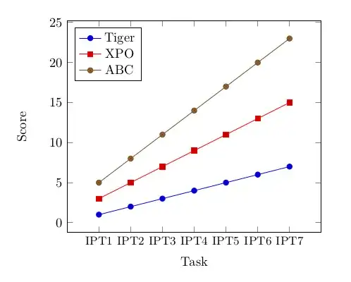
The goal is to plot the data for each row, however pgfplots expects the data to be organized in columns. This can be addressed using \pgfplotstabletranspose, using the first column to create keys to refer to each row (see Plot data row-wise with pgfplots).

Note that the row keys are sensitive to spaces, so XPO ;3;5 is different from XPO;3;5. If you want to use spaces in the team names then you need to use curly brackets in the \addplot commands with the exact number of spaces in it, e.g., y = {XPO }.

The x coordinates are not explicitly given in the data, so they should be inferred using \coordindex (which is the position of the value in the row). In the question this command was used for the y value, however the y value should be read from the data itself, because that is what you want to plot. As the rows have been assigned keys you can use y = Tiger etc. to refer to the row for a particular team. To make the lines start at 1 instead of 0 you can use \coordindex+1.

If you want to use a list of strings as tick marks on the x axis then you need to do two separate things: first give a numerical list with tick positions using xtick={...} and also provide the strings with xticklabels={...}. Note that xticklabels has an s at the end, otherwise each individual label is assigned the full list, resulting in the overlapping labels seen in the question. To make the axis more readable you can make the labels a bit smaller using x tick label style.

Finally the position of the team names. In my opinion it does not make much sense to put these names as tick labels on the y axis, because they describe one of the lines in the graph, and not one of the values on the axis. Moreover, the real values (1 to 23 in the example data) presumably have a meaning, for example a score. Therefore it is probably a good idea to use a legend for the team names and put the real y values as labels on the y axis.

Put together in an MWE:

\documentclass{article}
\usepackage{tikz}
\usepackage{pgfplots}
\usepackage{pgfplotstable}
\usepackage{filecontents}

\begin{filecontents}{data.dat}
Team;IPT1;IPT2;IPT3;IPT4;IPT5;IPT6;IPT7
Tiger;1;2;3;4;5;6;7
XPO;3;5;7;9;11;13;15
ABC;5;8;11;14;17;20;23
\end{filecontents}

\begin{document}
\pgfplotstableread[col sep=semicolon]{data.dat}\datatable
\pgfplotstabletranspose[colnames from=Team]\transposeddata{\datatable}
\begin{tikzpicture}
   \begin{axis}[
         ylabel = Score,
         xlabel = Task,
         xmin=0,
         xmax=8,
         xtick={1,...,7},
         xticklabels = {IPT1,IPT2,IPT3,IPT4,IPT5,IPT6,IPT7},
         x tick label style={font=\small},
         legend pos = {north west},
      ]
      \addplot table[
         x expr=\coordindex+1,
         y = Tiger,
      ] {\transposeddata};

      \addplot table[
         x expr=\coordindex+1,
         y = {XPO  },
      ] {\transposeddata};


      \addplot table[
         x expr=\coordindex+1,
         y = {ABC  },
      ] {\transposeddata};
      \addlegendentry{Tiger}
      \addlegendentry{XPO}
      \addlegendentry{ABC}      
   \end{axis}
\end{tikzpicture}
\end{document}

Result:

enter image description here

Marijn
  • 37,699