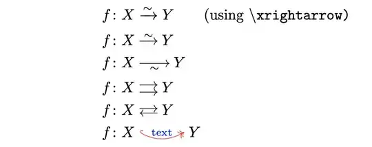
In the following screenshot,
there are some imprecisions on the horizontal part of the arrow that I made using \xrightarrow, which is even highlightable on my pdf viewer.
Note that this is also visible in the screenshots on \Rightarrow with text above it. Is there a way around this? Why would the implementation \xrightarrow do such a thing? I ran the following in Overleaf (pdflatex)
\documentclass{article}
\usepackage[utf8]{inputenc}
\usepackage{amsmath}
\newcommand{\isoto}{\xrightarrow{\sim}} % ``isomorphism to''
\let.! % ! is negative space command, so I replace
\newcommand{\twoto}{\raisebox{.56ex}{$;\xrightarrow{,,,,}$}\hspace{-11.85pt}\raisebox{-.56ex}{$\xrightarrow{,,,,};$}} % 11/4/21
\begin{document}
$$f: X\to Y, X \isoto Y, X \twoto Y$$
\end{document}
which produces
where the \xrightarrow has noticeably thicker spots compared to \to.


–characters (or similar), it's more the printer/renderer's fault for making overlapped lines bolder. Wouldn't happen with an infinite-precision printer? – user202729 Nov 29 '21 at 04:59\xvarrightarrowwhich should print a smoother looking line. But the arrow head is a different style than\xrightarrow's (I'm adding this as a comment because of this last point, I'm not sure if it fixes the issue OP or the bountier raise) – Slurp Jan 24 '23 at 13:50