1

I am trying to plot the Weierstrass function described in baby Rudin. I'm not trying to graph the entire series–even if I could graph its fourth or fifth partial sum nicely I would be relatively satisfied. For those not familiar with Rudin's construction, it goes like this:

Define $g(x)=2|\frac{x}{2}-\lfloor\frac{x+1}{2}\rfloor|$ and $g_n(x)=(\frac{3}{4})^n g(4^n x)$. Then the Weierstrass function is $\sum_{n=0}^\infty g_n(x)$.

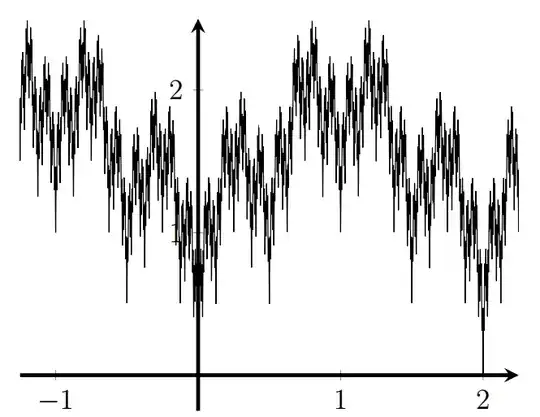
I have managed to graph the fourth partial sum, but I am not satisfied with its resolution. My function is not identical to the Weierstrass functions shown in this old TeX SE question, but I would love for mine to look more like that, if possible. (I believe that much of the difference in appearance is simply because Rudin's construction is rougher than the classic Weierstrass function definition.) The graph I've created of the fourth partial sum is quite jagged in appearance, and looks like this:

The fourth partial sum of Rudin's Weierstrass function

I'm hopeful that there's still something I could do in pgfplots to improve its appearance. (I've already pushed the number of samples in the plot to a really large value, but I'm not sure if that's actually helping much or not.) Here's my code:

    \documentclass[12pt]{article}
    \usepackage{tikz}
    \usepackage{pgfplots}
    \usepackage{pgfplotstable}
    \pgfplotsset{compat=1.13}
    \usepgfplotslibrary{fillbetween}
\begin{document}
\begin{tikzpicture}
\begin{axis}
[
  axis line style=ultra thick,
  axis x line=center,
  axis y line=center,
  grid=none,
  unit vector ratio=1 1,
  width=3.5in,
  xmin=-1.25, xmax=2.25,
  ymin=-.25, ymax=2.5,
  xtick={-1,0,...,2},
  ytick={-2,-1,...,2},
]
\addplot[black, domain=-1.3:2.3, samples=30000] {2*abs(x/2-floor(x/2+.5))+3/4*2*abs(4*x/2-floor(4*x/2+.5))+9/16*2*abs(16*x/2-floor(16*x/2+.5))+27/64*2*abs(64*x/2-floor(64*x/2+.5))+81/256*2*abs(256*x/2-floor(256*x/2+.5))};
\end{axis}
\end{tikzpicture}
\end{document}
Ingmar
  • 6,690
  • 5
  • 26
  • 47

1 Answers1

2

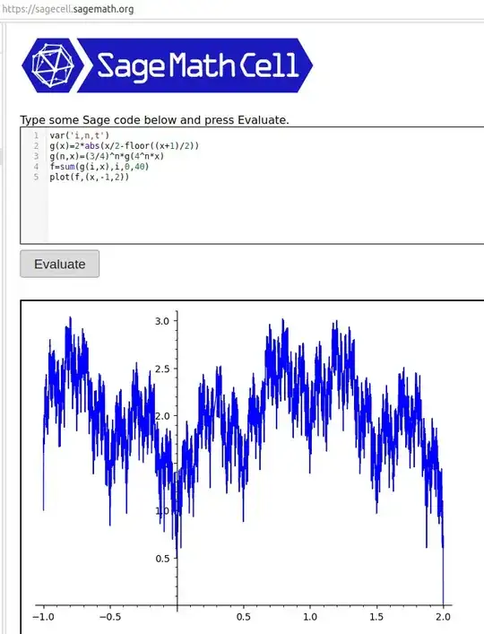
First,you said, "I believe that much of the difference in appearance is simply because Rudin's construction is rougher than the classic Weierstrass function definition.) The graph I've created of the fourth partial sum is quite jagged in appearance...". The uncertainty you have can be resolved by figuring out what the function should look like. If you go to a Sage Cell Server and copy/paste in the code:

var('i,n,t')
g(x)=2*abs(x/2-floor((x+1)/2))
g(n,x)=(3/4)^n*g(4^n*x)
f=sum(g(i,x),i,0,10)
plot(f,(x,-1,2))

followed by pressing Evaluate and you'll get enter image description here

after going to n=40. This is essentially the graph you have after n=4. This tells me that your basic plot won't change much.

Second, you also said, "I'm hopeful that there's still something I could do in pgfplots to improve its appearance. (I've already pushed the number of samples in the plot to a really large value, but I'm not sure if that's actually helping much or not.) ". Increasing samples to samples=30000 is a bad idea. It's the number of x values you're using. 30,000 samples between -1 and 2 is 10,000 points plotted between two consecutive integers. In general, 100 xvalues between consecutive integers should be good. If you look at many of the responses for the Weierstrass plot that you linked to and want your graph to look more like, the samples are quite low. For example, Jake's answer has samples=301.

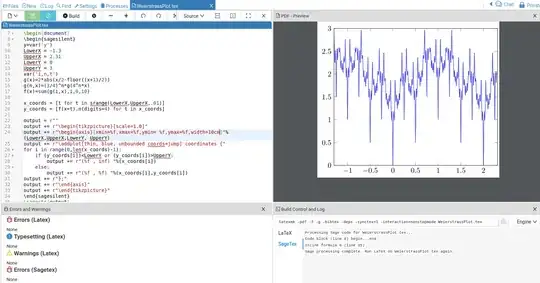
Third, besides using Sage to conduct quick sanity checks on your work, the sagetex package links it with LaTeX and Python to process more iterations accurately. That becomes essential for complicated functions like you have because of the limited precision of pgfplots. In these cases, Sage can be the engine to generate accurate plot data. Here is an implementation of this Weierstrass function for n=10.

\documentclass[11pt,border=1mm]{standalone}
\usepackage{sagetex}
\usepackage[usenames,dvipsnames]{xcolor}
\usepackage{tikz,pgfplots}
\pgfplotsset{compat=1.16}

\begin{document} \begin{sagesilent} y=var('y') LowerX = -1.3 UpperX = 2.31 LowerY = 0 UpperY = 3 var('i,n,t') g(x)=2abs(x/2-floor((x+1)/2)) g(n,x)=(3/4)^ng(4^n*x) f(x)=sum(g(i,x),i,0,10)

x_coords = [t for t in srange(LowerX,UpperX,.01)] y_coords = [f(x=t).n(digits=4) for t in x_coords]

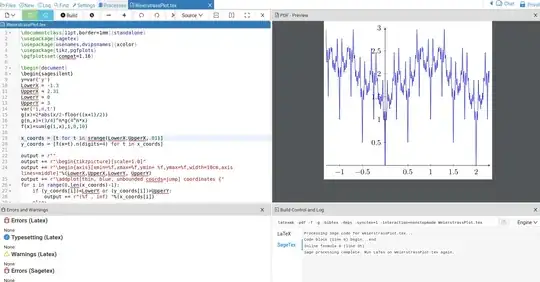
output = r"" output += r"\begin{tikzpicture}[scale=1.0]" output += r"\begin{axis}[xmin=%f,xmax=%f,ymin= %f,ymax=%f,width=10cm]"%(LowerX,UpperX,LowerY, UpperY) output += r"\addplot[thin, blue, unbounded coords=jump] coordinates {" for i in range(0,len(x_coords)-1): if (y_coords[i])<LowerY or (y_coords[i])>UpperY: output += r"(%f , inf) "%(x_coords[i]) else: output += r"(%f , %f) "%(x_coords[i],y_coords[i]) output += r"};" output += r"\end{axis}" output += r"\end{tikzpicture}" \end{sagesilent} \sagestr{output} \end{document}

Running the code in Cocalc gives

enter image description here

If you want x/y axes, add axis lines=middle where \begin{axis} is as shown below. I didn't like that the function was writing over the y-axis numbers enter image description here

Along the way I noticed that my plotting of the function was using thin lines (thin, blue). Running your code, with samples=300 and thin line plotting makes your original plot (with n=4) look better.

Finally, Sage is not part of a LaTeX distribution. The website is here; Sage can be downloaded for free to your computer and linked to your LaTeX program but depending on computers and computer skills, this can be problematic. The easiest way to experiment with Sage and sagetex is to get a free Cocalc account and copy/paste the code provided above into a LaTeX document.

DJP
  • 12,451