4

This is similar to this question.

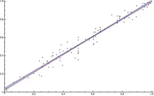
The fitted line can be plotted alongside with the data with this code:

Show[ListPlot[data], Plot[lm[x], {x, 0, 5}]]

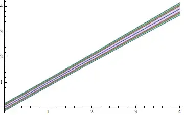
I would like to include a band around this line indicating the average error. How can I do this?

Example data:

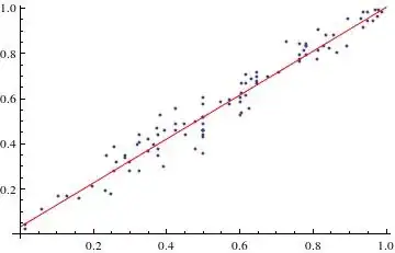
{{0.300369, 0.316832}, {0.450271, 0.485149}, {0.327772, 0.435644}, {0.573727, 0.594059}, {0.966333, 0.940594}, {0.5,0.356436}, {0.648136, 0.663366}, {0.830708, 0.831683}, {0.932212,0.950495}, {0.616441, 0.663366}, {0.616441, 0.613861}, {0.351864,0.415842}, {0.858684, 0.881188}, {0.626629, 0.554455}, {0.781502,0.841584}, {0.24901, 0.178218}, {0.776995, 0.811881}, {0.327772,0.405941}, {0.288312, 0.336634}, {0.60677, 0.663366}, {0.81564,0.811881}, {0.5, 0.455446}, {0.5, 0.60396}, {0.0592884,0.108911}, {0.951739, 0.940594}, {0.376411, 0.346535}, {0.5,0.435644}, {0.288312, 0.346535}, {0.781502, 0.831683}, {0.5,0.485149}, {0.5474, 0.584158}, {0.990885, 0.980198}, {0.376411,0.435644}, {0.937525, 0.980198}, {0.5, 0.455446}, {0.763858,0.841584}, {0.845342, 0.821782}, {0.616441, 0.70297}, {0.0158381,0.039604}, {0.836982, 0.881188}, {0.634059, 0.683168}, {0.258183,0.277228}, {0.867029, 0.80198}, {0.937525, 0.910891}, {0.130091,0.168317}, {0.971463, 0.990099}, {0.5, 0.455446}, {0.782699,0.792079}, {0.60314, 0.60396}, {0.977697, 0.960396}, {0.81564,0.90099}, {0.60677, 0.623762}, {0.39686, 0.455446}, {0.573727,0.574257}, {0.4526, 0.435644}, {0.5, 0.455446}, {0.236142,0.346535}, {0.5, 0.514851}, {0.60314, 0.584158}, {0.648136,0.693069}, {0.426273, 0.554455}, {0.373371, 0.465347}, {0.60314,0.524752}, {0.60677, 0.534653}, {0.383559, 0.524752}, {0.300369,0.277228}, {0.895366, 0.950495}, {0.426273, 0.455446}, {0.39323,0.29703}, {0.320827, 0.39604}, {0.979305, 0.990099}, {0.19846,0.207921}, {0.951739, 0.980198}, {0.0141859, 0.019802}, {0.265205,0.316832}, {0.783454, 0.831683}, {0.351864, 0.366337}, {0.763858,0.792079}, {0.648136, 0.673267}, {0.763858, 0.762376}, {0.678731,0.693069}, {0.376411, 0.376238}, {0.5, 0.514851}, {0.70727,0.712871}, {0.763858, 0.772277}, {0.5, 0.574257}, {0.258183,0.386139}, {0.893117, 0.831683}, {0.478985, 0.376238}, {0.104634,0.168317}, {0.235301, 0.188119}, {0.727486, 0.851485}, {0.327772,0.277228}, {0.5, 0.425743}, {0.648136, 0.712871}, {0.161454,0.158416}, {0.812018, 0.772277}, {0.365941, 0.39604}, {0.426273,0.485149}, {0.478985, 0.49505}}

lm = LinearModelFit[data, x, x]

Show[ListPlot[data, Plot[lm[x], {x, 0, 1}, PlotStyle -> Red], AxesOrigin -> {0, 0}]

enter image description here

a06e
  • 11,327
  • 4
  • 48
  • 108

2 Answers2

5

You can get a function of confidence bands,for LinearModelFit and other Fit objects. Assuming lm is the Fit object, then:

 lm["MeanPredictionBands",ConfidenceLevel->.90][x]

You can then use the Filling option of Plot to get an actual band. With the data you provided:

lm = LinearModelFit[data11, x, x]
yourbands[x_] = lm["MeanPredictionBands", ConfidenceLevel -> 0.68]
Show[ListPlot[data11], 
   Plot[{lm[x], yourbands[x]}, {x, 0, 1.0}, Filling -> {2 -> {1}}]]

enter image description here

lalmei
  • 3,332
  • 18
  • 26
5

In addition to @lalmeis answer (and thanks to @ubpdqn for his response here) we can work out additional information and learn more about the procedure:

with lm ["Properties"] we learn more about the underlying properties and can apply this also;

{"AdjustedRSquared", "AIC", "AICc", "ANOVATable", \
    "ANOVATableDegreesOfFreedom", "ANOVATableEntries", \
    "ANOVATableFStatistics", "ANOVATableMeanSquares", \
    "ANOVATablePValues", "ANOVATableSumsOfSquares", "BasisFunctions", \
    "BetaDifferences", "BestFit", "BestFitParameters", "BIC", \
    "CatcherMatrix", "CoefficientOfVariation", "CookDistances", \
    "CorrelationMatrix", "CovarianceMatrix", "CovarianceRatios", "Data", \
    "DesignMatrix", "DurbinWatsonD", "EigenstructureTable", \
    "EigenstructureTableEigenvalues", "EigenstructureTableEntries", \
    "EigenstructureTableIndexes", "EigenstructureTablePartitions", \
    "EstimatedVariance", "FitDifferences", "FitResiduals", "Function", \
    "FVarianceRatios", "HatDiagonal", "MeanPredictionBands", \
    "MeanPredictionConfidenceIntervals", \
    "MeanPredictionConfidenceIntervalTable", \
    "MeanPredictionConfidenceIntervalTableEntries", \
    "MeanPredictionErrors", "ParameterConfidenceIntervals", \
    "ParameterConfidenceIntervalTable", \
    "ParameterConfidenceIntervalTableEntries", \
    "ParameterConfidenceRegion", "ParameterErrors", "ParameterPValues", \
    "ParameterTable", "ParameterTableEntries", "ParameterTStatistics", \
    "PartialSumOfSquares", "PredictedResponse", "Properties", "Response", \
    "RSquared", "SequentialSumOfSquares", "SingleDeletionVariances", \
    "SinglePredictionBands", "SinglePredictionConfidenceIntervals", \
    "SinglePredictionConfidenceIntervalTable", \
    "SinglePredictionConfidenceIntervalTableEntries", \
    "SinglePredictionErrors", "StandardizedResiduals", \
    "StudentizedResiduals", "VarianceInflationFactors"}

lm[{"BestFit", "ParameterTable"}]

enter image description here

with

lm["ParameterConfidenceIntervals", ConfidenceLevel -> .999]
{{-0.0135474, 0.0777594}, {0.896584, 1.04648}}

respectively

lm["ParameterConfidenceIntervals", ConfidenceLevel -> .65]
{{0.019469, 0.044743}, {0.950786, 0.992278}}

you can estimate what happens to the bands. Perhaps the information from

lm["MeanPredictionBands"]

gives you additional information: enter image description here

The following is from here

First, define functions for the 80%, 90%, 95%, and 99% prediction bands of the fitted function:

{bands80[x_], bands90[x_], bands95[x_], bands99[x_]} = 
 Table[lm["SinglePredictionBands", 
   ConfidenceLevel -> cl], {cl, {.8, .9, .95, .99}}]

Visualize the regions bounded by the bands along with the fitted function and use Filling to more easily see the regions of each confidence level:

Plot[{lm[x], bands80[x], bands90[x], bands95[x], bands99[x]}, {x, 0, 
  4}, Filling -> {2 -> {1}, 3 -> {2}, 4 -> {3}, 5 -> {4}}]

enter image description here

Alternatively, you can also apply the above-mentioned strategy:

p[x_] := lm["MeanPredictionBands", ConfidenceLevel -> 0.95]
Show[ListPlot[data], Plot[Evaluate@{lm[x], p[x]}, {x, 0, 1}]]

enter image description here

For "Confidence and Prediction Bands" check out this Demonstration.

Well, the red Line, the blue Line between the Bands ist the fit. But one can fiddle around with Plotstyle;

Plot[{lm[x], bands80[x], bands90[x], bands95[x], bands99[x]}, {x, 0, 
  4}, PlotStyle -> {Red, Thick, {Blue, Yellow, Green}}, 
 Filling -> {2 -> {1}, 3 -> {2}, 4 -> {3}, 5 -> {4}}]

enter image description here

Or one can of course use this answer (@Ziofil) to pimp the plot:

Show[ListPlot[data, PlotStyle -> {Opacity[0.5]}], 
 Plot[{lm[x], bands80[x], bands90[x], bands95[x], bands99[x]}, {x, 0, 
   1}, Filling -> {2 -> {{1}, Directive[{Green, Opacity[0.25]}]}, 
    3 -> {{2}, Directive[{Yellow, Opacity[0.75]}]}}, 
  PlotStyle -> {Directive[Thickness[0.0075], Blue], Green, Red}]]

enter image description here


Edit:

Since you have not accepted an answer, I would like to suggest an additional strategy: Take whatever values ​​as "average error". For example, "true standard deviation of the sample mean" (see here).

val1 = StandardDeviation[data[[All, 1]]]/Sqrt[Length[data]]
val2 = StandardDeviation[data[[All, 2]]]/Sqrt[Length[data]]
Show[ListPlot[data], Plot[{lm[x], lm[x + val1], lm[x - val2]}, {x, 0, 1}]]

enter image description here

Again you have "small" Bands, but you can adjust the Bands with your own, or different calculated values:

myerr1 = 0.2
myerr2 = 0.2
Show[ListPlot[data], Plot[{lm[x], lm[x + myerr1], lm[x - myerr2]}, {x, 0, 1}, 
  Filling -> {2 -> {3}}]]

enter image description here

  • I still wait to upvote both answers because it is difficult for me to distinguish the fit (which was red in the question) from the bands. – eldo Jun 13 '14 at 16:58
  • @eldo adding some spice and pimp ... –  Jun 13 '14 at 18:35